Unlock a world of possibilities! Login now and discover the exclusive benefits awaiting you.
- Qlik Community
- :
- All Forums
- :
- Qlik NPrinting
- :
- Re: can nprinting display some of the columns from...
- Subscribe to RSS Feed
- Mark Topic as New
- Mark Topic as Read
- Float this Topic for Current User
- Bookmark
- Subscribe
- Mute
- Printer Friendly Page
- Mark as New
- Bookmark
- Subscribe
- Mute
- Subscribe to RSS Feed
- Permalink
- Report Inappropriate Content
can nprinting display some of the columns from a chart used in Qlikview?
I have table in a qlikview document with columns C to Q(see attached) when I use this chart in my Qlikview document all columns in my table is shown to only select users. Then for others columns K to Q are hiddden for other users. I want the same to happen when I distribute the results via nprinting.
How can this be done?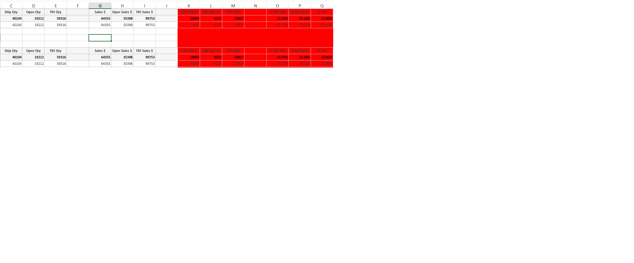
Thanks in advance.
- Mark as New
- Bookmark
- Subscribe
- Mute
- Subscribe to RSS Feed
- Permalink
- Report Inappropriate Content
yes this can be done - you can use filters on the recipients, so each recipient would see data based on the filter assigned to them.
Please refere to the following articles for more detailed inforamtion
How to Distribute User Specific QlikView Reports to User Folders – Customer Feedback for Vizubi
How to Distribute User Specific QlikView Reports by E-mail – Customer Feedback for Vizubi
How to Add Filters to Recipients – Customer Feedback for Vizubi
Advanced Filters Syntax on Recipients Import – Customer Feedback for Vizubi
- Mark as New
- Bookmark
- Subscribe
- Mute
- Subscribe to RSS Feed
- Permalink
- Report Inappropriate Content
Thanks for the good question. At the moment there is not the possibility to show an abject or a part of it in a report. NPrinting filters are created to select part of the data but cannot be used to hide columns.
Moreover, it is not possible to use QV conditional formatting because NPrinting imports also hidden charts.
- Mark as New
- Bookmark
- Subscribe
- Mute
- Subscribe to RSS Feed
- Permalink
- Report Inappropriate Content
You can build 2 separate reports. Create 2 Groups and add users to them. Distribute separate reports to separate groups.
- Mark as New
- Bookmark
- Subscribe
- Mute
- Subscribe to RSS Feed
- Permalink
- Report Inappropriate Content
I apologize for the misunderstanding - you can filter a report to control who says specific data but not columns.
As suggested you can build 2 different objects and create 2 different reports and build report groups to distribute
- Mark as New
- Bookmark
- Subscribe
- Mute
- Subscribe to RSS Feed
- Permalink
- Report Inappropriate Content
Hi,
Not sure about how you managed hidden columns but I hope that one of the different approaches used in the attached document can fit your needs.
Approach 1 (upper left): Variables
The chart contains as much dimensions and expressions as you need to show. You can choose which content to show (which fields and which values) by setting four variables values (two for the dimension and two for the expression)
QlikView NPrinting
Template Editor: Just drag and drop the chart tag (not single columns)
Recipient: associate to each recipient a filter based on variables.
Pro:
- dynamic chart with regards of content
- different filters may be imported and associated to recipients automatically with Repicient imports
Cons:
- static chart with regards of the number of dimensions/expressions
- need to create a different filter for each combination of dimensions/expressions you want to show
Approach 2 (upper right): Conditional dimensions/expressions (QV >= 11)
The chart contains as much dimensions and expressions as you might need to show. You can choose which ones to show
QlikView NPrinting
Template Editor: Just drag and drop the chart tag (not single columns)
Recipient: associate to each recipient a filter based on fields that select which dimensions and expressions to show.
Pro:
- dynamic chart with regards of number of dimensions/expressions
- different filters may be imported and associated to recipients automatically with Repicient imports
Cons:
- static chart with regards of the content of dimensions/expressions (you can choose whether show or not certain ones...but the content has been defined previously)
- need to create a different filter for each combination of dimensions/expressions you want to show
Approach 3 (bottom): uses expressions
You could create a chart with a wide number of dimensions and expressions based on formulas that pick the content from fields that you select with NPrinting Filters.
E.g.
=pick(
match(Title_Column,'Sales','Budget','Diff. Sales/Bdg','Diff. Sales/Bdg %'),
num(sum(Sales),'#.##0',',','.'),
num(sum(Budget),'#.##0',',','.'),
num(sum(Budget),'#.##0',',','.')-num(sum(Sales),'#.##0',',','.'),
num(sum(Sales),'#.##0',',','.')/num(sum(Budget)*100,'#.##0',',','.'))
QlikView NPrinting
Template Editor: Just drag and drop the chart tag (not single columns)
Recipient: associate to each recipient a filter based on fields that select which dimensions and expressions to show.
Pro:
- dynamic chart with regards of number of dimensions/expressions
- different filters may be imported and associated to recipients automatically with Recipient imports
Cons:
- need to create a different filter for each combination of dimensions/expressions you want to show
Approach 4: mix of 1 and 2
You could create a chart with a wide number of dimensions and expressions based on variables, configure these variables with formulas that pick the content from fields that you select with NPrinting Filters.
QlikView NPrinting
Template Editor: Just drag and drop the chart tag (not single columns)
Recipient: associate to each recipient a filter based on fields that select which dimensions and expressions to show.
Pro:
- dynamic chart with regards of number of dimensions/expressions and content. No need to know previously the formulas in QlikView...you can decide them when creating filters in QlikView NPrinting
- different filters may be imported and associated to recipients automatically with Repicient imports
Cons:
- need to create a different filter for each combination of dimensions/expressions you want to show
- Mark as New
- Bookmark
- Subscribe
- Mute
- Subscribe to RSS Feed
- Permalink
- Report Inappropriate Content
thank you for your response, but I'm quite new  to this process, where can I create the variables? and if I have an output with several excel sheets, how does this work. I tried to use the filter option but my fields are not showing there I'm not sure how I can go forward.
Thank you for your response though.
regards
M
- Mark as New
- Bookmark
- Subscribe
- Mute
- Subscribe to RSS Feed
- Permalink
- Report Inappropriate Content
Variables:
- "Settings" menu then "Variables Overview..."
OR
- Ctrl + Alt + V
Second question (multiple excel sheets): Regardless to where you put table tags from within the template editor using QlikView NPrinting Designer, tables will be exported accordingly.
E.g. CH100 into Sheet1 and CH200 into Sheet2.
QlikView NPrinting applies filters before exporting tables into excel and they will contain columns and values according with selections.