Unlock a world of possibilities! Login now and discover the exclusive benefits awaiting you.
- Qlik Community
- :
- All Forums
- :
- QlikView App Dev
- :
- Re: Displaying Multiple Dimensions with the Same E...
- Subscribe to RSS Feed
- Mark Topic as New
- Mark Topic as Read
- Float this Topic for Current User
- Bookmark
- Subscribe
- Mute
- Printer Friendly Page
- Mark as New
- Bookmark
- Subscribe
- Mute
- Subscribe to RSS Feed
- Permalink
- Report Inappropriate Content
Displaying Multiple Dimensions with the Same Expression in the Same Chart
I am trying to create a single chart, if possible, that will include the % of the population that has a number of characteristics. This could easily be achieved using set analysis in each expression, however, I would like each bar to be selectable so the user can filter the population based on the criteria for that bar. In order to do so, I was using a variable calculated dimension (EX:if(aggr(sum({<CurrentFlag={1}>} Dollars),Patient_ID)=0,'Zero Spend')) and then a standard expression (EX: sum(Patient_Counter)/sum(Total Patient_Counter)).
I have 20 of these different calculations, that I plan to show and hide using buttons, but I would like these to be on the same chart so I have a consistent axis and scale from dimension to dimension. I can't think of a way to accomplish this; I tried a container which makes them appear to be one graph, however, the axes don't align and scales would have to be hard coded. Any suggestions?
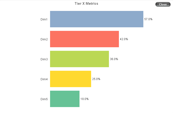
I'd like it to look like this:
- « Previous Replies
-
- 1
- 2
- Next Replies »
- Mark as New
- Bookmark
- Subscribe
- Mute
- Subscribe to RSS Feed
- Permalink
- Report Inappropriate Content
In my real world use case I have 20 metrics. I will have 5 buttons that select a subset of those 20.
For the example: Button1 = All Dims, Button2 = Dim1 and Dim2, Button 3 = Dim 3 only
- Mark as New
- Bookmark
- Subscribe
- Mute
- Subscribe to RSS Feed
- Permalink
- Report Inappropriate Content
You can use Bookmarks for that
- Mark as New
- Bookmark
- Subscribe
- Mute
- Subscribe to RSS Feed
- Permalink
- Report Inappropriate Content
I don't follow. Your example only showed one dimension at a time, but I need to be able to see multiples at the same time.
- « Previous Replies
-
- 1
- 2
- Next Replies »