Unlock a world of possibilities! Login now and discover the exclusive benefits awaiting you.
- Qlik Community
- :
- All Forums
- :
- QlikView App Dev
- :
- Re: My quest for the best way to visualize figures...
- Subscribe to RSS Feed
- Mark Topic as New
- Mark Topic as Read
- Float this Topic for Current User
- Bookmark
- Subscribe
- Mute
- Printer Friendly Page
- Mark as New
- Bookmark
- Subscribe
- Mute
- Subscribe to RSS Feed
- Permalink
- Report Inappropriate Content
My quest for the best way to visualize figures on different scales
Hi,
I have two figures, both out of an Excel_list, that I want to display in a barchart. Sounds simple, no? Well, take this:
- The first figure is "lorries arriving on a given day" which usually numbers in the dozens or so.
- The second is "boxes arriving on a given day" which usually numbers in the hundreds (every lorry can contain any number of boxes)
I want to display the two as close as possible so that it is clear at first sight which two figures (a # of lorries and a # of boxes) are associated with a given day.
- I cannot use one chart with the Trellis_option (which would effectually give me two charts) as the two scales are so different - the axes
automatically adapt to the largest figure (which would be a # of boxes), so the # of lorries would be hardly visible.
- Putting two separate charts side by side is quite ok, but it still requires "looking twice", so to speak, to notice the two different figures
associated with one day.
One thing that would be a solution if I can do it which I don't know is creating a horizontal barchart with the 0_line in the middle and with the bars for the lorries going right and the bars for boxes going left - but I don't know if I could use two different scales with that - I rather doubt it.
Now I came up with the idea of using two separate charts below each other and turning the lower one around - with the columns going down, not up. Then I just have to deactivate the display of the dimension for one of them and move them close to each other and get rid of a part of the frames.
Maybe someone here has some idea that could help me to further improve this visualization? There are also some more figures to come, I don't know whether it will be possible/ sensible to display those in the same diagram(s).
Thanks a lot!
Best regards,
DataNibbler
- Mark as New
- Bookmark
- Subscribe
- Mute
- Subscribe to RSS Feed
- Permalink
- Report Inappropriate Content
Oh, I just realised (!!!) that this is a QlikView discussion, not QlikSense - In that case I don't even know why I ended up here at all(???)
In that case, my answer is "I don't know", but good luck anyway.
- Mark as New
- Bookmark
- Subscribe
- Mute
- Subscribe to RSS Feed
- Permalink
- Report Inappropriate Content
Never mind. I'm not using that anyway because the main point in this instance is having several measures on the same dimension, which is the day.
Another question: Do you have an idea why, since yesterday if I'm not mistaken, emails are sent with the real names of the people here (and in some cases apparently with both the real name and the user_name)?
That is, if your name is Simon - I got two emails at the same time, one from Simon and one from Quriouss 😉
- Mark as New
- Bookmark
- Subscribe
- Mute
- Subscribe to RSS Feed
- Permalink
- Report Inappropriate Content
I have no idea why, and if that's the case it's errrm, less than ideal...
- Mark as New
- Bookmark
- Subscribe
- Mute
- Subscribe to RSS Feed
- Permalink
- Report Inappropriate Content
Must be some detail in your user_settings because it doesn't happen for all users - just you and one or two more currently.
Maybe the one where you can set up who can see your real name? Or something in the settings for emails about followed topics?
Tell me when you found it via a PM - I also wouldn't want that to happen to me.
- Mark as New
- Bookmark
- Subscribe
- Mute
- Subscribe to RSS Feed
- Permalink
- Report Inappropriate Content
I just posted a message in Community. You can follow it here; Notification emails being sent with real names instead of usernames?
- Mark as New
- Bookmark
- Subscribe
- Mute
- Subscribe to RSS Feed
- Permalink
- Report Inappropriate Content
Hi,
flipside, are you still around?
I have another question - there is a third and a fourth measure to include.
- The third has a magnitude similar to the #_of_lorries in the lower half of my chart and logically, it belongs to that (as it
concerns lorries coming with faulty papers), so I will include it in that part of the chart. But how?
- As it is currently, I cannot make it another column, that would automatically be stacked. That can be helped, but
with this vertically split axis, I doubt that this would work without any side_effects ...
- A line is ok.
- Is there a possibility, similar to a block_chart, to display another column inside the one I have?
(I think a second chart over the first with near everything being transparent would be a possibility, but a bit
fidgety ...)
Thanks a lot!
Best regards,
DataNibbler
P.S.: No - a second chart over the first one does work technically, but it seems that even though I've fixed the axis to the same min, max and interval, it isn't the same - a column representing 10 comes quite close to the 25_line (in the other chart) - so it seems that this vertical split in the axis makes the halves of the chart behave somewhat differently than they would in a standalone chart.
P.P.S.: So I think I'll stick with the line plus some text on the axis. Then there is a fourth measure to include which is again another magnitude and which does not logically belong to either the # of lorries nor the # of boxes, so that will need to be another chart or another panel in the same, but I don't think I can split the y-axis a second time, can I?
- Mark as New
- Bookmark
- Subscribe
- Mute
- Subscribe to RSS Feed
- Permalink
- Report Inappropriate Content
Okay,
now I have tried some more about the third measure - the one that belongs to the # of lorries - and I have made an exact copy of the first chart, complete with a vertical split and all, but with everything but the one column I want being transparent. I can overlay both charts and that way, the columns have the correct height and correspond to a line displaying the same measure.
Is there a way to make those columns a bit smaller so one can see that this is not a third stacked element, but rather a part of the former?
- Mark as New
- Bookmark
- Subscribe
- Mute
- Subscribe to RSS Feed
- Permalink
- Report Inappropriate Content
Yes, I'm still around  !
!
The only thing I can think of is to use a box plot combined with bars as the box plot doesn't stack onto the bars. You can still split the axis. You have to do the box plot first then add the bars and lines after as far as I can see.
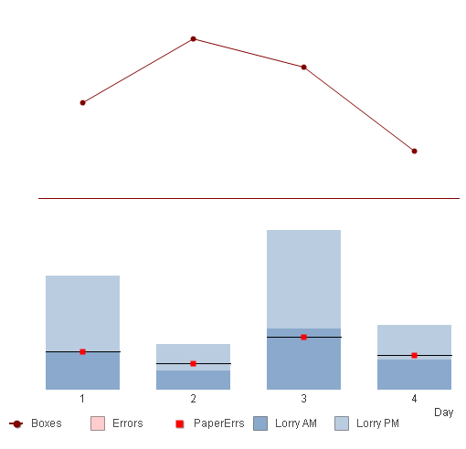
In this one I've used a box plot just to get the horizontal black line with the value I want to plot set the same for each of top, middle and bottom (I set my box plot without whiskers) and added a symbol as another expression.
The only thing I can't get rid of is the legend indicator for the box plot (Errors).
- Mark as New
- Bookmark
- Subscribe
- Mute
- Subscribe to RSS Feed
- Permalink
- Report Inappropriate Content
Hi flipside,
that looks good. The legend indicator is a bit disturbing, but not a catastrophe. The only annoying part of it is that I'll have to basically do it all again in a new chart, no? Well, I'll try. I can copy one element after another, so that should not be that much extra effort. let's see.
Thanks a lot!
P.S.: The boxplot requires something else, does it? When I untick the checkbox for "bars" and instead tick the one for the boxplot, there does not seem to be anything in my chart - well, the dimension is displayed, so there must be data, but I can't see a thing ...
- Mark as New
- Bookmark
- Subscribe
- Mute
- Subscribe to RSS Feed
- Permalink
- Report Inappropriate Content
The problem with Box Plots I've found is the properties can be a bit random. Sometimes they are greyed out and there's no way back. I have occasionally closed the properties and reopened to find them reactivated but also had to start from scratch as well a few times. They take a bit of practice to get used to.