Unlock a world of possibilities! Login now and discover the exclusive benefits awaiting you.
- Qlik Community
- :
- Forums
- :
- Analytics
- :
- New to Qlik Analytics
- :
- Re: Grey Lined Parts on Stacked Bar Chart
- Subscribe to RSS Feed
- Mark Topic as New
- Mark Topic as Read
- Float this Topic for Current User
- Bookmark
- Subscribe
- Mute
- Printer Friendly Page
- Mark as New
- Bookmark
- Subscribe
- Mute
- Subscribe to RSS Feed
- Permalink
- Report Inappropriate Content
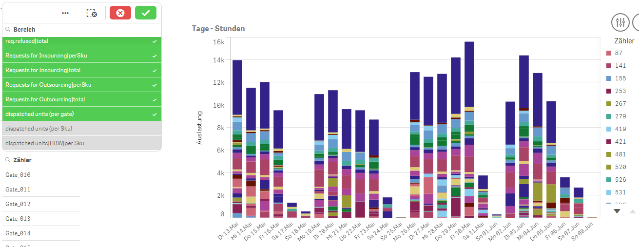
Grey Lined Parts on Stacked Bar Chart
Hi peoples!
My BarChart is doing strange things. I got some grey lined Parts and i don't know how to remove them.
I got 2 Dims (1 is Articles and 1 is Timestamp) and one Measure Sum(Count).
There are no Selections nor any options i changed. I just created the chart with these 3 Fields and set it as a Stacked Chart.
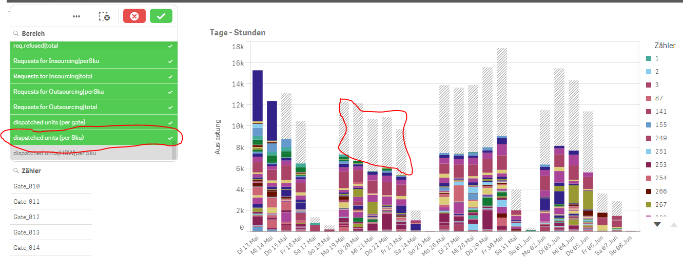
I attached an image for an example of my problem and marked some of these grey parts in red (nearly) circles.
Thanks in Advance!
Regards
Chris
EDIT: I can't select these grey parts either, forgot to tell you this
- « Previous Replies
-
- 1
- 2
- Next Replies »
Accepted Solutions
- Mark as New
- Bookmark
- Subscribe
- Mute
- Subscribe to RSS Feed
- Permalink
- Report Inappropriate Content
Hi,
This is a limitation we put in to avoid having a chart spend too much time fetching data.
The current limit is for a stacked bar chart is at 10,000 elements visible on screen, then we will render the amount of data we haven't fetched as one "bucket". If you add in a dimension limit or reduce the amount of segments they will dissaperar.
Kind regards,
Patrik.
- Mark as New
- Bookmark
- Subscribe
- Mute
- Subscribe to RSS Feed
- Permalink
- Report Inappropriate Content
Could you upload a small QVW that demonstrates this?
- Mark as New
- Bookmark
- Subscribe
- Mute
- Subscribe to RSS Feed
- Permalink
- Report Inappropriate Content
I added them in my First post.
Find attached file there
Regards
Chris
- Mark as New
- Bookmark
- Subscribe
- Mute
- Subscribe to RSS Feed
- Permalink
- Report Inappropriate Content
Could this be the Sense equivalent of the QV "Set Reference" option (on the right click context menu). This creates a shadowed/grayed out version of the data using one set of selections and allows you to make another selection to compare to the reference version?
In QV, you remove the reference line with "Clear Reference".
- Mark as New
- Bookmark
- Subscribe
- Mute
- Subscribe to RSS Feed
- Permalink
- Report Inappropriate Content
Due to not having this option in QS i don't think so, but even this would be an option in there, why does it happen automatically only on this chart? i made several other ones similar to this and it did not happen there.
Had the same problem two to three weeks ago, but i thought it was due to the set expression, but i wasn't sure.
Regards
Chris
- Mark as New
- Bookmark
- Subscribe
- Mute
- Subscribe to RSS Feed
- Permalink
- Report Inappropriate Content
It has something to do with the option 'show NULL values' in chart properties - add ons - data processing.
Still need to check what...
- Mark as New
- Bookmark
- Subscribe
- Mute
- Subscribe to RSS Feed
- Permalink
- Report Inappropriate Content
Hello,
I believe this is an internal chart failure issue. So it should be helpful to make visualization guys in Qlik take a look at it. Maybe mto can help forward it to the right people.
BR
Serhan
- Mark as New
- Bookmark
- Subscribe
- Mute
- Subscribe to RSS Feed
- Permalink
- Report Inappropriate Content
Hi
it seems that the probleme occured with one of those two line :

see below selecting all values except those two lines your bar chart looks OK
by selecting ones of this 2 values , it gives this :
hope it helps
Bruno
- Mark as New
- Bookmark
- Subscribe
- Mute
- Subscribe to RSS Feed
- Permalink
- Report Inappropriate Content
Yes i noticed that too, but most of the time the chart will be unselected so these grey lined parts are very unneat (i hope this word exists in english  )
)
- Mark as New
- Bookmark
- Subscribe
- Mute
- Subscribe to RSS Feed
- Permalink
- Report Inappropriate Content
well , not sure "unneat" is an english word
it seems that those 2 values are drilled down with the rest of the list.
selecting only one gives this :
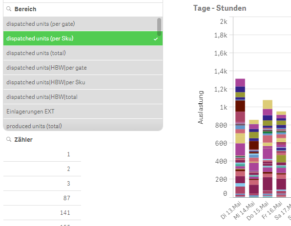
Have a look in your data model maybe ?
Sorry not able to help you more than this : too rookie in QlikSense
bruno
- « Previous Replies
-
- 1
- 2
- Next Replies »