Unlock a world of possibilities! Login now and discover the exclusive benefits awaiting you.
- Qlik Community
- :
- All Forums
- :
- QlikView App Dev
- :
- Re: Bar Chart Color -> above and below Value
- Subscribe to RSS Feed
- Mark Topic as New
- Mark Topic as Read
- Float this Topic for Current User
- Bookmark
- Subscribe
- Mute
- Printer Friendly Page
- Mark as New
- Bookmark
- Subscribe
- Mute
- Subscribe to RSS Feed
- Permalink
- Report Inappropriate Content
Bar Chart Color -> above and below Value
Hi,
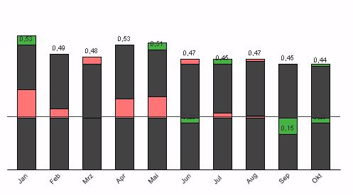
i want to create a chart like this:
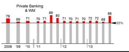
I think i could create this with a stacked bar chart.
But i dont know how to apply different colors according to being above/below plan value.
Does someone has already implemented something like that?
Phil
- « Previous Replies
-
- 1
- 2
- Next Replies »
Accepted Solutions
- Mark as New
- Bookmark
- Subscribe
- Mute
- Subscribe to RSS Feed
- Permalink
- Report Inappropriate Content
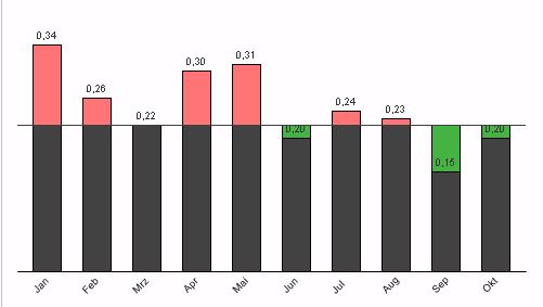
Three expressions in a stacked bar chart:
=Rangemin(sum(Expression3), vThreshold)
=if(sum(Expression3)>vThreshold, sum(Expression3)-vThreshold)
=if(sum(Expression3)<vThreshold, vThreshold-sum(Expression3))
- Mark as New
- Bookmark
- Subscribe
- Mute
- Subscribe to RSS Feed
- Permalink
- Report Inappropriate Content
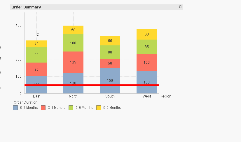
See attached sample qvw
- Mark as New
- Bookmark
- Subscribe
- Mute
- Subscribe to RSS Feed
- Permalink
- Report Inappropriate Content
Maybe like attached?
Two expressions in a stacked bar chart:
=Rangemin(sum(Expression3), vThreshold)
=if(sum(Expression3)>vThreshold, sum(Expression3)-vThreshold)
- Mark as New
- Bookmark
- Subscribe
- Mute
- Subscribe to RSS Feed
- Permalink
- Report Inappropriate Content
Hey thanks guys! That really helps me.
But how can i change the expression to geht it in another color if its below plan?
- Mark as New
- Bookmark
- Subscribe
- Mute
- Subscribe to RSS Feed
- Permalink
- Report Inappropriate Content
Could you post your sample qvw ?
- Mark as New
- Bookmark
- Subscribe
- Mute
- Subscribe to RSS Feed
- Permalink
- Report Inappropriate Content
Open the expression attributes of the first expression by clicking on the small plus sign next to the expression label on upper left corner of expression tab.
Then edit the background color attribute expression:
=Black()
- Mark as New
- Bookmark
- Subscribe
- Mute
- Subscribe to RSS Feed
- Permalink
- Report Inappropriate Content
Three expressions in a stacked bar chart:
=Rangemin(sum(Expression3), vThreshold)
=if(sum(Expression3)>vThreshold, sum(Expression3)-vThreshold)
=if(sum(Expression3)<vThreshold, vThreshold-sum(Expression3))
- Mark as New
- Bookmark
- Subscribe
- Mute
- Subscribe to RSS Feed
- Permalink
- Report Inappropriate Content
Hi,
PFA,
For Line and Mutlicolored Stacks .
I hope this Helps,
Regards,
Hirish.
“Aspire to Inspire before we Expire!”
- Mark as New
- Bookmark
- Subscribe
- Mute
- Subscribe to RSS Feed
- Permalink
- Report Inappropriate Content
Hi Jonathan,
thats the right answer!
Thanks alot!
Phil
- Mark as New
- Bookmark
- Subscribe
- Mute
- Subscribe to RSS Feed
- Permalink
- Report Inappropriate Content
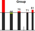
Got another requirement.
So far it looks like:
If I select more than one Year it looks like:
How can i get this to show grouped? I guess thats not possible?
At the moment ive got one expression for each year.
- « Previous Replies
-
- 1
- 2
- Next Replies »