Unlock a world of possibilities! Login now and discover the exclusive benefits awaiting you.
- Qlik Community
- :
- All Forums
- :
- QlikView App Dev
- :
- Re: Bar Chart Color -> above and below Value
Options
- Subscribe to RSS Feed
- Mark Topic as New
- Mark Topic as Read
- Float this Topic for Current User
- Bookmark
- Subscribe
- Mute
- Printer Friendly Page
Turn on suggestions
Auto-suggest helps you quickly narrow down your search results by suggesting possible matches as you type.
Showing results for
Anonymous
Not applicable
2015-11-30
06:01 AM
- Mark as New
- Bookmark
- Subscribe
- Mute
- Subscribe to RSS Feed
- Permalink
- Report Inappropriate Content
Bar Chart Color -> above and below Value
Hi,
i want to create a chart like this:
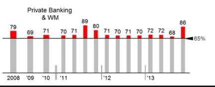
I think i could create this with a stacked bar chart.
But i dont know how to apply different colors according to being above/below plan value.
Does someone has already implemented something like that?
Phil
980 Views
- « Previous Replies
-
- 1
- 2
- Next Replies »
11 Replies
MVP
2015-11-30
09:24 AM
- Mark as New
- Bookmark
- Subscribe
- Mute
- Subscribe to RSS Feed
- Permalink
- Report Inappropriate Content
Not sure if I understand what you want to group here. Sample lines of data or a small sample QVW always help to understand where you are coming from.
Potentially, you can add more expressions to stack upon your bars.
65 Views
Anonymous
Not applicable
2015-12-03
04:08 AM
Author
- Mark as New
- Bookmark
- Subscribe
- Mute
- Subscribe to RSS Feed
- Permalink
- Report Inappropriate Content
Forget my last posting. Im ok with that now 
65 Views
- « Previous Replies
-
- 1
- 2
- Next Replies »