Unlock a world of possibilities! Login now and discover the exclusive benefits awaiting you.
- Qlik Community
- :
- All Forums
- :
- QlikView App Dev
- :
- Re: how to add supplier info to scatter plot
- Subscribe to RSS Feed
- Mark Topic as New
- Mark Topic as Read
- Float this Topic for Current User
- Bookmark
- Subscribe
- Mute
- Printer Friendly Page
- Mark as New
- Bookmark
- Subscribe
- Mute
- Subscribe to RSS Feed
- Permalink
- Report Inappropriate Content
how to add supplier info to scatter plot
Hello Everybody,
I am trying to solve the follwing problem.
I set up a scatter chart indicating price (y axis) and quantity purchased (x axis), as a dimension I use the article number.
Now I would like to add the information "supplier name" to the data point or highlight all data point from the same supplier with the same color. Goal is to visualize where the articles of the different suppliers are located in the scatter chart.
i.e. Supplier A: Down right (high quantity, low price) or Top left (low quantity, high price) etc.
Anybondy can help me?
Thanks much in advance.
Best Regards,
beat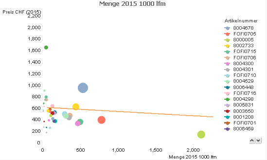
Accepted Solutions
- Mark as New
- Bookmark
- Subscribe
- Mute
- Subscribe to RSS Feed
- Permalink
- Report Inappropriate Content
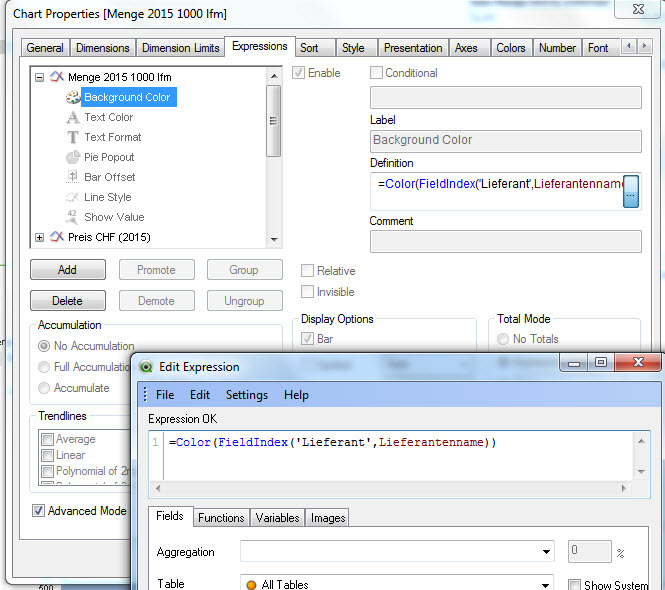
For the background color attribute expression of the X axis expression, try something like (assuming Supplier as supplier field name):
=Color(FieldIndex('Supplier',Supplier))
- Mark as New
- Bookmark
- Subscribe
- Mute
- Subscribe to RSS Feed
- Permalink
- Report Inappropriate Content
For the background color attribute expression of the X axis expression, try something like (assuming Supplier as supplier field name):
=Color(FieldIndex('Supplier',Supplier))
- Mark as New
- Bookmark
- Subscribe
- Mute
- Subscribe to RSS Feed
- Permalink
- Report Inappropriate Content
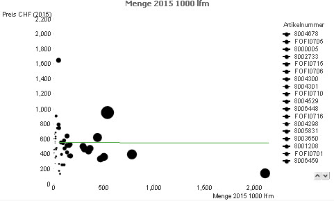
Hi
Check out the Attachment.
Hope this Helps ,
Regards,
Hirish
“Aspire to Inspire before we Expire!”
- Mark as New
- Bookmark
- Subscribe
- Mute
- Subscribe to RSS Feed
- Permalink
- Report Inappropriate Content
Thank you guys for your answer.
When I put in the "=Color(FieldIndex('Supplier',Supplier))" using "Lieferantenname" as "Supplier. Now all data points (articles) turn black although in the underlying excel column (Lieferantename) there are a number of different supplier names.
I insert a screenshot. What am I doing wrong?
- Mark as New
- Bookmark
- Subscribe
- Mute
- Subscribe to RSS Feed
- Permalink
- Report Inappropriate Content
Hi beat,
Did you got your desired Result!
-Hirish
“Aspire to Inspire before we Expire!”
- Mark as New
- Bookmark
- Subscribe
- Mute
- Subscribe to RSS Feed
- Permalink
- Report Inappropriate Content
Hi Hirish
Unfortunatly not yet, see my 2nd post above.
Can you think of a solution? or what I am doing wrong?
Thanks much in advance.
Best,
Beat
- Mark as New
- Bookmark
- Subscribe
- Mute
- Subscribe to RSS Feed
- Permalink
- Report Inappropriate Content
If your field is named Lieferantenname, you should also use this as field name in FieldIndex() function:
=Color(FieldIndex('Lieferantenname', Lieferantenname))
Or what is the relation between Lieferant and Lieferantenname and are the field values the same?
- Mark as New
- Bookmark
- Subscribe
- Mute
- Subscribe to RSS Feed
- Permalink
- Report Inappropriate Content
Perfect. Now it works. Thank you for your support.
Best,
Beat