Unlock a world of possibilities! Login now and discover the exclusive benefits awaiting you.
- Qlik Community
- :
- All Forums
- :
- QlikView App Dev
- :
- Re: Line Chart
- Subscribe to RSS Feed
- Mark Topic as New
- Mark Topic as Read
- Float this Topic for Current User
- Bookmark
- Subscribe
- Mute
- Printer Friendly Page
- Mark as New
- Bookmark
- Subscribe
- Mute
- Subscribe to RSS Feed
- Permalink
- Report Inappropriate Content
Line Chart
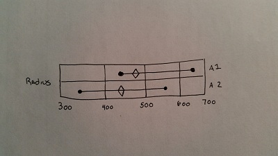
I am trying to make this unique line chart. It essentially is two lines each line has a min value, a maximum value and a current value represented with different icons. Min and Max are dots on the end and the triangle is the current value which is a different color. I drew this out on paper what I am trying to do and am having difficulty. When a record comes into Qlik the fields are Item, Max Value, Min Value, Current Value. We can have several items normally only two or three.
Thanks for any help.
- Mark as New
- Bookmark
- Subscribe
- Mute
- Subscribe to RSS Feed
- Permalink
- Report Inappropriate Content
I have gotten further on the problem. I just need help figuring out how to connect the two dots.
- Mark as New
- Bookmark
- Subscribe
- Mute
- Subscribe to RSS Feed
- Permalink
- Report Inappropriate Content
Very Nice Presentation !!!
If the issue is solved please mark the answer with Accept as Solution & like it.
If you want to go quickly, go alone. If you want to go far, go together.
- Mark as New
- Bookmark
- Subscribe
- Mute
- Subscribe to RSS Feed
- Permalink
- Report Inappropriate Content
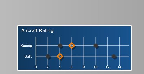
like this?
- Mark as New
- Bookmark
- Subscribe
- Mute
- Subscribe to RSS Feed
- Permalink
- Report Inappropriate Content
if you want to just connect lines then go head enable the line and symbol together that should do
- Mark as New
- Bookmark
- Subscribe
- Mute
- Subscribe to RSS Feed
- Permalink
- Report Inappropriate Content
Check this.
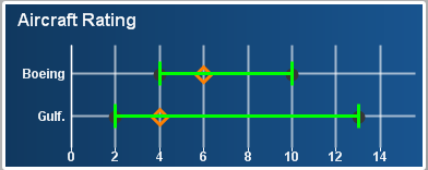
Note: 'Has Error Bars' feature has been used to achieve the same
- Mark as New
- Bookmark
- Subscribe
- Mute
- Subscribe to RSS Feed
- Permalink
- Report Inappropriate Content
Tresesco,
I just remove the tick mark from "Has Error Bars" option and applied again. It's not working now. If I press apply button the tick mark automatically disappeared from the "Has Error Bars" option. What could be the reason?
- Mark as New
- Bookmark
- Subscribe
- Mute
- Subscribe to RSS Feed
- Permalink
- Report Inappropriate Content
Unchecking 'Has Error Bars' and pressing Apply, causes resetting the 'Error Above' and 'Error Below'. To make it work again, set expressions like:
Error Above : MaxRad-MinRad-1
Error Below : 1