Unlock a world of possibilities! Login now and discover the exclusive benefits awaiting you.
- Qlik Community
- :
- All Forums
- :
- QlikView App Dev
- :
- Re: Chart bunches up when multiple dimensions
- Subscribe to RSS Feed
- Mark Topic as New
- Mark Topic as Read
- Float this Topic for Current User
- Bookmark
- Subscribe
- Mute
- Printer Friendly Page
- Mark as New
- Bookmark
- Subscribe
- Mute
- Subscribe to RSS Feed
- Permalink
- Report Inappropriate Content
Chart bunches up when multiple dimensions
Hi
I'm comparatively new to QlikView, but have managed a few dashboards successfully. My latest however is really tricking me in the way the chart is laid out.
The challenge lies in me having multiple dimensions represented hierarchically: business units grouped within region.
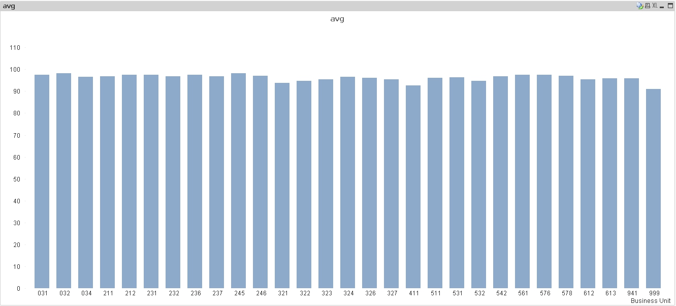
If I only have Business Unit as a dimension, the chart is great:
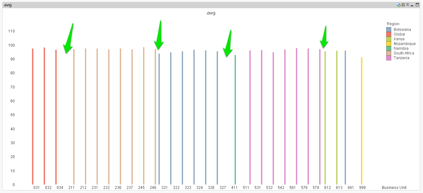
If I only have Region, also great. However if I have both the formatting turns out awfully, with thin lines, uneven spacing, and bars not aligned to their labels:
Has anyone come across this before? Both the data and the QVW are attached - would be grateful for any insights.
Thanks
Andrew
- Mark as New
- Bookmark
- Subscribe
- Mute
- Subscribe to RSS Feed
- Permalink
- Report Inappropriate Content
If you change your Charts Properties -> Style -> Subtype -> Stacked. That might make it look better.
- Mark as New
- Bookmark
- Subscribe
- Mute
- Subscribe to RSS Feed
- Permalink
- Report Inappropriate Content
Hi Andrew,
On Dimension, promote Region above Business Unit, then on style, change the subtype to stacked.
Chart then looks much better
HTH
andy
- Mark as New
- Bookmark
- Subscribe
- Mute
- Subscribe to RSS Feed
- Permalink
- Report Inappropriate Content
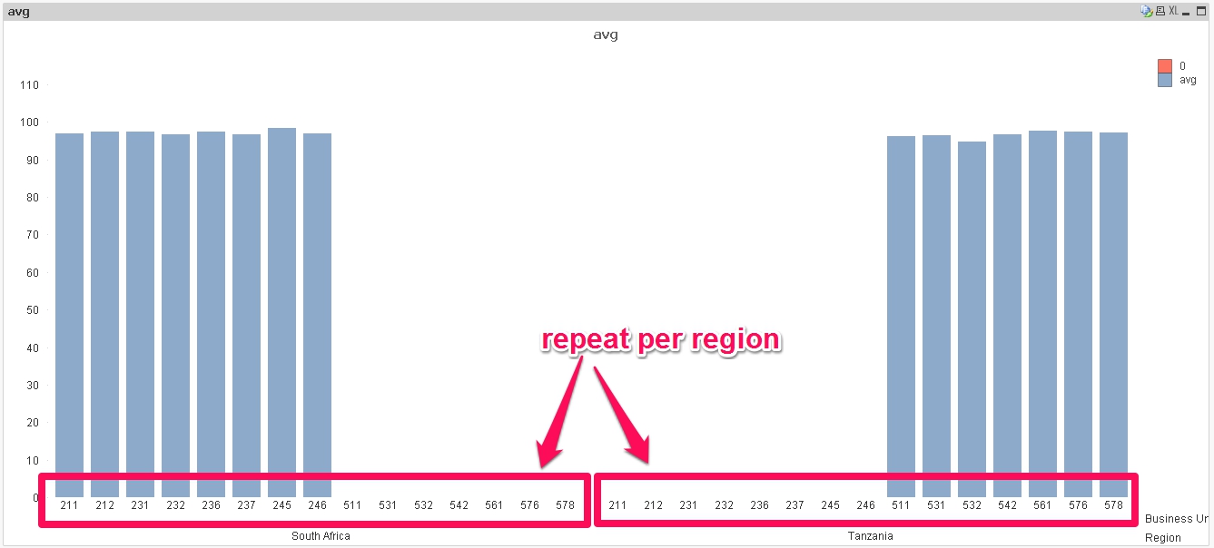
Thanks Gents, that does make a difference. However I think I've found the underlying issue: Each Business Unit only exists in 1 country. When I group by country as a dimension, the chart creates empty columns for every Business Unit in every Country. Eg. if I select only 2 countries you can see units 211-246 only have data for South Africa, yet are repeated as empty columns for Tanzania:
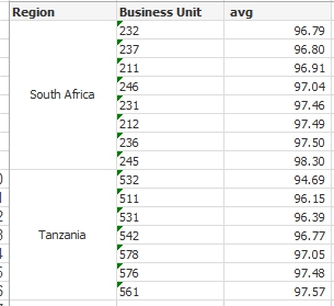
I've tried suppressing Zero-Values an Missing values but no luck. Ideally I want a chart that only shows the Business Units within a region that has data - in other words a graphical representation of the below table:
Thanks
Andrew