Unlock a world of possibilities! Login now and discover the exclusive benefits awaiting you.
- Qlik Community
- :
- All Forums
- :
- QlikView App Dev
- :
- Re: Packed Bubble Chart Equivalent
- Subscribe to RSS Feed
- Mark Topic as New
- Mark Topic as Read
- Float this Topic for Current User
- Bookmark
- Subscribe
- Mute
- Printer Friendly Page
- Mark as New
- Bookmark
- Subscribe
- Mute
- Subscribe to RSS Feed
- Permalink
- Report Inappropriate Content
Packed Bubble Chart Equivalent
I am trying to create something that looks like this for my customer:
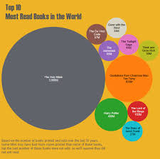
I really only have one dimension and one expression though, so a bubble in Qlik isn't going to work for me.
Any suggestions how I can work around this?
Otherwise do you have suggestions for a better way to visualize this.
Accepted Solutions
- Mark as New
- Bookmark
- Subscribe
- Mute
- Subscribe to RSS Feed
- Permalink
- Report Inappropriate Content
I suggest a bar chart. It's far superior to the dysfunctional packed bubble chart. You can read what one of the foremost experts in information visualization has to say about packed bubble charts in this blog post: Visual Business Intelligence – Tableau Veers from the Path
talk is cheap, supply exceeds demand
- Mark as New
- Bookmark
- Subscribe
- Mute
- Subscribe to RSS Feed
- Permalink
- Report Inappropriate Content
Thanks, that was helpful. I have read a lot of Stephen Few's stuff, but sometimes I feel like I still can't wrap my head around good/bad visualizations. Due to number of dimensions I actually suggested a tree map. I feel like the article backs me up on that suggestion.