Unlock a world of possibilities! Login now and discover the exclusive benefits awaiting you.
- Qlik Community
- :
- All Forums
- :
- QlikView App Dev
- :
- Re: Class Function with Max Interval?
- Subscribe to RSS Feed
- Mark Topic as New
- Mark Topic as Read
- Float this Topic for Current User
- Bookmark
- Subscribe
- Mute
- Printer Friendly Page
- Mark as New
- Bookmark
- Subscribe
- Mute
- Subscribe to RSS Feed
- Permalink
- Report Inappropriate Content
Class Function with Max Interval?
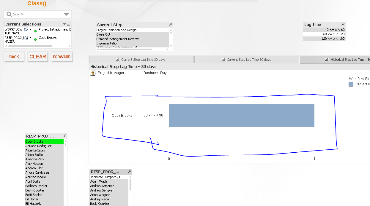
I am using a class function that shows =class(WORKFLOW_DURATION,30,WORKFLOW_DURATION) .
I want the largest interval to show >120. Rather than 120 - 150, etc... How can I do this?
Thanks,
Cassandra
- Mark as New
- Bookmark
- Subscribe
- Mute
- Subscribe to RSS Feed
- Permalink
- Report Inappropriate Content
Can you share a sample?
- Mark as New
- Bookmark
- Subscribe
- Mute
- Subscribe to RSS Feed
- Permalink
- Report Inappropriate Content
I am seeing just one bar for the selection you have in your application.
- Mark as New
- Bookmark
- Subscribe
- Mute
- Subscribe to RSS Feed
- Permalink
- Report Inappropriate Content
If you Clear the selections, however, now the intervals don't look right.
If you look at the expression I am using, it is now Dual(If(WORKFLOW_DURATION <= 120, Class(Sum(total WORKFLOW_DURATION), 60), '>120'),
If(WORKFLOW_DURATION <= 120, Class(Sum(total WORKFLOW_DURATION), 60), 120))
- Mark as New
- Bookmark
- Subscribe
- Mute
- Subscribe to RSS Feed
- Permalink
- Report Inappropriate Content
Create the Buckets in the script with IntervalMatch function.
- Mark as New
- Bookmark
- Subscribe
- Mute
- Subscribe to RSS Feed
- Permalink
- Report Inappropriate Content
Do you have a reference for that?
- Mark as New
- Bookmark
- Subscribe
- Mute
- Subscribe to RSS Feed
- Permalink
- Report Inappropriate Content
Please see updated sample.
- Mark as New
- Bookmark
- Subscribe
- Mute
- Subscribe to RSS Feed
- Permalink
- Report Inappropriate Content
Can you point out what isn't working? May be tell us what selections to make and what are the expected result based on those selections
- Mark as New
- Bookmark
- Subscribe
- Mute
- Subscribe to RSS Feed
- Permalink
- Report Inappropriate Content
if you select REQUEST_ID 182921, you will see two versions of the chart. The top one shows two buckets for one request (not sure why). The second chart looks correct with the 60-120 bucket compared to the data on the bottom showing 101 business days.
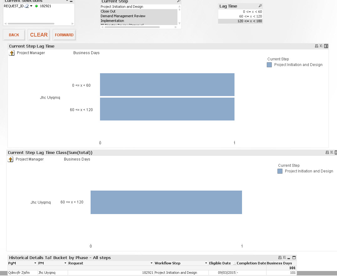
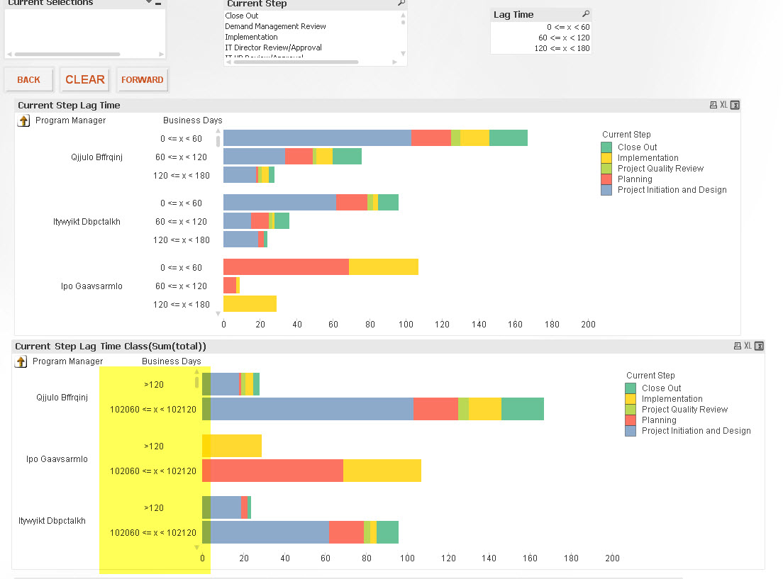
However, if you clear the selections, you will see the buckets for the second chart no longer reflect 0-60, 60-120 and >120. This is why I was playing with the Class(Sum(total))) in the expression...
Does that help? Sorry for the confusion.
- Mark as New
- Bookmark
- Subscribe
- Mute
- Subscribe to RSS Feed
- Permalink
- Report Inappropriate Content
Based on the REQUEST_ID selection, there are two rows of data one is between 0 and 60 and other is between 60 and 120. That is why you see two bars. Would you want to add them together when you create classes?
- Mark as New
- Bookmark
- Subscribe
- Mute
- Subscribe to RSS Feed
- Permalink
- Report Inappropriate Content
See if this is what you want?