Unlock a world of possibilities! Login now and discover the exclusive benefits awaiting you.
- Qlik Community
- :
- Forums
- :
- Analytics
- :
- New to Qlik Analytics
- :
- Re: Sorting of Stacked Bar Chart does not work pro...
- Subscribe to RSS Feed
- Mark Topic as New
- Mark Topic as Read
- Float this Topic for Current User
- Bookmark
- Subscribe
- Mute
- Printer Friendly Page
- Mark as New
- Bookmark
- Subscribe
- Mute
- Subscribe to RSS Feed
- Permalink
- Report Inappropriate Content
Sorting of Stacked Bar Chart does not work properly in Qlik sense desktop
Using Qlik Sense Desktop we would like to create a Staked bar chart using the following fields:
Dimensions:
- Week (Week of the Year)
- Product Type
Measure: Sales
Aim: The final Staked chart should display stacks (“Product Type”) of each bar in sorted order based on the “Sales” figure.
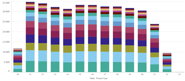
The default chart with Sort property set to “Auto” looks like as given below:

Now in order to apply sorting we have turned on the “Custom” sorting features for “Product Type” dimension and selected “Sort by expression” and entered the same expression “sum(QTY_Delivery)” that we have used in measure (i.e. Sales). The chart looks as below
On closely looking at the chart, we have found that chart is not sorted properly. There are some bars (e.g. bar at 46 Week) has wrong order (you can see the first two stacks from the bottom - blue color stack is longer than the green one)
Other than that we have tried another expression “sum(total<Week> QTY_Delivery)” to group the sum by “Week” but it sorts chart differently and the chart looks as below:

Please suggest how we can sort it properly?
- Tags:
- sort order
- stack bar
- Mark as New
- Bookmark
- Subscribe
- Mute
- Subscribe to RSS Feed
- Permalink
- Report Inappropriate Content
See this discussion: Bar Chart 2 Dimentions sorting. The same approach should work in Qlik Sense too.
talk is cheap, supply exceeds demand
- Mark as New
- Bookmark
- Subscribe
- Mute
- Subscribe to RSS Feed
- Permalink
- Report Inappropriate Content
Sorry the link suggested does not resolve our issue We have downloaded the .qvw file and did not found any sheet in it to test, so we have created a test Sheet and attached a .qvf file here. Please feel free to modify it and we would appreciate if someone could help us in sorting the chart in this app.
- Mark as New
- Bookmark
- Subscribe
- Mute
- Subscribe to RSS Feed
- Permalink
- Report Inappropriate Content
Sorry the link suggested does not resolve our issue We have downloaded the .qvw file and did not found any sheet in it to test
If you convert a qvw file to a Qlik Sense app then only the data model is converted.
I've modified the qvf file you provide. See attached example.
talk is cheap, supply exceeds demand
- Mark as New
- Bookmark
- Subscribe
- Mute
- Subscribe to RSS Feed
- Permalink
- Report Inappropriate Content
Thanks for your help. The suggested expression helps in sorting the chart but now if we use that expression, we have below issues in the chart:
- The chart does not show data for one of the Customers "G"
- When any of the filters is applied then Customer "G" data is shown e.g if you select "City2" from City filter or color "6" from the color filter then you will notice that data for "G" appears.
- The legend, data label does not match with the actual data for eg for yearmonth "2010-04" you will see 6 blocks but the legend shows only 5 items. Also Customer "A" is shown twice in this year with different values.
- The legend color is inconsistent for all the years.
5. The same color repeats twice e.g. for yearmonth “2008-03”, “2008-10”
I have attached the modified qvf with more data. Please see "My new sheet (2)" for the issue.