Unlock a world of possibilities! Login now and discover the exclusive benefits awaiting you.
- Qlik Community
- :
- Forums
- :
- Analytics
- :
- New to Qlik Analytics
- :
- Re: Help with creating a dropdown in Qlik
- Subscribe to RSS Feed
- Mark Topic as New
- Mark Topic as Read
- Float this Topic for Current User
- Bookmark
- Subscribe
- Mute
- Printer Friendly Page
- Mark as New
- Bookmark
- Subscribe
- Mute
- Subscribe to RSS Feed
- Permalink
- Report Inappropriate Content
Help with creating a dropdown in Qlik
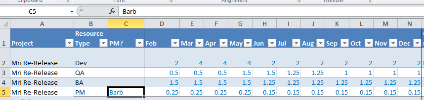
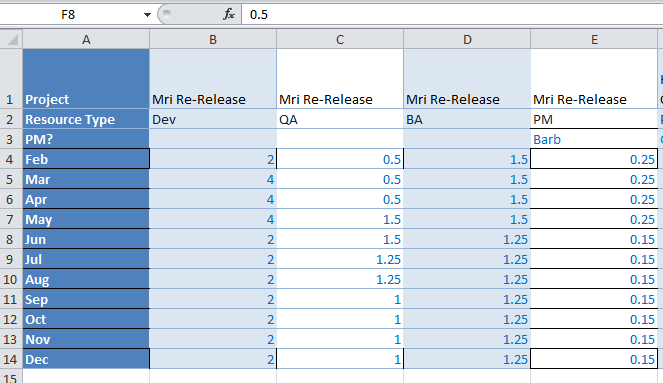
Hey everyone. I'm very new to QlikSense and I'm trying to figure out how to transfer an important file we use in Excel to something that would tell a compelling story in Qlik. The document is basically made to document resource management and our over/under threshold. Looking at the screenshots below, I'm trying to make a chart that will allow me to see results based off of the month. I'm hoping I'm just over analyzing and there is an easier way to format this so Qlik will handle it better.
Screenshot 1 - This is the current format of the report. The months are the columns and the projects are on the left. I need to figure out how to see project numbers by month in a graph.
Screenshot 2 - This is my trying to format the data differently to get different results - still having issues because the columns really aren't all inclusive.
Apologies if this is all over the place - been trying to figure out a way to do this and running blank besides scrapping the current format and making something else completely. Any help would be appreciated. Thank you.
- Mark as New
- Bookmark
- Subscribe
- Mute
- Subscribe to RSS Feed
- Permalink
- Report Inappropriate Content
Hi Scott,
both screenshots look like Sense Pivot tables, with different sets of Columns and Rows. While keeping in mind that some of the unlimited Excel flexibility can't be matched, your specific needs (IMHO) can be solved in a Pivot table.
cheers,
Oleg Troyansky
Upgrade your Qlik skills at the Masters Summit for Qlik - coming soon to Milan, Italy!
- Mark as New
- Bookmark
- Subscribe
- Mute
- Subscribe to RSS Feed
- Permalink
- Report Inappropriate Content
Hi Scott,
It seems best to convert your data to a regular table first by using the "Crosstable" load script. Below is an article to discuss the topic. Then you can have more visibility to the data. I hope this helps.
Regards,
Muliady
- Mark as New
- Bookmark
- Subscribe
- Mute
- Subscribe to RSS Feed
- Permalink
- Report Inappropriate Content
You might required Mutli Header Cross table like this?
Extracting multiple headers from Crosstable
CrossTable from Excel with Multiple Headers | Qlik Community