Unlock a world of possibilities! Login now and discover the exclusive benefits awaiting you.
- Qlik Community
- :
- Forums
- :
- Analytics
- :
- New to Qlik Analytics
- :
- Re: How to show percentage of total instead of abs...
- Subscribe to RSS Feed
- Mark Topic as New
- Mark Topic as Read
- Float this Topic for Current User
- Bookmark
- Subscribe
- Mute
- Printer Friendly Page
- Mark as New
- Bookmark
- Subscribe
- Mute
- Subscribe to RSS Feed
- Permalink
- Report Inappropriate Content
How to show percentage of total instead of absolute numbers
Hello,
QuikSense newbie here. I am trying to show Female vs. Male percentages by Job Level, and have absolute numbers in my data. Sample data below:-
| Job Level | Female | Male | Total |
| Executive | 165 | 190 | 355 |
| Director | 1100 | 1200 | 2300 |
| Manager | 6500 | 6400 | 12900 |
| Professional | 12200 | 11500 | 23700 |
| Manufacturing | 15500 | 14500 | 30000 |
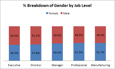
I want to create a bar chart, but instead of showing absolute numbers, I want to show percentages of Female vs. Males. Something like this:-
I understand I will need to create a custom measure, like Female/Total *100 or something. But not sure what formula to use.
Thoughts?
Thanks in anticipation!
Ankit
Accepted Solutions
- Mark as New
- Bookmark
- Subscribe
- Mute
- Subscribe to RSS Feed
- Permalink
- Report Inappropriate Content
What issues do you see? Incorrect numbers? No result? Error messages?
I think Oleg's solution should work:
Create a chart with two dimensions, [Job Level] and Gender
As expression, use
=Count(ID) / Count(TOTAL<[Job Level]> ID)
I assume you have distinct IDs in the ID column, so you don't need to use explicitely a count distinct.
If you still have issues, could you describe what exactely you have done and what you see (and maybe what you expect to see)?
- Mark as New
- Bookmark
- Subscribe
- Mute
- Subscribe to RSS Feed
- Permalink
- Report Inappropriate Content
Something like the following:
Count(ID) / count (TOTAL <[Job Level]> ID)
,assuming that each person is identified by the field ID.
cheers,
Oleg Troyansky
Upgrade your Qlik skills at the Masters Summit for Qlik - coming soon to Milan, Italy and Austin, TX!
- Mark as New
- Bookmark
- Subscribe
- Mute
- Subscribe to RSS Feed
- Permalink
- Report Inappropriate Content
Does your top table represent your raw data, i.e. a table from your model? Or do you have a table with fields Job Level, Sex, EmpID instead?
In latter case, you can do what Oleg suggested, create a chart with dimensions Job Level and Sex and the above expression (adapted to your field names).
In first case, you can consider transforming the table using CROSSTABLE LOAD prefix ( I think this would be best), then follow second case.
Or create a chart with dimension Job Level and two expressions:
=Num(Sum(Female) / Sum(Total),'#0.00%')
=Num(Sum(Male) / Sum(Total),'#0.00%')
- Mark as New
- Bookmark
- Subscribe
- Mute
- Subscribe to RSS Feed
- Permalink
- Report Inappropriate Content
Oleg & Swuehl -
Thank you for your prompt responses. Appreciate it!
Good question, thanks for checking Swuehl. I have the latter. So my data does look like this:-
| Name | ID | Job Level | Region | Gender |
| asf | 123 | Executive | US | Male |
| asdfasdf | 234 | Professional | APAC | Female |
| asdfasdf | 345 | Professional | US | Male |
| asda | 456 | Manager | Europe | Male |
| sdasd | 567 | Professional | US | Female |
I tried the formulae you suggested as well as what Oleg suggested but I am not able to get it right. Based on my data above, do you have other thoughts?
Thanks again,
Ankit
- Mark as New
- Bookmark
- Subscribe
- Mute
- Subscribe to RSS Feed
- Permalink
- Report Inappropriate Content
What issues do you see? Incorrect numbers? No result? Error messages?
I think Oleg's solution should work:
Create a chart with two dimensions, [Job Level] and Gender
As expression, use
=Count(ID) / Count(TOTAL<[Job Level]> ID)
I assume you have distinct IDs in the ID column, so you don't need to use explicitely a count distinct.
If you still have issues, could you describe what exactely you have done and what you see (and maybe what you expect to see)?
- Mark as New
- Bookmark
- Subscribe
- Mute
- Subscribe to RSS Feed
- Permalink
- Report Inappropriate Content
It worked!  Thank you both.