Unlock a world of possibilities! Login now and discover the exclusive benefits awaiting you.
- Qlik Community
- :
- Forums
- :
- Analytics
- :
- New to Qlik Analytics
- :
- Re: How can i get rid off the scale thing on the b...
- Subscribe to RSS Feed
- Mark Topic as New
- Mark Topic as Read
- Float this Topic for Current User
- Bookmark
- Subscribe
- Mute
- Printer Friendly Page
- Mark as New
- Bookmark
- Subscribe
- Mute
- Subscribe to RSS Feed
- Permalink
- Report Inappropriate Content
How can i get rid off the scale thing on the bottom or sides of bar charts?
Hi Guys,
How can i get rid off the scale thing on the bottom or sides of bar charts?
Regards
lak
Accepted Solutions
- Mark as New
- Bookmark
- Subscribe
- Mute
- Subscribe to RSS Feed
- Permalink
- Report Inappropriate Content
ahh - that shows up when there are too many lines to show on one page.
Strange that you appear to only have one record on show?
Are you able to post a copy of the report?
- Mark as New
- Bookmark
- Subscribe
- Mute
- Subscribe to RSS Feed
- Permalink
- Report Inappropriate Content
Open Axes tab on chart properties.
Enable 'Hide axis' for the expression axes and also for the dimension axis (you may need to enable 'continuous axis' to be able to enable hide axis for the dimension)
edit:
Sorry, missed that you posted to QlikSense place. Above is related to QV chart.
- Mark as New
- Bookmark
- Subscribe
- Mute
- Subscribe to RSS Feed
- Permalink
- Report Inappropriate Content
I can't see the hide axis bit.
- Mark as New
- Bookmark
- Subscribe
- Mute
- Subscribe to RSS Feed
- Permalink
- Report Inappropriate Content
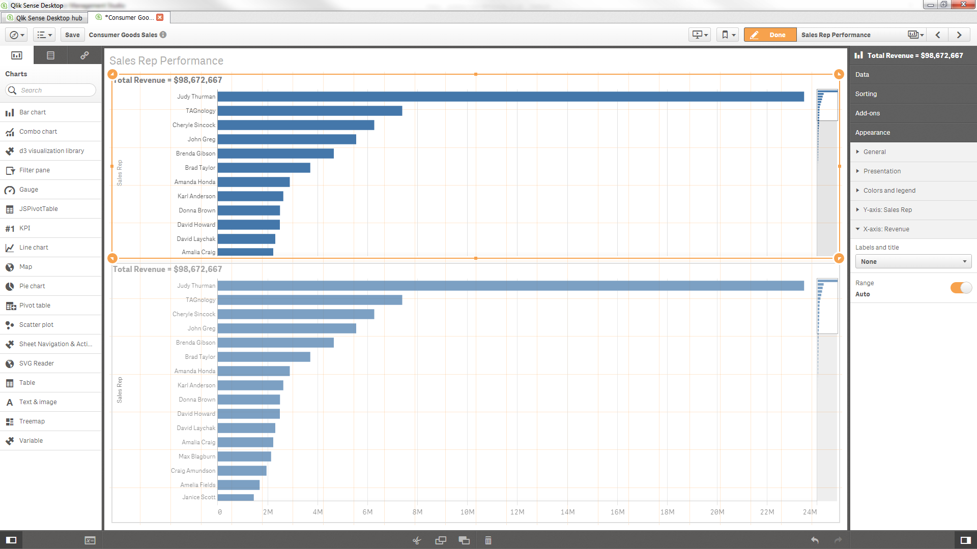
Appearance properties of the chart, choose which axis you want to change and edit the "Labels and title" drop down accordingly.
- Mark as New
- Bookmark
- Subscribe
- Mute
- Subscribe to RSS Feed
- Permalink
- Report Inappropriate Content
Still not working, I do have around 7 add alternatives, but that shouldn't make a difference as my other chart has lost the scale thing.
- Mark as New
- Bookmark
- Subscribe
- Mute
- Subscribe to RSS Feed
- Permalink
- Report Inappropriate Content
top bar chart without scale - you can see the properties.
I added Alternatives to this chart and it didn't make any difference to the axis
- Mark as New
- Bookmark
- Subscribe
- Mute
- Subscribe to RSS Feed
- Permalink
- Report Inappropriate Content
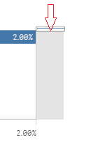
I want to get rid of this thing
- Mark as New
- Bookmark
- Subscribe
- Mute
- Subscribe to RSS Feed
- Permalink
- Report Inappropriate Content
ahh - that shows up when there are too many lines to show on one page.
Strange that you appear to only have one record on show?
Are you able to post a copy of the report?