Unlock a world of possibilities! Login now and discover the exclusive benefits awaiting you.
- Qlik Community
- :
- Blogs
- :
- Technical
- :
- Design
- :
- Why Comparative Analysis
- Subscribe to RSS Feed
- Mark as New
- Mark as Read
- Bookmark
- Subscribe
- Printer Friendly Page
- Report Inappropriate Content
Comparative Analysis is a way to analyze data based on multiple groups. It is not a comparison between two items such as Company A vs Company B. It is all about you, the user, creating customized groups on demand.
For example, you might have seen a graph like this, which is a standard way to compare between companies.
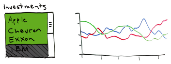
Note: The sketch was created for a demo purpose only.
Comparative analysis lets you group these three companies as portfolio A and compare to another portfolio group B, which may have one company swapped. And then, you may compare which grouping is a better choice for you.
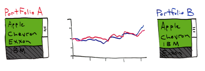
Note: The sketch is created for a demo purpose only.
In this example, I have used the same type of values as two groups; however, you can mix different level of data or different types of data. For example, you may choose one company against an entire industry for business growth comparison, or comparing one country, such as Japan, to a state in the US, California, for population increases. The most common usage of comparative analysis is for basket analysis.
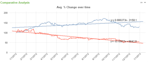
If you would like to try this functionality, go to Financial Stocks Analysis demo > Comparative Analysis tab. Make selections as you’d like and you will see the top chart being populated for your groups.
Here is technical brief on how to enable comparative analysis. You can download the Financial Stocks Analysis demo or Whats New in QlikView11 demo to see how this functionality is implemented.
Here is the video of Comparative Analysis recorded by Michael Anthony.
Shima Auzins
You must be a registered user to add a comment. If you've already registered, sign in. Otherwise, register and sign in.