Unlock a world of possibilities! Login now and discover the exclusive benefits awaiting you.
- Qlik Community
- :
- Forums
- :
- Analytics & AI
- :
- Products & Topics
- :
- App Development
- :
- Charting dimensions in a timeline for item
- Subscribe to RSS Feed
- Mark Topic as New
- Mark Topic as Read
- Float this Topic for Current User
- Bookmark
- Subscribe
- Mute
- Printer Friendly Page
- Mark as New
- Bookmark
- Subscribe
- Mute
- Subscribe to RSS Feed
- Permalink
- Report Inappropriate Content
Charting dimensions in a timeline for item
I have a table that includes request numbers and different values, representing the time spent by that request in a specific status.
I'd like to chart a timeline where the bars represents a stacked (or not) visualization, by yr/mo i.e., of the averages of these timeboxes.
My table looks like this:
| Request N. | Date (d/m/y) | Created (d) | Processed (d) | Waiting Approval 1 (d) | Waiting Approval 2 (d) |
| 1234 | 03/01/19 | 1.5 | 2 | 2.5 | 3 |
| 2345 | 03/01/19 | 1 | 1 | 3 | 5.5 |
| 6543 | 04/02/19 | 2 | 3 | 4 | 2 |
| 7899 | 05/03/19 | 2.5 | 1 | 2.5 | 3 |
| 9876 | 06/03/19 | 1 | 1 | 3 | 2 |
| 4675 | 06/03/19 | 2 | 1.5 | 2 | 1.5 |
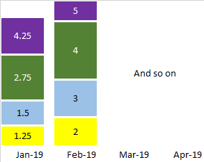
In my view I should have a barchart with a timeline in X and the bars representing all requests created in that month/year, with stacked (or not, so multiple bars) with, as measure, the average of the time in the different statuses.
Something like this (here not in scale...)
Can someone enlighten me ? I tried with several AGGR, DISTINTC, etc. but always failed.
thanks
- Mark as New
- Bookmark
- Subscribe
- Mute
- Subscribe to RSS Feed
- Permalink
- Report Inappropriate Content
Considering that your table is loaded as shown:
Load
"Request N." ,
"Date (d/m/y)" ,
"Created (d)" ,
"Processed (d)" ,
"Waiting Approval 1 (d)",
"Waiting Approval 2 (d)"
from table;
I would do a crosstable for the values (in a resident table or not), and also create the field "month/year", so we would have:
Crosstable(Status,Value,3)
Load
"Request N." ,
"Date (d/m/y)" ,
month("Date (d/m/y)")&'/'&year("Date (d/m/y)") as "month/year" ,
"Created (d)" ,
"Processed (d)" ,
"Waiting Approval 1 (d)",
"Waiting Approval 2 (d)"
from table;
After that you can create your chart with the month/year axis and break it with Status, and use the sum of value as measure
