Unlock a world of possibilities! Login now and discover the exclusive benefits awaiting you.
- Qlik Community
- :
- Forums
- :
- Analytics & AI
- :
- Products & Topics
- :
- App Development
- :
- Creating S Curve in Qlik Sense
- Subscribe to RSS Feed
- Mark Topic as New
- Mark Topic as Read
- Float this Topic for Current User
- Bookmark
- Subscribe
- Mute
- Printer Friendly Page
- Mark as New
- Bookmark
- Subscribe
- Mute
- Subscribe to RSS Feed
- Permalink
- Report Inappropriate Content
Creating S Curve in Qlik Sense
Hi all,
actually I have created a very cool dashboard using Qlik Sense, but still I couldn't create the S Curve which is line chart displaying the planned VS actual progress for a project or multiple projects as per the selection, I am holding all the data in excel sheets, I tried many data structuring and all of them were not useful, I need your help for the data structure what is the dimensions and measures needed to draw the lines for monthly progress.
thank you in advance,
- Mark as New
- Bookmark
- Subscribe
- Mute
- Subscribe to RSS Feed
- Permalink
- Report Inappropriate Content
hi can you share a screenshot of what you hope to achieve ?
- Mark as New
- Bookmark
- Subscribe
- Mute
- Subscribe to RSS Feed
- Permalink
- Report Inappropriate Content
Dear Jonathan
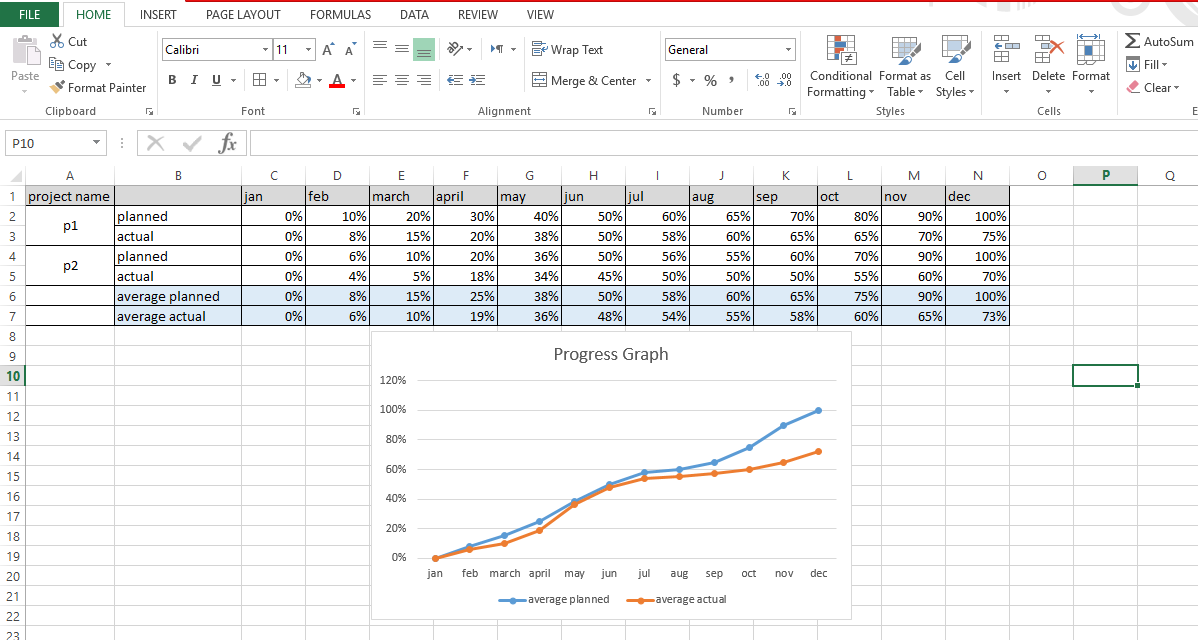
attached is example of progress graph i want to reach in the dashboard with the ability to drill down as per the selected filter

thanks,
- Mark as New
- Bookmark
- Subscribe
- Mute
- Subscribe to RSS Feed
- Permalink
- Report Inappropriate Content
thanks for sharing. I'll start with the data structure in the pivot table above. If your source data is in a similar structure you can use the CROSSTABLE load to dynamically pivot the months into a new field and the cells into a new field. You would need to filter out the 'average planned' and 'average actual' as those are calcs that Qlik can easily calculate. Mike Tarallo's video should help a built Power of Qlik Script - Reshaping Data with Crosstable (video) .
About the UI, you wuld use the new month field (formed by crosstable) as the 1st dimension and you would add the 2nd field (Actual vs Planned) as the 2nd dimension. Your data is pre-aggregated so i was thinking avg([measure]) would be your expression.
One more thing: Now reporting off excel is not the best data source when the data is already in a report format as above. for example cells A2 and A3 are merged and qlik may not pick up the fact that A3=planned for example. Also, there is no column header for column B and you would have to give it a name. All in all, its better to work with a raw tabular data set for qlik .