Unlock a world of possibilities! Login now and discover the exclusive benefits awaiting you.
- Qlik Community
- :
- Forums
- :
- Analytics & AI
- :
- Products & Topics
- :
- App Development
- :
- How best to build a stacked bar chart from this da...
- Subscribe to RSS Feed
- Mark Topic as New
- Mark Topic as Read
- Float this Topic for Current User
- Bookmark
- Subscribe
- Mute
- Printer Friendly Page
- Mark as New
- Bookmark
- Subscribe
- Mute
- Subscribe to RSS Feed
- Permalink
- Report Inappropriate Content
How best to build a stacked bar chart from this data?
I currently have indicators across 3 different fields and want to look at the best way to build a stacked bar chart from this data. More specifically I want to understand if transforming the data I pull back is the only option or is there a way to solve this in Qlik charting.
Here is the data in the database format:
| ID | EMAILABLE_INDIC | CALLABLE_INDIC | BAD_ADDRESS_INDIC |
| 1 | Y | N | Y |
| 2 | N | N | Y |
| 3 | Y | Y | N |
| 4 | N | N | N |
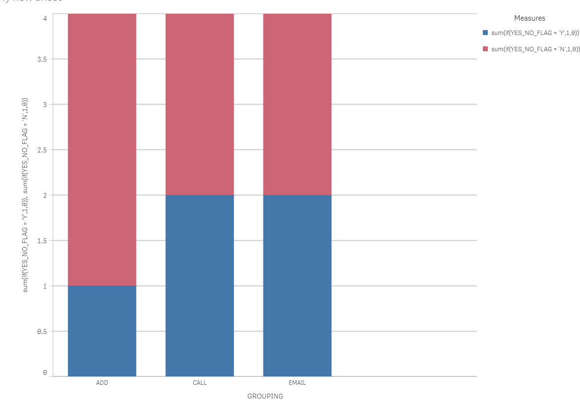
Here is what I transformed it to in the data load script to load into the stacked bar chart:
| ID | YES_NO_FLAG | GROUPING |
| 1 | Y | |
| 2 | N | |
| 3 | Y | |
| 4 | N | |
| 1 | N | ADD |
| 2 | N | ADD |
| 3 | Y | ADD |
| 4 | N | ADD |
| 1 | Y | CALL |
| 2 | Y | CALL |
| 3 | N | CALL |
| 4 | N | CALL |
Here was the final result:

- Mark as New
- Bookmark
- Subscribe
- Mute
- Subscribe to RSS Feed
- Permalink
- Report Inappropriate Content
Hi,
The output image is not visible, can you upload again?
Regards,
Kaushik Solanki
- Mark as New
- Bookmark
- Subscribe
- Mute
- Subscribe to RSS Feed
- Permalink
- Report Inappropriate Content
I've added it as an attachment hopefully that works.
- Mark as New
- Bookmark
- Subscribe
- Mute
- Subscribe to RSS Feed
- Permalink
- Report Inappropriate Content
Hello Alex,
Hope that you are keeping well!
You can create two measures:
1. Yes = Count({<YES_NO_FLAG={'Y'}>}YES_NO_FLAG)
2. No = Count({<YES_NO_FLAG={'N'}>}YES_NO_FLAG)
Post that you can change the presentation settings of the bar chart to make it stacked bar chart.
Refer attached application.
Regards!
Rahul
- Mark as New
- Bookmark
- Subscribe
- Mute
- Subscribe to RSS Feed
- Permalink
- Report Inappropriate Content
Hi Rahul,
I did that in the second example. What I'm really wondering is there another way to take the data from the first table, and without transforming it create the same thing?
| ID | EMAILABLE_INDIC | CALLABLE_INDIC | BAD_ADDRESS_INDIC |
| 1 | Y | N | Y |
| 2 | N | N | Y |
| 3 | Y | Y | N |
| 4 | N | N | N |