Unlock a world of possibilities! Login now and discover the exclusive benefits awaiting you.
- Qlik Community
- :
- Forums
- :
- Analytics & AI
- :
- Products & Topics
- :
- App Development
- :
- Line Chart - Min/Max possible on Y, why not X?
- Subscribe to RSS Feed
- Mark Topic as New
- Mark Topic as Read
- Float this Topic for Current User
- Bookmark
- Subscribe
- Mute
- Printer Friendly Page
- Mark as New
- Bookmark
- Subscribe
- Mute
- Subscribe to RSS Feed
- Permalink
- Report Inappropriate Content
Line Chart - Min/Max possible on Y, why not X?
For measures ( Y -Axis ) on a line chart, you can set precise bounds ( Min/Max ) , however it seems there's no easy way to exert the same control over the X-Axis.
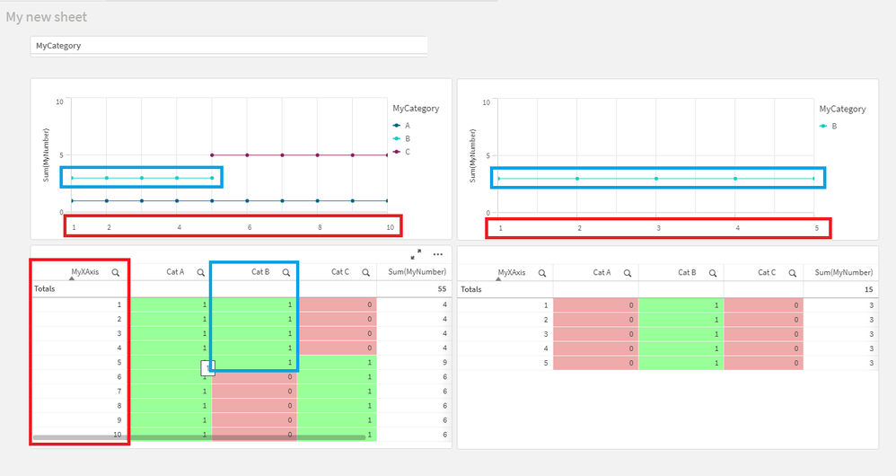
Below, the data has an X-Axis ( Integer 1 - 10 ), and 3 measures of 'Category', A,B and C.
A has entries for X-Axis values of 1-10, B for 1-5, and C for 5-10.
Ideally, the user would filter on a Category, and still get the context, with the X-Axis remaining at 1-10, yet Qlik will filter to show only the non-zero/non-null values .
Is there an easy way to force the X-axis to stay 'fixed' without a bunch of janky work-arounds with set analysis, alternate states or messing with the measures?
Is it simply a case of filling the nulls with zero's instead ( though totally inefficient , if it works, I'll accept it ) , or is there a cleaner / smarter way of ensuring the X-Axis doesn't Yo-Yo around when filtering ( like we already can do on the Y-Axis )
- Tags:
- line chart
- x axis
- Mark as New
- Bookmark
- Subscribe
- Mute
- Subscribe to RSS Feed
- Permalink
- Report Inappropriate Content
Hello @ForgotMyOldUsername ,
So you don't want to use any functionality such as set analysis (which suits perfectly for your needs)?
Out of the box there isn't any functionality with the line chart to meet your requirements. Maybe you can elaborate more on your choice to not fiddle around with the given functionality in Qlik Sense? Are there other blocking issues when you use set analysis or any other functionality of Qlik? Just curious.
Regards Eddie
- Mark as New
- Bookmark
- Subscribe
- Mute
- Subscribe to RSS Feed
- Permalink
- Report Inappropriate Content
Hi Eddie, short answer, yes.
Long answer - the measures are already a rather complex set of nested conditionals, so throwing set analysis into the mix isn't trivial.
I think perhaps then , in the data model itself, we need to fill in the 'null' data points with 0, so even when filtered, there are data points to be plotted on the chart ( as zero ) and not eliminated as null.
It'd be wonderful to have a checkbox on the chart to just chose whether the axis flexes or not haha.
- Mark as New
- Bookmark
- Subscribe
- Mute
- Subscribe to RSS Feed
- Permalink
- Report Inappropriate Content
Ok, clear. Other question, you can solve it in the dimension with set analysis. Is this an option? Otherwise if you fill the zeroes, then you should do some calculations in the coloring.
- Mark as New
- Bookmark
- Subscribe
- Mute
- Subscribe to RSS Feed
- Permalink
- Report Inappropriate Content
That's news to me, you can do set analysis with dimension axis?
That'd be great, the dimension axis is a simple field right now, if it was possible to get the 'default' / 'all' state for the dimension with set analysis, that'd be a win!
Everything I can find relies on adding set analysis to the measures, which'd be quite an undertaking.
- Mark as New
- Bookmark
- Subscribe
- Mute
- Subscribe to RSS Feed
- Permalink
- Report Inappropriate Content
Hello @ForgotMyOldUsername ,
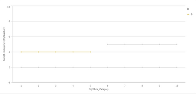
Sorry for the late reply. I was reading my earlier post today and I realized this is Qlik Sense and not Qlikview. In Qlikview you can control the range of the X-axis. So I tried to come up with another solution, but I still don't know if this suits your needs. I think if you neatly arrange all conditions and measures then you should not be confronted with such a problem in Sense. I have a solution that incorporates a dummy variable which you can add to your expression, it is just an extension of your expression no matter how long and what the conditions of these expressions are.
MyVariable = * sum({1}1)
Sum({$}MyNumber) $(MyVariable)
See attached qvf
Regards
Eddie

