Unlock a world of possibilities! Login now and discover the exclusive benefits awaiting you.
- Qlik Community
- :
- Forums
- :
- Analytics & AI
- :
- Products & Topics
- :
- App Development
- :
- Re: Qliksense - Chart columns colour based on posi...
- Subscribe to RSS Feed
- Mark Topic as New
- Mark Topic as Read
- Float this Topic for Current User
- Bookmark
- Subscribe
- Mute
- Printer Friendly Page
- Mark as New
- Bookmark
- Subscribe
- Mute
- Subscribe to RSS Feed
- Permalink
- Report Inappropriate Content
Qliksense - Chart columns colour based on positive or negative values
Hello all,
This seems simple to me but I still cannot find a solution. In a simple bar chart, I have Profit and Loss figures. I would like to show each column as a different colour depending on whether the value is positive or negative.
Green for Positive, and Red for Negative.
I have attempted to use the Expression formulas for the actual data point with simple If...Then statements e.g. sum(item>0,Green(),Red())and the same in the Appearence>>Colors and legend options. Nothing works for me.
Is this a solved issue? I couldn't find a solution after hours of searching.
Thanks.
- Mark as New
- Bookmark
- Subscribe
- Mute
- Subscribe to RSS Feed
- Permalink
- Report Inappropriate Content
This is what you can do
if(yourvalue>0,green(),red())
In this option
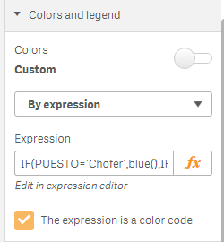
I hope this helps
- Mark as New
- Bookmark
- Subscribe
- Mute
- Subscribe to RSS Feed
- Permalink
- Report Inappropriate Content
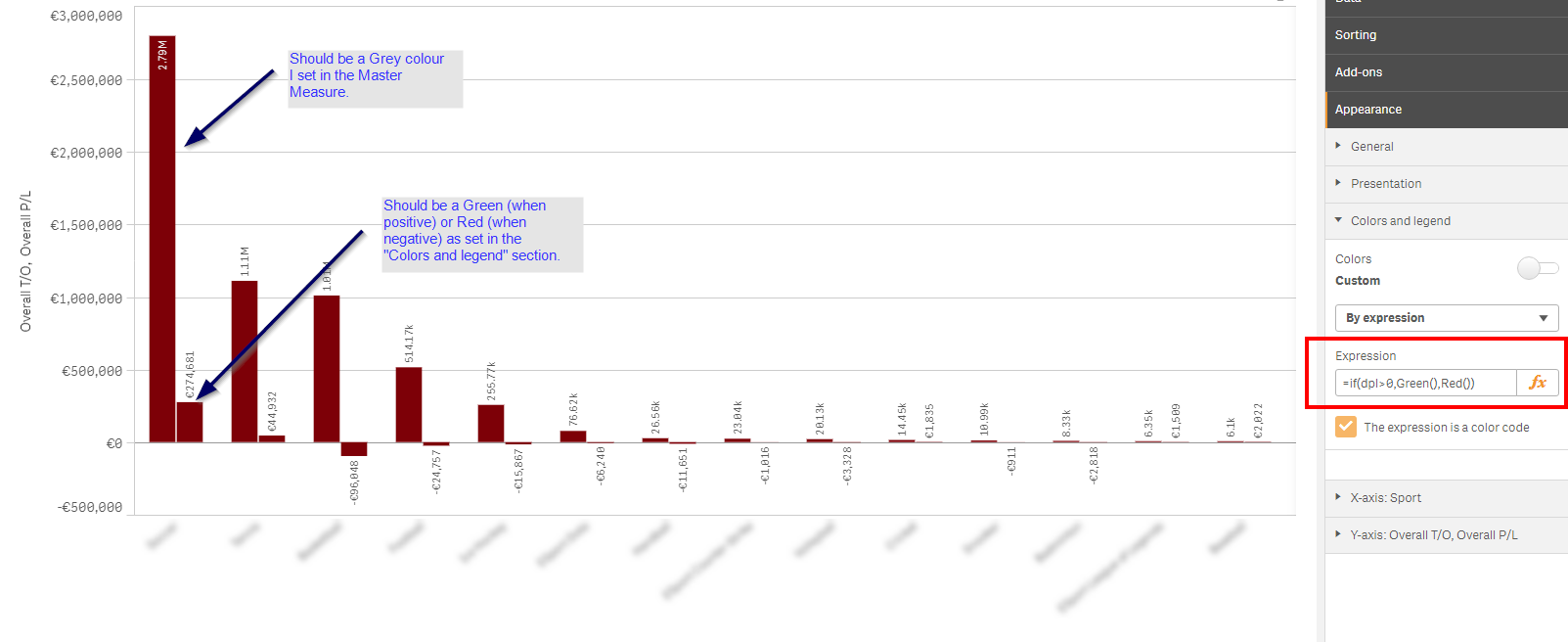
As you can see in the image, the issue is that there are two elements in the bar chart. Using that expression affects ALL the elements, where as I only want one affected. Is there a solution for this?
- Mark as New
- Bookmark
- Subscribe
- Mute
- Subscribe to RSS Feed
- Permalink
- Report Inappropriate Content
if(YOUREXPRESSION>0,green(),red())