Unlock a world of possibilities! Login now and discover the exclusive benefits awaiting you.
- Qlik Community
- :
- Forums
- :
- Analytics & AI
- :
- Products & Topics
- :
- App Development
- :
- Re: scatter plot chart running total
- Subscribe to RSS Feed
- Mark Topic as New
- Mark Topic as Read
- Float this Topic for Current User
- Bookmark
- Subscribe
- Mute
- Printer Friendly Page
- Mark as New
- Bookmark
- Subscribe
- Mute
- Subscribe to RSS Feed
- Permalink
- Report Inappropriate Content
scatter plot chart running total
On a sheet in my app, I made a pivot table that looks like this
| Customers | €/m | meters |
| Customer 1 | 2,36 | 10 |
| Customer 2 | 4,80 | 360 |
| Customer 3 | 9,83 | 377,5 |
| Customer 4 | 10,83 | 447,5 |
| Customer 5 | 11,51 | 1007,5 |
| Customer 6 | 11,70 | 1217,5 |
| Customer 7 | 11,73 | 1357,5 |
| Customer 8 | 12,09 | 1917,5 |
| Customer 9 | 12,10 | 2477,5 |
| Customer 10 | 12,11 | 3597,5 |
| Customer 11 | 12,12 | 3807,5 |
| Customer 12 | 12,32 | 4087,5 |
I sorted first column ascending by €/m, and used this formula =Rangesum(Above(TOTAL Sum([Corporate quantity 2]),0,rowno(TOTAL))) to get running total in third column.
I'd like to replace the pivot table with a chart.
Customers would be a dimension, X-axis would be €/m, Y-axis would be running total. I am trying to use the same formula for runnig total, but how do I sort customers ascending inside the chart?
- Mark as New
- Bookmark
- Subscribe
- Mute
- Subscribe to RSS Feed
- Permalink
- Report Inappropriate Content
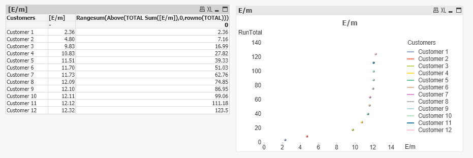
I am able to create this in QlikView. Please let me know issue you are facing.
- Mark as New
- Bookmark
- Subscribe
- Mute
- Subscribe to RSS Feed
- Permalink
- Report Inappropriate Content
Cool!
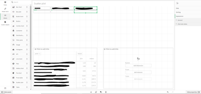
my sheet looks like this. I have several filters. The customers in the table depend on the filters of course.
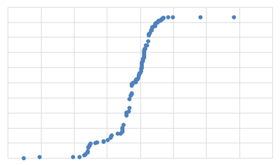
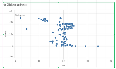
and my scatter chart looks likes this, because the customers inside the chart are not sorted ascending by €/m.
Is your chart somehow linked to your pivot table?
- Mark as New
- Bookmark
- Subscribe
- Mute
- Subscribe to RSS Feed
- Permalink
- Report Inappropriate Content
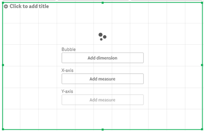
Solved! I simply drag and dropped scatter plot over pivot table and converted pivot table to scartter chart
