Unlock a world of possibilities! Login now and discover the exclusive benefits awaiting you.
- Qlik Community
- :
- Forums
- :
- Groups
- :
- Location and Language
- :
- Brasil
- :
- Creating a Good Looking Gauge Chart in Qlikview
- Subscribe to RSS Feed
- Mark Topic as New
- Mark Topic as Read
- Float this Topic for Current User
- Bookmark
- Subscribe
- Mute
- Printer Friendly Page
- Feature this Topic
- Mark as New
- Bookmark
- Subscribe
- Mute
- Subscribe to RSS Feed
- Permalink
- Report Inappropriate Content
Creating a Good Looking Gauge Chart in Qlikview
Hello Guys!
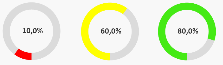
I am always seeking for good ideas trough the community and I never get disappointed. That is why I decided to share this format of gauge chart with you. So far, there is a quite big gap between formatting objects in qlikview and qliksense. I see that this is about to be changed. Meanwhile, I was trying to improve the design of my gauge charts and, based on other ideas, I came up with the following one:
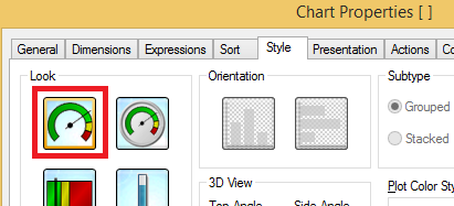
To achive that you will have to create a gauge chart (not a pie one), select the first 'look' in the Style property tab.
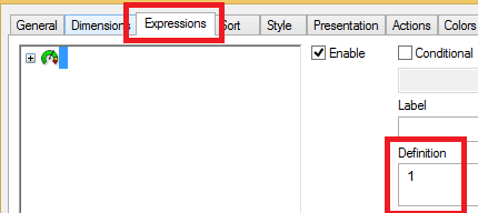
Go to your 'Expressions' tab and set '1' as Definition
In the Presentation tab we will do the big changes.
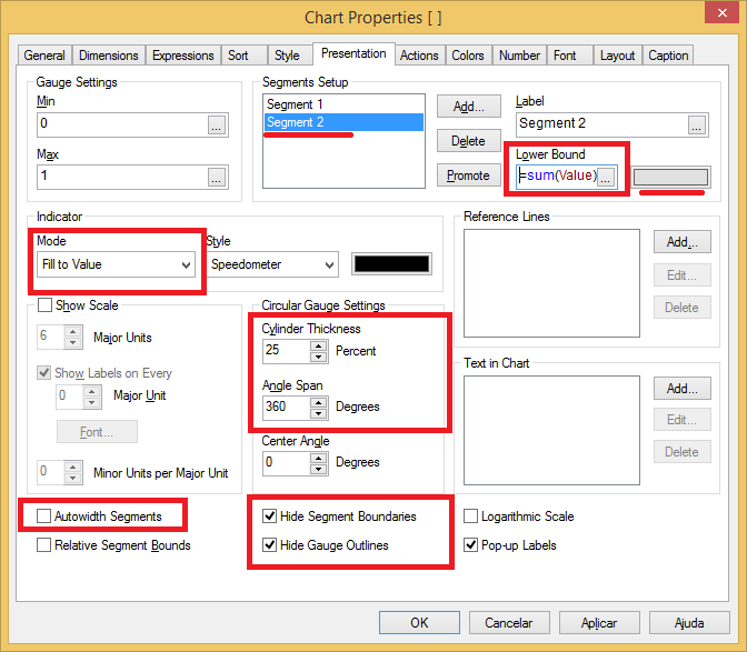
Note we will have two segments. The Lower Bound of our second Segment is where we should insert our expression. The color should be a light gray.
For the first segment we could add a conditional color to make it more intresting.

Next step is adding a 'Text in Chart' with our expression. Note that I am using a 'num' function to format it as percentage. I changed the size and color of my font to make it bigger and less dark and centralized it as well.
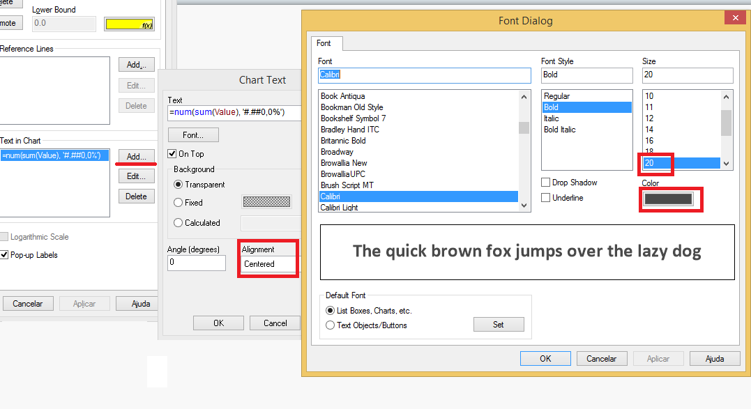
Now just center your text in the middle of your chart holding Ctrl + Shift and moving the text red line box.
That is it! I hope I could have helped someone!
See you around QlikCommunity!
- Mark as New
- Bookmark
- Subscribe
- Mute
- Subscribe to RSS Feed
- Permalink
- Report Inappropriate Content
Thanks for sharing....
Few more examples on Gauge Chart
Dislike gauge charts? You may want to give them a second chance
- Mark as New
- Bookmark
- Subscribe
- Mute
- Subscribe to RSS Feed
- Permalink
- Report Inappropriate Content
Very nice!
Thanks for sharing.
- Mark as New
- Bookmark
- Subscribe
- Mute
- Subscribe to RSS Feed
- Permalink
- Report Inappropriate Content
Manish, I updated the post based in your examples!
Thanks a lot!
- Mark as New
- Bookmark
- Subscribe
- Mute
- Subscribe to RSS Feed
- Permalink
- Report Inappropriate Content
Very well.
Thanks a lot.
- Mark as New
- Bookmark
- Subscribe
- Mute
- Subscribe to RSS Feed
- Permalink
- Report Inappropriate Content
cool idea
congratulations!
Thanks a lot.
- Mark as New
- Bookmark
- Subscribe
- Mute
- Subscribe to RSS Feed
- Permalink
- Report Inappropriate Content
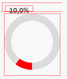
Hi All,
First of all thanks for sharing it.
I have tried as shown above by caio_caminoskion Jun 9, 2015 1:41 PM.
But i'm getting chart as shown below only. I'm not getting full circle in ash color in back ground to sky blue color which represents 100%. please help me in this.
Note: Here in place of value I'm using sum(1value) / sum(2value) because i will get actual value if i divide the two values..
- Mark as New
- Bookmark
- Subscribe
- Mute
- Subscribe to RSS Feed
- Permalink
- Report Inappropriate Content
Hi Uday, how are you doing?
Have you checked if the colour for the second segment is gray? it is suppose to have segment 1 with the colour you intend to use for filling up the chart and the segment 2 is suppose to be the 'background'.
If you do have it, could you share a sample qvw?
Regards,
Caio
- Mark as New
- Bookmark
- Subscribe
- Mute
- Subscribe to RSS Feed
- Permalink
- Report Inappropriate Content
Thanks a lot for this great work,
thanks for sharing
- Mark as New
- Bookmark
- Subscribe
- Mute
- Subscribe to RSS Feed
- Permalink
- Report Inappropriate Content
Thanks for sharing. I suggest also un-checking popup labels on the presentation tab. If this is checked then when the user hovers over the guage '1' is displayed as a popup message.