Unlock a world of possibilities! Login now and discover the exclusive benefits awaiting you.
- Qlik Community
- :
- Discover
- :
- Blogs
- :
- Non-Technical
- :
- Community Manager Blog
- :
- Community Redesign - Phase 2
- Subscribe to RSS Feed
- Mark as New
- Mark as Read
- Bookmark
- Subscribe
- Printer Friendly Page
- Report Inappropriate Content

First, let me provide some backdrop:
A month ago we kicked off our Community redesign efforts when we launched new banners sitewide and new promo cards addressing some of the inside components of our community. The design concept was born with the launch of Qlik Gallery and was later streamlined into many Qlik Community 2020 social campaigns:
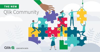
This is one example of a new banner image:
You can read about the all changes that deployed last month here.
Today, you will notice even more changes:
#1. A newly redesigned home page
Meant to deliver a brand new look and feel, more modern in design yet playful and fun! When we launched to our new platform over 2 years ago we were 58K members strong. Today, we have 115K+ members and growing every single day. It was time for a change! Recreating the home page banner was no easy feat as we wanted it to convey the beautiful and magnificent spirit of all of you! We'd like to thank Qlik's Creative and Brand services team for their creativity and dedication to this massive undertaking! ( it was 10+ revisions - no joke ).

It's pretty amazing when you look at the change side-by-side:
On the new home page you will notice new imagery throughout and also a refreshed use of icons:
From Left to Right
(a) Discussion (b) Document (c) Support-Authored Knowledge Article (d) Idea
#2. Brand New Top Level Navigation
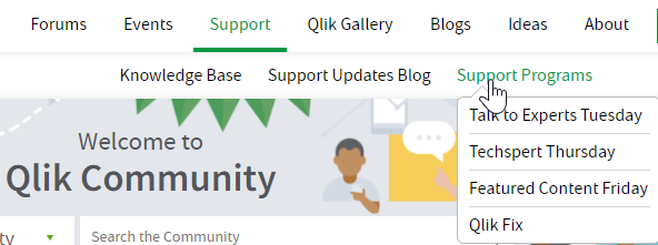
We have completed our shift to a Top Level Navigation. YAHOO! There are multiple tiers to the navigation structure ranging from 1 to 4 tiers. The hamburger menu will remain for our mobile device and tablet users.
example of 2 Tiers:
example of 3 Tiers:
example of hamburger menu, with newly created icons, for our phone and tablet users.
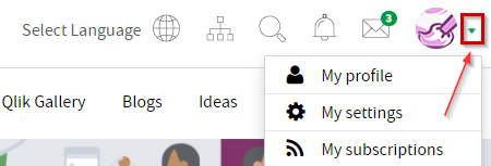
We have also updated the Top Level Utility Bar by improving placement of the icons, and while we were at it we aligned those icons to match what you see on Qlik.com.
To get to your community settings select the little green arrow that sits next to your avatar.

One of our favorite new additions is the "Ask a Question" button. Meant for members that need to get a question answered and fast - we made it easier for you to do just that. This will be especially useful for newbies to our community who haven't figured out how to navigate to specific forums. YES!
3. Improvements to Search
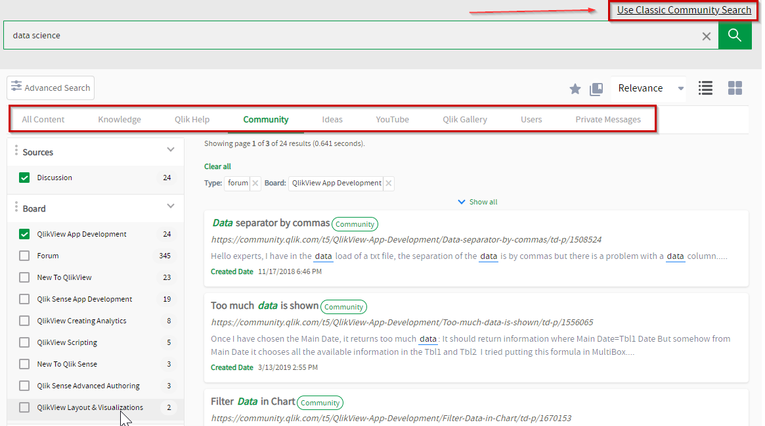
Incredibly excited to share with you that we now have Unified Search available to our members. Double YES!
Already in place today on our Qlik Support Portal, you will now have a consistent search experience across these two platforms. In case you prefer the old and familiar you can revert back to Classic Community Search at any time.
(and yes, we are discussing bringing Unified Search to other Qlik platforms as well - but I can't make any promises).
On behalf of the Qlik Community Team we want to thank you for taking this journey with us and embracing change. To report any functional issues with the new design please go here --> https://community.qlik.com/t5/Getting-Started-and-How-To-s/January-2021-Redesign-Issue-Tracking-Post...
We hope that you enjoy your new space. See you online!
Melissa and Sue
PS. What's coming next on Qlik Community:
- UI improvements for Blogs
- New forum for Application Automation
- Forum Consolidation - with focus on Qlik Sense and QlikView forums
- New Program for Community MVPs
- Top Secret new program. Stay tuned for the one thing I can share - the name - 'Qlik Greenway' !
- « Previous
-
- 1
- 2
- Next »
You must be a registered user to add a comment. If you've already registered, sign in. Otherwise, register and sign in.


