Unlock a world of possibilities! Login now and discover the exclusive benefits awaiting you.
- Qlik Community
- :
- Forums
- :
- Analytics & AI
- :
- Products & Topics
- :
- Connectivity & Data Prep
- :
- Re: How to conduct muti-level table header through...
- Subscribe to RSS Feed
- Mark Topic as New
- Mark Topic as Read
- Float this Topic for Current User
- Bookmark
- Subscribe
- Mute
- Printer Friendly Page
- Mark as New
- Bookmark
- Subscribe
- Mute
- Subscribe to RSS Feed
- Permalink
- Report Inappropriate Content
How to conduct muti-level table header through 'mapping' table
I am trying to built a pivot table which have multi-level table headers like shown below. I tried to use the mapping function in the data load scripting area to build each level, yet it ended up with the third level (order book sum, overdue order, undue order) are spreaded not only by 'order book', but also by 'backlog-sum' and 'shipment without invoicing'.
The mapping tables I wrote can be seen below. How can I build the table header as the one shown below? Can I build mapping table inside of another mapping table? Or is there any other way to realize this table header?
Thanks a lot!!! 🙂
Mapping1:
Load * Inline [
backlog
backlog-sum
order book
Shipment without invoicing
];
Mapping2:
Load * Inline [
order book
order book sum
overdue order
Undue order
];
- Tags:
- mapping
- table header
Accepted Solutions
- Mark as New
- Bookmark
- Subscribe
- Mute
- Subscribe to RSS Feed
- Permalink
- Report Inappropriate Content
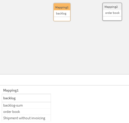
The way you have constructed your table doesn't fit with what you are trying to show. This is what is shown in the data manager:
You need to think about and model the columns so that there is a hierarchy as desired. Notice how in this code I've designed Category, Sub Category and Minor Category to be the levels reflected in your desired image:
Data:
Load * Inline [
Month, Category, Sub Category, Minor Category, Value
April, Sales Org, ,, 100
April, Backlog, Backlog-sum, , 75
April, Backlog, Order book, order book sum, 30
April, Backlog, Order book, overdue order, 65
April, Backlog, Order book, undue order, 92
April, Backlog, Shipment without invoicing,, 33
April, Budget Sales, ,, 81
April, difference between budget, ,, 19
];
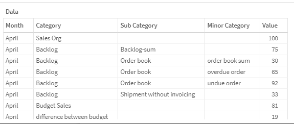
That yields a table that looks like this:
I then used the Month as the ROW for the pivot table
And the Category, Sub Category and Minor Category as the COLUMNS for the pivot table and Sum(Value) for the Measure
Which is close to what you drew. If I remove the automatic sort for the Category so that it isn't in alphabetical order and isn't in numerical order, it will load it based on the way the values were loaded into the table.
- Mark as New
- Bookmark
- Subscribe
- Mute
- Subscribe to RSS Feed
- Permalink
- Report Inappropriate Content
Thank you so much Dalton!! It works perfect. 😄


