Unlock a world of possibilities! Login now and discover the exclusive benefits awaiting you.
- Qlik Community
- :
- All Forums
- :
- Deployment & Management
- :
- different selections in one list, side by side on ...
- Subscribe to RSS Feed
- Mark Topic as New
- Mark Topic as Read
- Float this Topic for Current User
- Bookmark
- Subscribe
- Mute
- Printer Friendly Page
- Mark as New
- Bookmark
- Subscribe
- Mute
- Subscribe to RSS Feed
- Permalink
- Report Inappropriate Content
different selections in one list, side by side on one worksheet
Hello Together,
I need your help again.
For my actually Projekt I sould put one Diagram three times on a worksheet, and for each I will a List for selection. They Tablediagrams get the same Data and the Lists as well, so that we can compare 3 different pack of Data.
For Example It sould look like this:
Selectionsliste:
| Teile |
|
VarianteA |
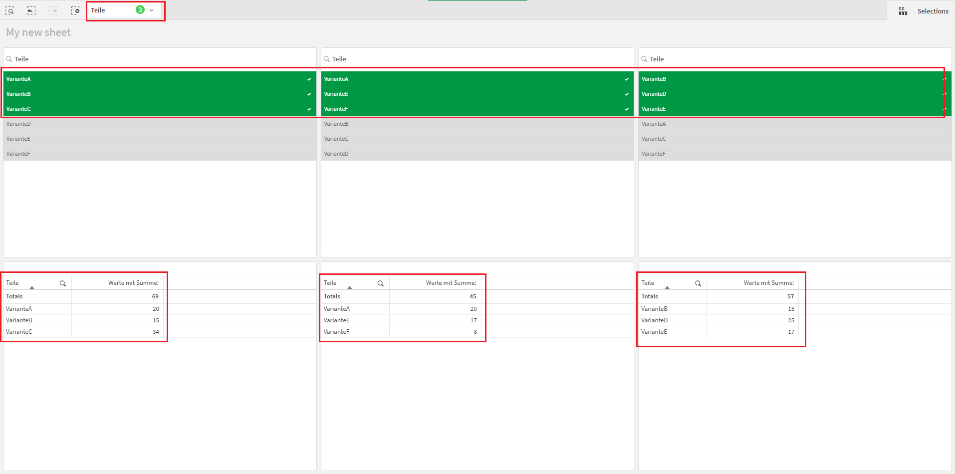
| Teile | Werte mit Summe: 69 |
| VarianteA | 20 |
| VarianteB | 15 |
| VarianteC | 34 |
____________________________________________________________________________________________________
Selectionsliste:
| Teile |
|
VarianteA |
| Teile | Werte mit Summe: 45 |
| VarianteA | 20 |
| VarianteE | 17 |
| VarianteF | 8 |
____________________________________________________________________________________________________
Selectionsliste:
| Teile |
|
VarianteA |
| Teile | Werte mit Summe: 57 |
| VarianteD | 25 |
| VarianteB | 15 |
| VarianteE | 17 |
They three pairs (Table with list) would like to be side by side, that we can compare the Parts.
I thought it will be done with Set Analyse, but I can not found how, did anyone know a idea how i get it?
Regards
Merry
Accepted Solutions
- Mark as New
- Bookmark
- Subscribe
- Mute
- Subscribe to RSS Feed
- Permalink
- Report Inappropriate Content
Hello,
If my understanding is correct, you have one dataset and you would like to filter different values on 3 different tables on the same sheet to compare selections. These are the steps that I have followed to achieve a similar outcome:
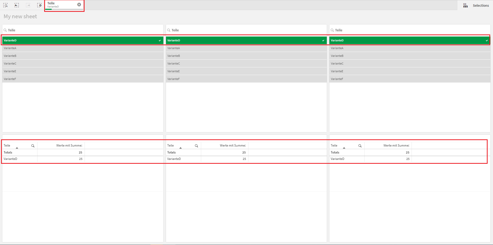
1. Created 3 Filter panes and 3 Table charts with the data:

2. If you apply one selection to the first Filter pane, the selection will be applied to all the other visualizations as well:
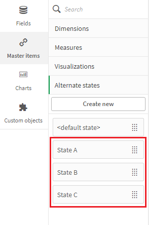
3. What you need here, is NOT Set Analysis but States. Create 3 states:
4. Go to each visualization and assign the corresponding state:
First Filter pane and Table chart:
- Filter pane => Appearance > Alternative states > State and set it to "State A"
- Table chart => Appearance > Alternative states > State and set it to "State A"
Second Filter pane and Table chart:
- Filter pane => Appearance > Alternative states > State and set it to "State B"
- Table chart => Appearance > Alternative states > State and set it to "State B"
Third Filter pane and Table chart:
- Filter pane => Appearance > Alternative states > State and set it to "State C"
- Table chart => Appearance > Alternative states > State and set it to "State C"
5. Now you can apply different selections to the Filter panes and the Table charts will display different data:
I hope that this information was helpful. In case I have misunderstood the use case scenario, please elaborate in details by providing additional information. However, if it has helped you resolve the issue, please mark it as accepted solution to give further visibility to other community members.
- Mark as New
- Bookmark
- Subscribe
- Mute
- Subscribe to RSS Feed
- Permalink
- Report Inappropriate Content
Hello,
If my understanding is correct, you have one dataset and you would like to filter different values on 3 different tables on the same sheet to compare selections. These are the steps that I have followed to achieve a similar outcome:
1. Created 3 Filter panes and 3 Table charts with the data:
2. If you apply one selection to the first Filter pane, the selection will be applied to all the other visualizations as well:
3. What you need here, is NOT Set Analysis but States. Create 3 states:
4. Go to each visualization and assign the corresponding state:
First Filter pane and Table chart:
- Filter pane => Appearance > Alternative states > State and set it to "State A"
- Table chart => Appearance > Alternative states > State and set it to "State A"
Second Filter pane and Table chart:
- Filter pane => Appearance > Alternative states > State and set it to "State B"
- Table chart => Appearance > Alternative states > State and set it to "State B"
Third Filter pane and Table chart:
- Filter pane => Appearance > Alternative states > State and set it to "State C"
- Table chart => Appearance > Alternative states > State and set it to "State C"
5. Now you can apply different selections to the Filter panes and the Table charts will display different data:
I hope that this information was helpful. In case I have misunderstood the use case scenario, please elaborate in details by providing additional information. However, if it has helped you resolve the issue, please mark it as accepted solution to give further visibility to other community members.
- Mark as New
- Bookmark
- Subscribe
- Mute
- Subscribe to RSS Feed
- Permalink
- Report Inappropriate Content
Thank you, that is exactly what I need.