Unlock a world of possibilities! Login now and discover the exclusive benefits awaiting you.
- Qlik Community
- :
- Blogs
- :
- Technical
- :
- Design
- :
- A Tip for the Type
- Subscribe to RSS Feed
- Mark as New
- Mark as Read
- Bookmark
- Subscribe
- Printer Friendly Page
- Report Inappropriate Content
If you think that your typeface or font that you use does nothing more than just conveying the content of the words themselves or just add an artistic streak to your page then, you’re wrong! Rather I must put it this way, YOU’RE WRONG!
Notice my tone of voice change when I used the uppercase letters instead of lowercase in stating ‘You’re Wrong’. The UPPERCASE Bold letters not only communicate the message boldly but do it in a strong assertive, almost authoritative manner. Typography forms a quintessential part of Graphic Design and Visual Communication. In fact, typography makes 95% of Graphic design.
The visual aspect of type has as much effect on how the content is communicated and perceived as does the verbal aspect. Visual appearance of text can communicate more than the text itself like expressing the mood, personality, gender, age or situation that is in context. It can also give visual cues about the hierarchy of the content, how to read it and which part is more important than the other. It can be perceived the same way as wearing the right clothes for the right occasion like wearing formal clothes for a job interview and wearing a casual pair of shorts for a barbecue house party.
For instance, the 2 images below use a different typeface for the tag line.
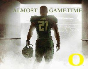
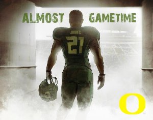
Although the one on the left side is a clean, legible and a good looking typeface, it doesn't suite the context at all. Whereas the one on the right not only suits the context but also builds the atmosphere and gives certain punch and flavor to the poster. If we put the context aside and look at both typefaces side by side there is no grounds for comparison since both have distinct personalities but if compared on a contextual level, the type used on the right immediately stands out as better suited to the image than the one on the left.
Typefaces have their own distinct personalities and it is the role of a designer to decide which typeface will suite which condition. However, certain general rules can be established depending on the typeface.
Recommendations for using typefaces
- Sans Serif fonts (Arial, Helvetica) are better to use for body text while Serif fonts (Garamond, Times New Roman) are better to use for headings and titles.
- Avoid combination of similar typefaces together like Franklin Gothic and Helvetica since types from the same family (in this case Geometric Sans) break the visual harmony as they don’t look alike but are not totally different. For typeface combinations contrasting fonts work best like Helvetica and Garamond.
- Avoid using more than 2-3 types per design.
- Create a gradation in weight to show hierarchy in text and for better visual flow.
- Use Script fonts and accent fonts sparingly only to highlight elements in a design.
- When unsure stick to traditional and popular fonts like Arial.
- Consider the tone of voice and context when choosing an appropriate font.
Google fonts are a great way to integrate some of the web fonts in QlikView. See blog post by Arturo Munoz about 8 ways to customize your QlikView applications with Google Fonts in which he talks about the step by step process of incorporating Google fonts in QlikView.
In summary, each typeface has a different personality which needs to be identified and applied to the context accordingly. And remember, apart from saying all about the design the typeface also adds the much needed aesthetic streak to the design so don’t hesitate to experiment.
postscript -
Typeface & Font – What’s the difference?
People often get confused between typeface and font and sometimes use it interchangeably. Typeface is the style of design of the letters, symbols or numbers whereas fonts are a set of printable text characters in a specific style. For example, Arial, Times New Roman, Garamond are typefaces but Arial Bold 12 points or Times New Roman Regular 9 points are fonts.
Resources
http://www.fastcodesign.com/1664719/infographic-of-the-day-why-should-you-care-about-typography
You must be a registered user to add a comment. If you've already registered, sign in. Otherwise, register and sign in.