Unlock a world of possibilities! Login now and discover the exclusive benefits awaiting you.
- Qlik Community
- :
- Blogs
- :
- Technical
- :
- Design
- :
- A design lesson from Van Halen
- Subscribe to RSS Feed
- Mark as New
- Mark as Read
- Bookmark
- Subscribe
- Printer Friendly Page
- Report Inappropriate Content
When something is well designed it shows that time and consideration have been made to create something that is well thought-out and not just hastily thrown together last minute. It shows planning. It’s like wearing a well designed suit: it shows you put effort into presenting the best possible version of yourself.
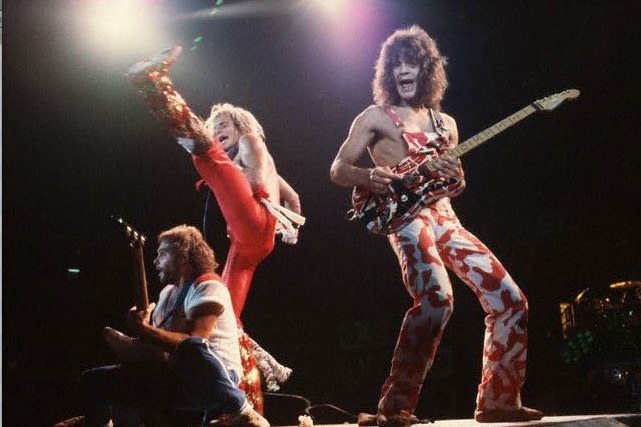
In the 1970s & ‘80s Van Halen was one of the biggest rock bands in the world. They had a huge stage show: 9 eighteen-wheeler trucks full of equipment traveled with them from city to city and at every show this equipment had to be assembled and disassembled. Van Halen also had a rider – a rider is a list of the requirements & demands a performer or band need fulfilled in order to perform. It is the concert promoter’s job to meet all of these requests.
Usually you hear about a band’s rider when they make crazy requests such as how much alcohol they want, how many towels they need, exotic foods, etc. Van Halen’s rider was a massive document with mostly technical requirements on how to assemble their equipment but in the middle of the document, out of nowhere, there was a line-item that said there should be a bowl of M&Ms but “…there will be no brown M&M's in the backstage area, upon pain of forfeiture of the show, with full compensation.” The no brown M&Ms became the stuff of rock lore but there was a really practical reason why it was included. The M&Ms were the canary in the coal mine, they were a visual indicator whether or not the rider had been read in detail and followed. The band knew that if the concert promoter didn’t catch that detail then guaranteed if they did a line inspection of the equipment there would be other problems.
To Van Halen the brown M&Ms were a reflection of the concert promoter’s attention to detail. They knew if this simple front-end item was broken then guaranteed there were more problems on the back-end, that the concert promoter didn’t take the time to pay attention to all of the necessary details.
Like seeing brown M&Ms, a poorly designed application can be treated with suspicion as to the overall quality. We generally consider well designed items to be of better quality. Good design is an indicator that something is smart and well created - that the designer knows what they are doing. Take the time to consider the design of your applications because your users certainly will.
You must be a registered user to add a comment. If you've already registered, sign in. Otherwise, register and sign in.