Unlock a world of possibilities! Login now and discover the exclusive benefits awaiting you.
- Subscribe to RSS Feed
- Mark as New
- Mark as Read
- Bookmark
- Subscribe
- Printer Friendly Page
- Report Inappropriate Content
It’s been a while since the last time we covered an extension in this blog, this time I would like to introduce ColorStyler by Johannes Sunden jsn .
The reason I found ColorStyler very special, besides its obvious value, is due the way this extension was built. It’s half an extension half a mashup or should I rephrase it as a “mashup that extends your Qlik Sense app”.
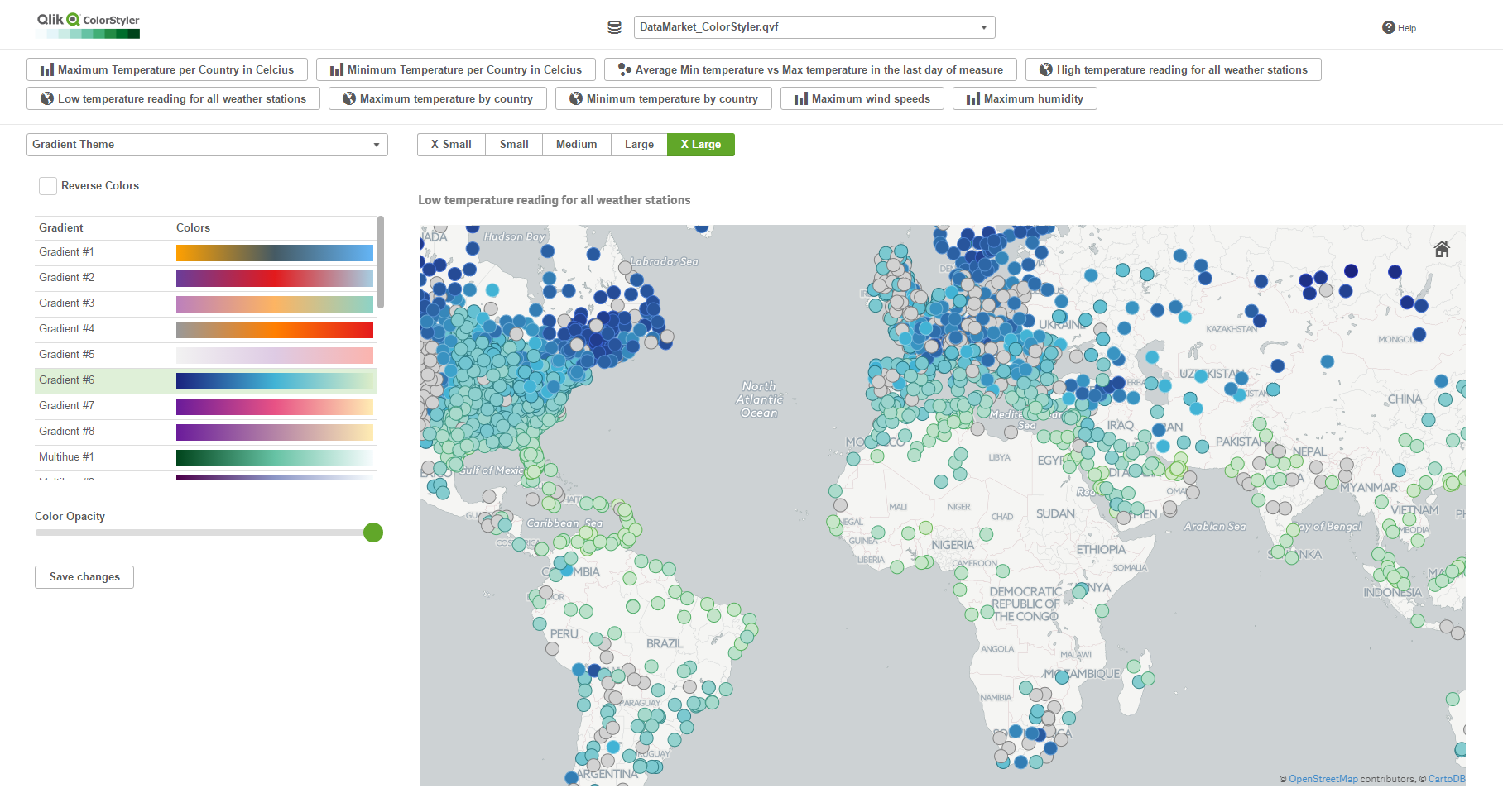
ColorStyler as you might have figured out by now is a coloring extension, it will let you preview and apply different color schemes to your charts, no coding is required, it will take care of the not-so-easy task of creating a ColorMix expression for you.
Once installed in your computer, ColorStyler sets up a mashup that will let you interact with the available apps and apply some color options to your charts.
To start working with ColorStyler you must pick an app from a list of your available Qlik Sense apps, then you will be presented with a list of available visualizations (as of today it only loads Master Items), and finally ColorStyler will offer you four main color categories to pick from.
I find very useful the gradient options, and especially gradient themes, it’s a good selection of nice and safe colors palettes. If you are not happy with the proposed themes you can always create your own by defining the gradient colors.
It’s quite interesting to see the chart update on real-time and compare how different color alternatives affect to our ability to read the visualization. Once you’re happy with your color selection you just need to “Save Changes” to make it persistent not only in the mashup but in the actual Qlik Sense app.
As I mentioned before,ColorStyler will only let you interact with Master Visualizations from your Qlik Master Items library so you must have at least one master object in your app to be able to use this tool. After applying color to your master item, you can edit it as normal in your Qlik Sense client and copy the generated expression (ColorMix1 or ColorMix2) and then apply it to any other visualization.
Note: I would recommend to be extra careful when applying colors to charts by dimension, it’s very important to use color with care, just remember color in data visualization should be used to convey information, and not as decoration. Also, is very important to make sure that a dimension chosen color will be applied consistently across your app, avoiding situations where the same dimension value has two different colors in two charts.
For latest version and technical questions please check Qlik Branch project page: Qlik Branch
If you prefer to watch a video instead:
- « Previous
-
- 1
- 2
- Next »
You must be a registered user to add a comment. If you've already registered, sign in. Otherwise, register and sign in.