Unlock a world of possibilities! Login now and discover the exclusive benefits awaiting you.
- Qlik Community
- :
- Blogs
- :
- Technical
- :
- Design
- :
- Dimension Colors
- Subscribe to RSS Feed
- Mark as New
- Mark as Read
- Bookmark
- Subscribe
- Printer Friendly Page
- Report Inappropriate Content
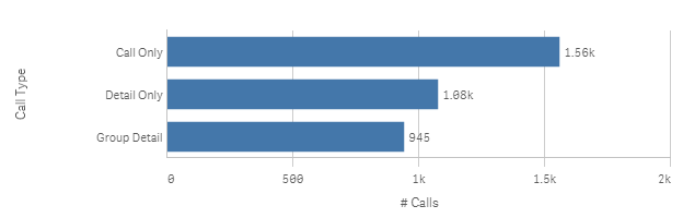
A few months ago, I wrote a blog about setting colors in master dimensions and measures. Today I am going to share a little more about how master dimensions can be set to a single color or multiple colors. Let’s first talk about setting a dimension to a single color. This can be helpful when you want to use a color other than the Qlik Sense default color in your charts. For instance, a bar chart may look like this with the default blue color.
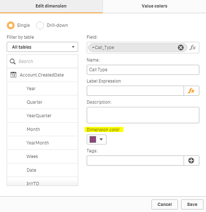
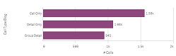
But if your app is using a different color theme, you may want all the bars to be purple for instance. You can do this by setting the Dimension color on the Edit dimension tab of the master dimension to the color you would like the dimension to be. This color will be the same for all dimension values which is good practice when there are many dimension values.
Now let's discuss setting a master dimension to multiple colors. Sometimes you may need the color for each dimension value to be different. This is when you can use the Value colors tab of the master dimension to set the colors of each dimension value. The stacked bar chart below is a good example of when you may want the dimension values to have different colors. This chart is looking at the calls by activity type and call type. The call type dimension values are set to 3 different shades of blue so that they can be distinguished in the stacked bar chart. If the color values were not set, then the standard blue, red and yellow colors would be used instead.
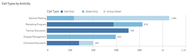
The color values can be set on the Value colors tab of the master dimension (see image below). A color scheme can be used to set the colors or each value can be set manually. The call type field only has 3 values so it is a good candidate for value colors. You want to avoid using values colors or coloring by dimension if there are several different dimension values. Too many different colors (or not so different colors) can become confusing and indistinguishable to the user.
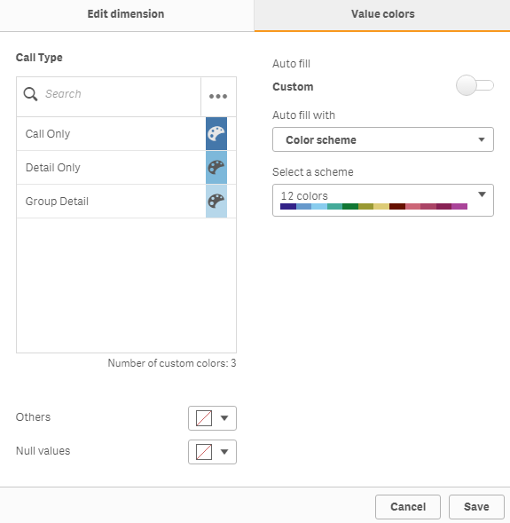
On the Value colors tab, there is also the option to select a color for Others, if you are adding any limitations to the dimension, or for Null values. When using the value colors to color your dimensions, be sure to select color by dimension and enable library color in the properties of the chart. Check out this video in Qlik Sense Help for more information.
These color features available in dimension master items provide one place to set and edit the dimension colors used in charts. You can set it once and use it in multiple charts. This promotes consistency in our apps thus making them easier to digest and understand.
Thanks,
Jennell
You must be a registered user to add a comment. If you've already registered, sign in. Otherwise, register and sign in.