Unlock a world of possibilities! Login now and discover the exclusive benefits awaiting you.
- Qlik Community
- :
- Blogs
- :
- Technical
- :
- Design
- :
- How to create a custom theme in Qlik Sense
- Subscribe to RSS Feed
- Mark as New
- Mark as Read
- Bookmark
- Subscribe
- Printer Friendly Page
- Report Inappropriate Content
Custom Themes is one of the new features shipped with February release so make sure you are updated before trying to come up with your own.
To create a new theme, first we need to understand what exactly is a theme and what it can do for us. A custom theme is a collection of files stored in a folder, it must contain a definition (QEXT) file, a main JSON file, and optionally any other assets you might need to support the custom theme such as CSS files, custom font files, images, etc.
Custom themes let users to quickly apply different levels of customization to their apps, some of you might be interested in having your custom color palletes, while someone else might just need bigger font size, both can be achieved with Custom Themes. Theme authors can target individual visualization objects via JSON and/or use a custom CSS to modify the sheet styles.
From Qlik Help
The custom styles can be defined in two ways:
- In the JSON file you define the style for the individual visualization types, for example bar charts and line charts.
- CSS styling is more general and flexible. You can, for example, style sheets, visualizations and extensions.
Creating a simple custom theme
I'll be using Qlik Sense Desktop for this example, please check the help page for instructions on how to install a Custom Theme in Qlik Sense Server.
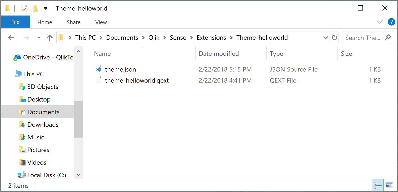
- Go to your extensions folder: C:\Users\[username]\Documents\Qlik\Sense\Extensions
- Create a new folder, I'll call mine theme-helloworld
- Create a new file and rename it to theme-helloworld.qext. The QEXT file is a definition file that contains a few lines, where only name and type are the only mandatory lines.
{
  "name": "Hello World theme",
  "description": "My first custom theme",
  "type": "theme",
  "version": "1.0.0",
  "author": "Arturo Muñoz"
}
- Now, it's time for the JSON file. Create a new file, name it theme.json
- Edit the theme.json file with your favorite text/code editor
- My advice is to start your theme with the sample code you can find in Qlik Help so you can familiarize with JSON and it's properties:
{
  "_inherit": true,
  "_variables" : {
    "@greenColor" : "#61a729",
    "@text": "#4c4c4c"
  },
  "color": "@text",
  "fontSize": "12px",
  "object" : {
    "title": {
      "main": {
      "fontSize" : "16px"
      }
    }
  },
  "dataColors": {
    "primaryColor": "@greenColor"
  }
}
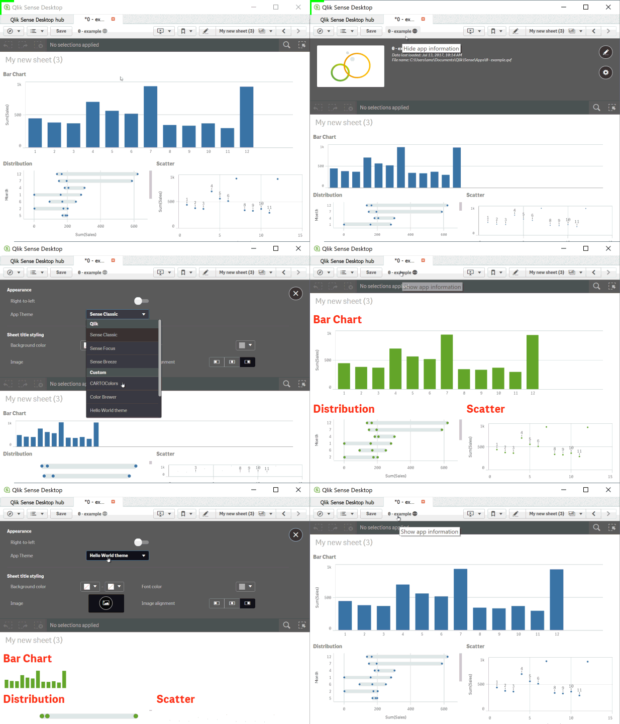
- The JSON file will change the primary color of your charts from Qlik dark blue to the custom green as defined in the variable at line 4 and will also modify the charts title to a font size of 16 pixels.
This is a simple example but there are much more you can do with the JSON file, you could for example, define new color schemes for measures, change the axis', labels, legends font size and color and much more.
Actually you could even load your custom CSS through the JSON file so you can target and hack any predefined style within your app, so you could modify object paddings, change font family, and so forth.
If you've followed the steps above you should have something like:

How to activate a Custom Theme?
Check how to apply a Custom Theme to your app in the animation below

Tips from the expert... and theme sharing!
I've asked my colleague Nabeel Asif for some tips since he created the Custom Theme based on Color Brewer that we are sharing today (check the attachments). This is what he said:
All of our standard themes just give one sequential and one diverging gradient for measures, and two color schemes for dimensions. But you can actually define as many options as you like through the “scale” and “palettes” properties in the theme’s JSON.
For sequential and diverging gradients, Qlik uses seven colors to define a scheme. But you don’t actually need to specify all seven colors. Just define the two colors at the extremes, and Qlik does a nice job of calculating the rest. Of course, if you want very specific colors you can define them yourself.
Often apps will be designed with red representing something bad or dark colors representing higher values. To maintain this look as the user switches themes, you should follow these conventions in the JSON:
- Diverging scales should be ordered from reddish hues to bluish hues.
- Sequential scales should be ordered from dark to light.
Please don't forget to always check Qlik Help for the most recent specifications.
Enjoy
- « Previous
-
- 1
- 2
- 3
- 4
- 5
- Next »
You must be a registered user to add a comment. If you've already registered, sign in. Otherwise, register and sign in.