Unlock a world of possibilities! Login now and discover the exclusive benefits awaiting you.
- Subscribe to RSS Feed
- Mark as New
- Mark as Read
- Bookmark
- Subscribe
- Printer Friendly Page
- Report Inappropriate Content
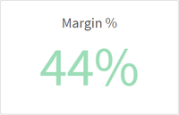
In this blog post, I will discuss some of the color enhancements that have been added to the KPI chart and the Map chart in Qlik Sense SaaS. Both allow you to further customize the visualizations in an app. Let’s begin with the KPI chart. A KPI is a key performance indicator and is often used to highlight an important metric. In Qlik Sense SaaS, you can now change the background color of a KPI. In the past, KPIs always had a white background and users had the ability to change the color of the metric.
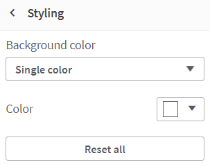
Now, users can also change the background color of the KPI. In the Presentation section of the Properties Panel, in Styling, the background color can be set. The background can be set to a single color, or an expression can be used to set the color. This is nice if you want to make the KPI stand out on the sheet based on a condition or an expression.
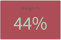
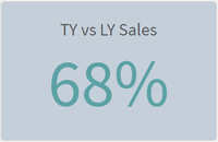
Here is what the KPI looks like with a background color.
Notice that the label of the KPI color cannot be changed so make sure you select a background color that does not hide the label. In the KPIs above, the label of the KPI on the right is easier to read than the one on the left. Also keep in mind that you have the option to hide the KPI label. I would recommend doing this only if the KPI metric being displayed is clear to the user without the label.
Another new color related feature added to Qlik Sense SaaS is the color of the labels used in a Map. Users can now change the label coloring to Light or Dark or they keep it set to Auto. This setting is found in the Presentation section of the Properties Panel. To use this feature, the map must be showing the labels.
When set to Auto, the labels will change depending on the base map being used. If the base map is darker, then a light label tends to be used and if the base map is lighter, a dark label color tends to be used. Users now have the option to set this regardless of the base map color. So depending on the map and the coloring you are using in the map; you may prefer a light label even if the background is light like in the map below. The key is to go with the option that is best read by the user. Usually that is this the option with the most contrast.
This is just a few of the visualization enhancements that have been made in Qlik Sense SaaS. Learn more about the KPI background color enhancements as well as other KPI improvements in Michael Tarallo’s SaaS in 60 video. You can check out the entire SaaS in 60 video series here to learn more about new product features.
Thanks,
Jennell
You must be a registered user to add a comment. If you've already registered, sign in. Otherwise, register and sign in.


