Unlock a world of possibilities! Login now and discover the exclusive benefits awaiting you.
- Qlik Community
- :
- Blogs
- :
- Technical
- :
- Design
- :
- Qlik GeoAnalytics: An example of binning
- Subscribe to RSS Feed
- Mark as New
- Mark as Read
- Bookmark
- Subscribe
- Printer Friendly Page
- Report Inappropriate Content
A few weeks ago, we got into a new project to create an interactive piece with the Canadian media, National Post. The goal was to illustrate the donations candidates of the Conservative Leadership Race received from the start of the race through March 2017. Qlik Sense was integrated with Qlik GeoAnalytics to visualize where the donations were coming from and which candidates received the most donations in each area.
The map below was one of our first tries, we decided to use color to illustrate the top candidate by amount collected, and by postal code.
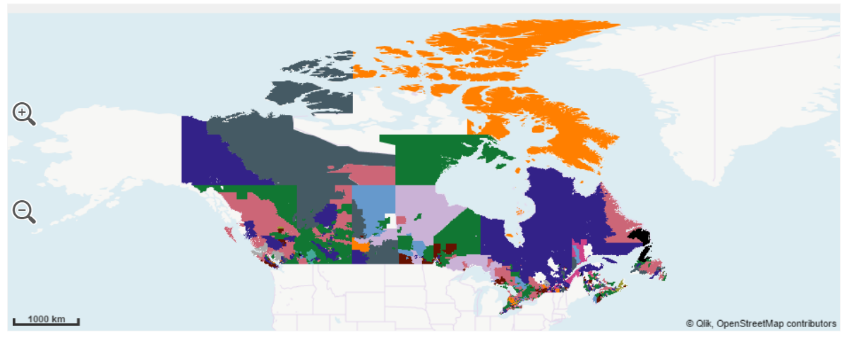
Problem with this approach appeared obvious at a first glance, postal codes areas have an insane size variance, regions such as the northern and barely populated province of Nunavut extents thousands of square miles in just one postal code while postal areas in urban zones, such as in Toronto, span a few city blocks and are hidden in the map.
So, how to make Nunavut and Toronto visible and comparable?
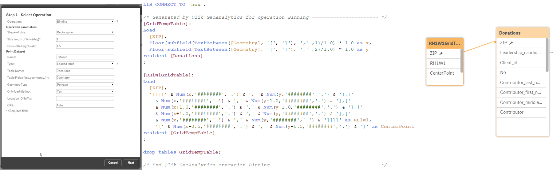
We decided to apply a binning operation to our data to solve most of the issues described. Qlik GeoAnalytics has a wizard that lets you chose operation, making the process seamless. The result is a new table containing squares (or hexagons) geo-polygons.
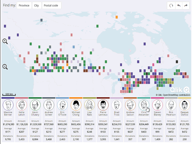
In this new map version, readers can compare areas easily without the distortion introduced by the different postal code sizes, letting us to see what’s going on in Toronto and in Nunavut at the same time.
We've added some extra cool features to the resulting Qlik Mashup. I recommend you to visit it and explore it at http://news.nationalpost.com/news/qlik
Enjoy,
AMZ
You must be a registered user to add a comment. If you've already registered, sign in. Otherwise, register and sign in.