Unlock a world of possibilities! Login now and discover the exclusive benefits awaiting you.
- Qlik Community
- :
- Blogs
- :
- Technical
- :
- Design
- :
- Tips to Polish Your Qlik Sense App
- Subscribe to RSS Feed
- Mark as New
- Mark as Read
- Bookmark
- Subscribe
- Printer Friendly Page
- Report Inappropriate Content
In this blog, I am going to discuss some things you should do before you publish and/or share your Qlik Sense app with others. These tips are steps that can be taken to improve the user experience whether they are simply viewing the app or making edits to the app.
- The first set of tips is around Descriptions – provide descriptions wherever you can to help users understand what they are viewing.
- Add an app description to your app. This provides an overview of what the app is all about.
- Add sheet descriptions to your app. Offer a sentence or two about the sheet explaining the analysis that can be done on that sheet.
- Add comments to your script, if necessary, to make it easier for you or someone else who may update or edit it in the future.
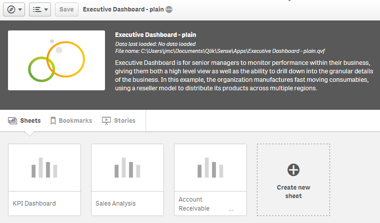
- Jazz it up a bit. Add an app thumbnail and sheet thumbnails to your app to improve the look of the app from the App Overview page. Which App Overview is more appealing to you? This one:
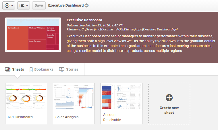
Or this one?
- Organize your app so that it flows nicely. Make sure your sheets and the objects on the sheets are in a logical order. Keep sheet objects to a few and do not clutter the sheet – less is more.
- Be Consistent throughout the app. Here are some examples of what I mean:
- Have a consistent layout - If you have filters on your sheets, place them in the same area on all sheets so the user knows where to expect them.
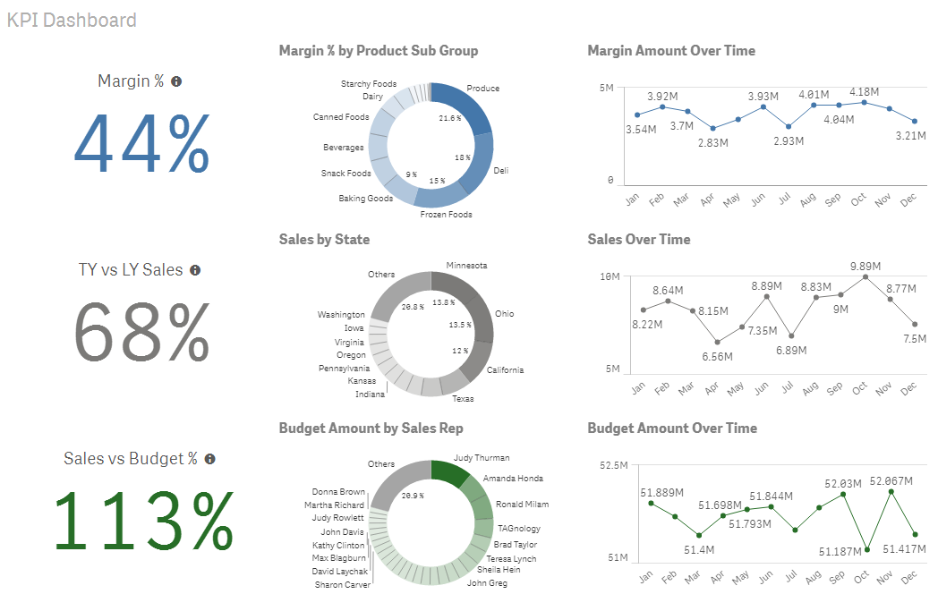
- Use color consistently – The Consumer Goods Sales demo does this nicely on the KPI Dashboard sheet by coloring all the margin charts in blue, the sales charts in gray and the budget charts in green. This sheet uses coloring to show what objects go together making it more intuitive for the user and guiding the user on how you would like them to read the charts on this sheet.
- Align objects on the sheet. With the grid, Qlik Sense does a good job at making it easy for users to keep objects aligned, organized and neat.
- Create Master Items to make your development easier as well as the development of any future editors of the app. Master Items provide one location for dimensions and measures that may need to be reused in the app. Add a quick description to measures that are a little more complicated.
- Add a Story to your app if there are some findings you would like to share with others or if you would like to document how you want users to use the app.
- Make sure the Data is right. Before sharing your app, just confirm that your data is accurate.
- Test on Smaller Devices if there is the chance that users may access your app from a tablet or mobile phone. Remember that with responsive design, objects will be organized from top to bottom, left to right. So if the sheet from Consumer Goods Sales (shown above) was viewed on a mobile device, the charts would be viewed in this order: margin KPI, margin pie chart, margin line chart, sales KPI, sales pie chart and so on. Michael Anthony wrote a blog on this topic that you may find useful.
Presented here are a few tips that can be taken to polish your Qlik Sense app before you share it with others. These tips take a few minutes to implement and can improve the user experience thus their understanding of the app. You should also check out Michael Anthony’s blog on UX Best Practices for Data Analysis. It provides a detailed overview of some topics I discussed such as color, mobile design, layout and so much more.
Thanks,
Jennell
You must be a registered user to add a comment. If you've already registered, sign in. Otherwise, register and sign in.