Hello, Everyone!
Today we gonna make this cute equalized graph:
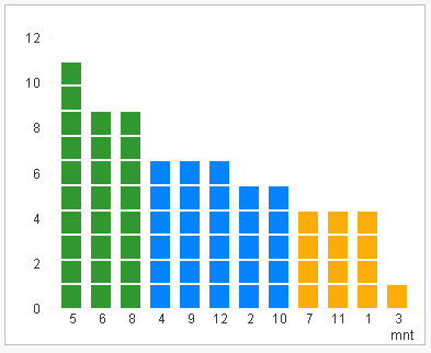
I call it "eq" because it similar with equalizer. Maybe it has a different name, no matter. Let's make it live!
Any data may be converted in rounded values:
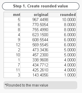
with this expression: round(sum(val)/$(=max(aggr(sum(val),mnt)))*10)
Next we can make a bar chart with calculated dimension ValueList(1,2,3,4,5,6,7,8,9,10,11,12,13,14,15,16,17,18,19)
(if we want ten-pieces bars for each "mnt" field):
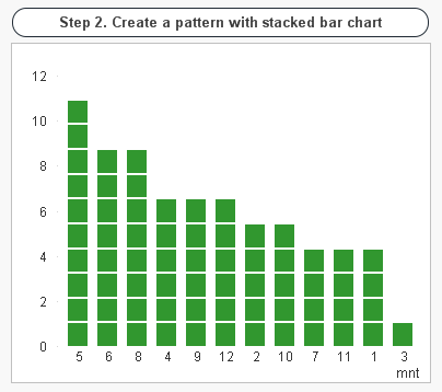
As expression we should use: if(Mod(ValueList(1,2,3,4,5,6,7,8,9,10,11,12,13,14,15,16,17,18,19),2)=0,0.1,1)
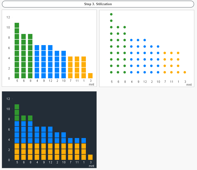
And have a background color for it like:
if(
mod(
ValueList(1,2,3,4,5,6,7,8,9,10,11,12,13,14,15,16,17,18,19)
,2)=0,White(),
if(round(sum(val)/$(=max(aggr(sum(val),mnt)))*10)>
pick(
ValueList(1,2,3,4,5,6,7,8,9,10,11,12,13,14,15,16,17,18,19)
,0,0,1,0,2,0,3,0,4,0,5,0,6,0,7,0,8,0,9)
,vGreen,White())
)
Note: Check Stacked on Style tab.
After that all we have to do is use some color and style variations:
That's all! Hope you'll like it and if it so - share your opinion!
Thank you! !