Suggest an Idea

Vote for your favorite Qlik product ideas and add your own suggestions.

Update Radar Chart

parkera
Partner Ambassador
Partner Ambassador

Update Radar Chart

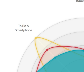
Qlik Sense radar charts are in need of updating to make them usable. The standard D3 charts have labels on the outside of the chart. The Qlik ones are currently inside the chart, making the labels look busy.

Request is for the labels to sit outside of the chart.

Second request if for the colours to be from the same palette as the rest of Qlik Sense. Currently they appear to have a very odd (dark) set of colours.
 

parkera_0-1593194872790.png

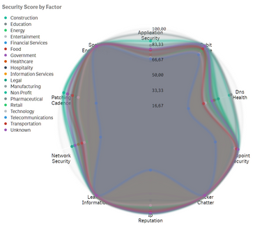
We use Radar charts in two of our Smarter.BI apps, Smarter.WFM for showing skills by employee and our #CyberHygiene app that shows cyber score by type.  Both charts would be great if Radar charts could be improved.


See example:
parkera_1-1593195215717.png


8 Comments
dc_donna
Partner - Contributor II

dc_donna_0-1593200334286.png

Good points. Also, when you haven't used a calculated range and have a data value which falls outside of the static range - producing a squiggle like the above... would be great to have a message stating that values fall outside the range (like some other Qlik Sense charts do).

parkera
Partner Ambassador
Partner Ambassador

Another simple improvement would be to have the option to make the chart a Star Chart by simply applying a percentage value for the centre of the star eg 20%

What a star chart would do is to add a point between each measure with the score of the percentage above. You then end up with a chart that looks like a Starfish... it can actually looks less busy than a pure radar chart.

Clearly you can create this already, but it would be great to have the functionality inbuilt and offered as a feature, and not a trick.

parkera_0-1593242664941.png


AndrewMcIlwrick
Luminary Alumni
Luminary Alumni
Agree 100%. And configuration options should be in the exploration menu to allow user customization. We used a bespoke radar chart extension in my last job - it took the web developer about 3 months to build - admittedly he started with no Qlik experience - but the end result was superb. It was really feature rich. And the charts could spin in both directions on mouse action. I can introduce you to him for some ideation if you like 😉
Patric_Nordstrom
Employee
Employee

Thank you for your feedback on ways to improve our product. While this is something we understand would be useful, it's not on the short-term roadmap. Please continue to show your support for this idea.

Please note that the Radar chart is still open source:

https://github.com/qlik-oss/D3ImprovedRadarChart

Feel free to fork and suggest pull requests for improvements and bug fixes. Changes will be moderated and reviewed before inclusion in future bundle versions. Please note that emphasis is on backward compatibility, i.e. breaking changes will most likely not be approved.

Thanks,

Patric

Status changed to: Open - Collecting Feedback
parkera
Partner Ambassador
Partner Ambassador

Perhaps Qlik should stop the insight engine from producing radar charts. Our team did a demo to a client last week and the insight engine showed a radar chart similar to above and it was horrible to look at. Nothing about it said, "I want that" Shame.

parkera
Partner Ambassador
Partner Ambassador

Hello, is it just me that thinks this chart is both brilliant and ugly?  It is one of the best ways to do comparisons. We would love to use it more. Please vote to get it updated and make it pop.

Meghann_MacDonald

From now on, please track this idea from the Ideation portal. 

Link to new idea

Meghann

NOTE: Upon clicking this link 2 tabs may open - please feel free to close the one with a login page. If you only see 1 tab with the login page, please try clicking this link first: Authenticate me! then try the link above again. Ensure pop-up blocker is off.

Ideation
Explorer II
Explorer II
 
Status changed to: Closed - Archived