Unlock a world of possibilities! Login now and discover the exclusive benefits awaiting you.
- Qlik Community
- :
- Support
- :
- Support
- :
- Knowledge
- :
- Support Articles
- :
- How to color chart bars based on the current selec...
- Subscribe to RSS Feed
- Mark as New
- Mark as Read
- Bookmark
- Subscribe
- Printer Friendly Page
- Report Inappropriate Content
How to color chart bars based on the current selection on the dimension
- Mark as New
- Bookmark
- Subscribe
- Mute
- Subscribe to RSS Feed
- Permalink
- Report Inappropriate Content
How to color chart bars based on the current selection on the dimension
May 10, 2022 1:31:28 PM
Nov 30, 2021 5:46:46 AM
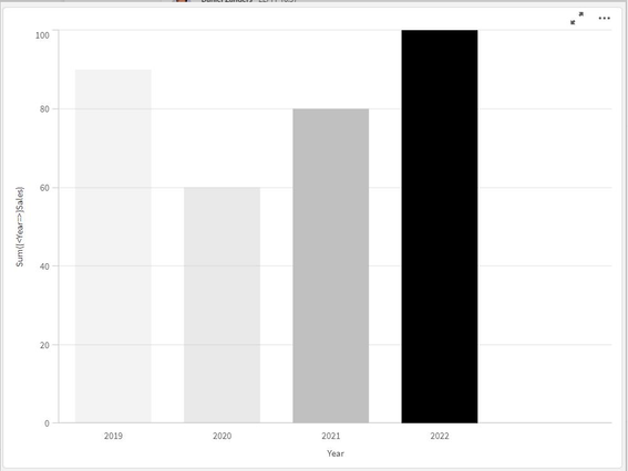
This article shows how some chart bars can be dynamically colored based on the selection performed on the dimension. In our example, we take a bar chart showing Sales by year. A user can select any years. We want to show the bars corresponding to the selected year and the three preceding it in different colors. The selected year will be shown black, the previous in dark grey, then in medium grey and the last one in light grey.
Here below the result we want to get.
Environment
- Qlik Sense on Windows all versions
- Qlik Cloud
- QlikView all versions
We use this formula:
Pick(Fabs(GetFieldSelections(Year) - Only({<Year=>}Year)) + 1,
Black(),
LightGray(),
LightGray(90),
LightGray(50))
Here is a brief explanation of the functions in use.
- Black(), LightGray(), LightGray(90), LightGray(50) define the color. Any color expressions defined here will work.
- The Pick() function assigns a color to each bar, see here for a reference.
Based on the difference between the selected year and the year represented by the bar, the first, the second, the third or the last color is chosen.
"+1" is added to the difference because the first term in the function must be a natural number grater than 0. So, if the bar is showing the selected year, then difference is 0 (+1) and the bar will be colored with the first color (black). - The Only() function selects the single column for each dimension value.
