Unlock a world of possibilities! Login now and discover the exclusive benefits awaiting you.
- Qlik Community
- :
- Forums
- :
- Analytics
- :
- New to Qlik Analytics
- :
- Re: Color By Expression - Legend
- Subscribe to RSS Feed
- Mark Topic as New
- Mark Topic as Read
- Float this Topic for Current User
- Bookmark
- Subscribe
- Mute
- Printer Friendly Page
- Mark as New
- Bookmark
- Subscribe
- Mute
- Subscribe to RSS Feed
- Permalink
- Report Inappropriate Content
Color By Expression - Legend
How can we add a legend for a bar chart where we have a custom color setting?
- Mark as New
- Bookmark
- Subscribe
- Mute
- Subscribe to RSS Feed
- Permalink
- Report Inappropriate Content
I'm assuming this is for the out-of-the-box Bar Chart visualization with Qlik Sense. Currently, the visualization allows for legends on Color by Dimension and Color by Measure. It is not available for expressions.
All visualizations are considered to be 'Extensions'. Extensions can be added to your deployment of Qlik Sense or even created by you to visualize data in various ways (ie. such as in a Map, or in a Sunburst chart, or a Gantt chart, etc..).
Here is a link to Branch, a project website that may have a bar chart that accomplishes the specific need or task that you are looking to have addressed (that or you create your own): http://branch.qlik.com/#!/project
To create your own, please refer to the online help: Extend ‒ Qlik Sense
- Mark as New
- Bookmark
- Subscribe
- Mute
- Subscribe to RSS Feed
- Permalink
- Report Inappropriate Content
I'm having the same issue - I would like to be able to show a legend based on the color expression I've provided.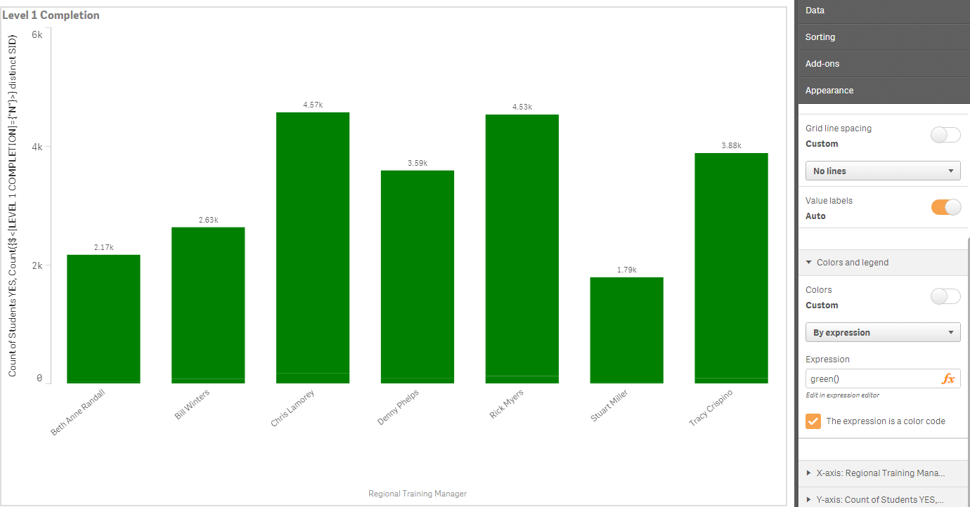
- Mark as New
- Bookmark
- Subscribe
- Mute
- Subscribe to RSS Feed
- Permalink
- Report Inappropriate Content
Create a Master Dimension
Set the Value colors for each value in that dimension
Then Select set by dimension using that newly create master dimension


— Nintendo Quit screen message