Unlock a world of possibilities! Login now and discover the exclusive benefits awaiting you.
- Qlik Community
- :
- Forums
- :
- Analytics
- :
- New to Qlik Analytics
- :
- Colour Line Chart Based on a Rank
- Subscribe to RSS Feed
- Mark Topic as New
- Mark Topic as Read
- Float this Topic for Current User
- Bookmark
- Subscribe
- Mute
- Printer Friendly Page
- Mark as New
- Bookmark
- Subscribe
- Mute
- Subscribe to RSS Feed
- Permalink
- Report Inappropriate Content
Colour Line Chart Based on a Rank
Hi All,
My line chart it is a standard Line chart based on 2 dimensions Date and Product Name and one measure Sales.
As I want to see the best 10 Product among one month and not on each day (as be default) The dimension Product Name has the following expression :
If(
Aggr({<Date={">=$(=Num(Today() - 11))"}>} Rank(Sum(Sales)) , [Product Name])<=10 ,
[Product Name]
)
I am trying to colour my chart with the following expression:
Pick(Num(Rank(Sum(TOTAL <[Product Name]> Amount))),Blue(),Yellow(),Black(),Red())
But I have 3 problem with this solution:
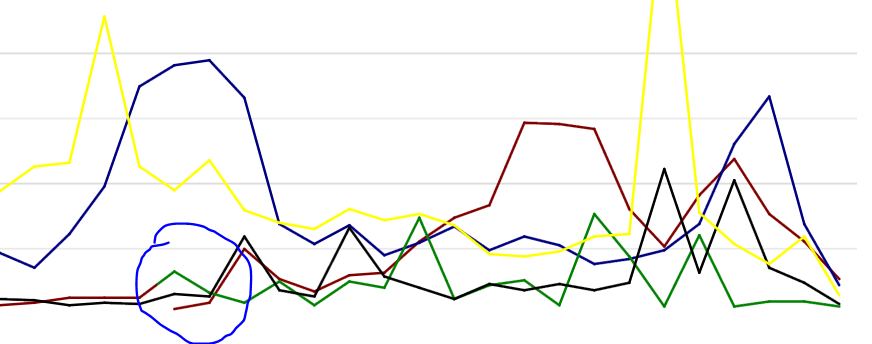
1) I have some problem because my product doesn't have the same launch date so seems that the colour doesn't remain costant among different period (see attached image).
2) with the colour by expression the label that show me the match between colour and product has been disappear. So it is quite impossible for me to understand which line is referred to specific product.
3) I think that I should include also the set analysis into the colour expression because I want that the colour will be consistent with the dimension.
Any help will be really appreciated on any of the points above.
Thanks,
Giulio
- Mark as New
- Bookmark
- Subscribe
- Mute
- Subscribe to RSS Feed
- Permalink
- Report Inappropriate Content
To answer #2 first:
Yes it disappears since you do a color by expression - Qlik Sense doesn't make an attempt to find out how a legend could match the expression. You will have to add a Text&Image and use the same colors and calculate the right dimensions to show...
#1 - The number of lines has to be constant for the entire time interval and that is probably the simplest way of solving it.