Unlock a world of possibilities! Login now and discover the exclusive benefits awaiting you.
- Qlik Community
- :
- Forums
- :
- Analytics
- :
- New to Qlik Analytics
- :
- Cumulative chart and color coding for calculated m...
- Subscribe to RSS Feed
- Mark Topic as New
- Mark Topic as Read
- Float this Topic for Current User
- Bookmark
- Subscribe
- Mute
- Printer Friendly Page
- Mark as New
- Bookmark
- Subscribe
- Mute
- Subscribe to RSS Feed
- Permalink
- Report Inappropriate Content
Cumulative chart and color coding for calculated measures
Hi,
I am a new user of Qliksense and I have 2 questions:
Question 1:
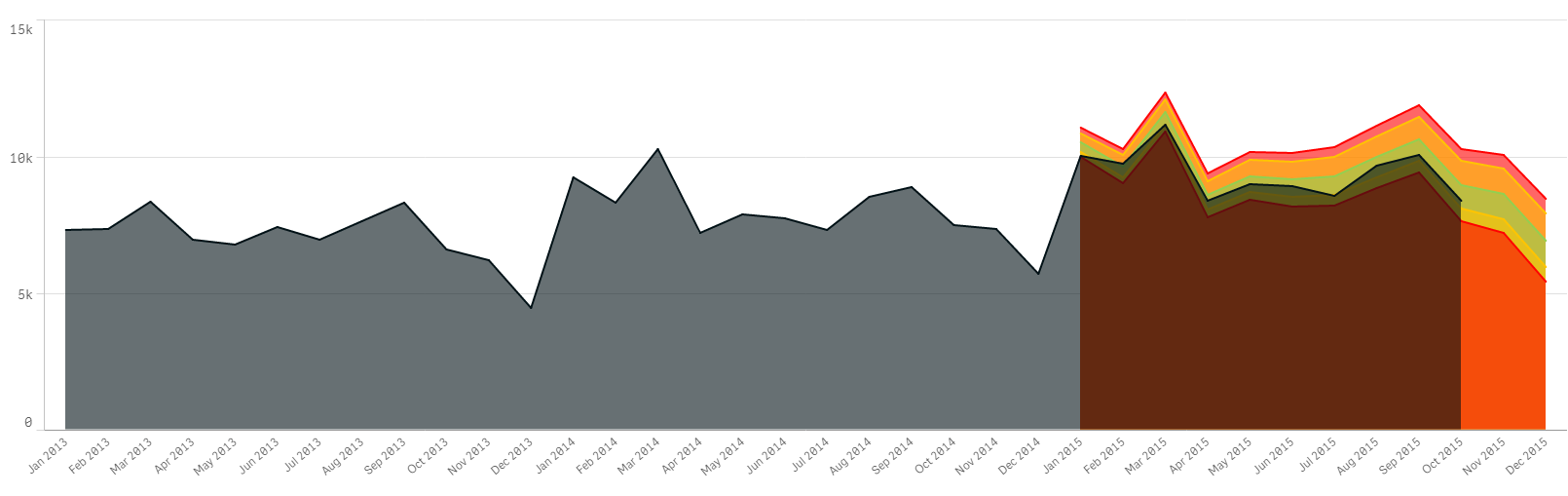
I am trying to do chart showing cumulative volume and cumulative Gross Margin (see below)
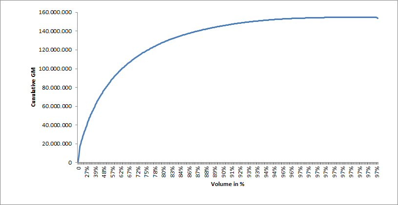
Any advise for the expression (formula for cumulative data) and the chart to be used (line chart)???
Question 2:
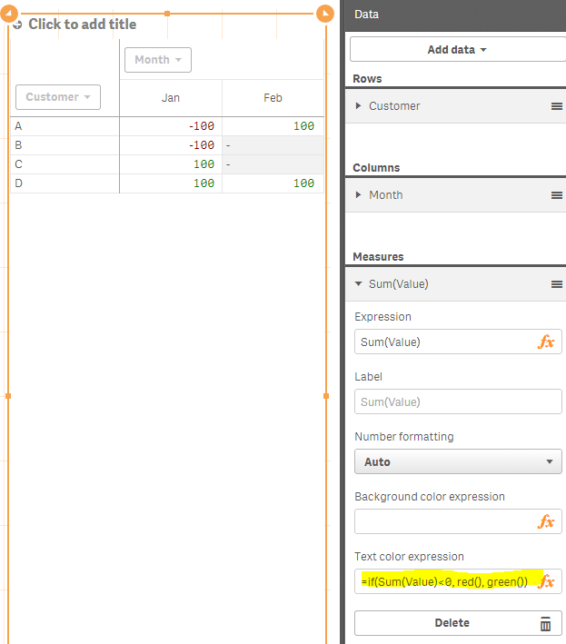
I have a pivot table with Gross Margin per Liter (Gross Margin divided by Liter). I would like negative value to be in red. I would like to know the formula to add color in Text color expression...
Thank you in advance for your help
Best regards,
Rodolphe
- Mark as New
- Bookmark
- Subscribe
- Mute
- Subscribe to RSS Feed
- Permalink
- Report Inappropriate Content
Hi Rodolphe,
Answer #1: Will an adaptation of the article by HIC below work?
Qlik Design Blog : Recipe for a Pareto Analysis | Qlik Community
Answer #2: will the below color expression work?
- Mark as New
- Bookmark
- Subscribe
- Mute
- Subscribe to RSS Feed
- Permalink
- Report Inappropriate Content
#1: use Rangesum & Above functions with a Line chart
RangeSum(Above(GROSS_MARGIN_EXPRESSION,0,RowNo()))
#2: mhartono solution should work.
- Mark as New
- Bookmark
- Subscribe
- Mute
- Subscribe to RSS Feed
- Permalink
- Report Inappropriate Content
Thank you
#1: It works for the measure but not for the dimension because a line chart requires a dimension and a measure
When I chose the expression RangeSum(Above(GROSS_MARGIN_EXPRESSION,0,RowNo())) in the dimension field, I got the error message : Invalid Dimension. May be a line chart does not support the Cumulative formula for the Y and X axis.
#2 color coding works for a not calculated measure (Gross Profit), not for a calculated measure (Gross Margin per Liter)
Any suggestion?
Regards,
Rodolphe
- Mark as New
- Bookmark
- Subscribe
- Mute
- Subscribe to RSS Feed
- Permalink
- Report Inappropriate Content
Hi Rodolphe,
For the first question, I am assuming that you are looking for something like this:
if((sum([Days In Stock]) / count([Vehicle ID])) < 35,rgb(146,208,80),rgb(255,0,0))
And for the second question make use of an expression similar to this:
if((sum([Current Stock Budget])-sum([Stock Value])>0),rgb(146,208,80),rgb(255,0,0))
Thanks,
Sangram.
- Mark as New
- Bookmark
- Subscribe
- Mute
- Subscribe to RSS Feed
- Permalink
- Report Inappropriate Content
thanks - #2 is now OK
for the first question I think this is not possible in Qliksense to make a line chart with 2 measures (1 for X axis and 1 for Y axis). Line charts in Qliksense only allow 1 dimension and 1 measure. Will you agree with me?
- Mark as New
- Bookmark
- Subscribe
- Mute
- Subscribe to RSS Feed
- Permalink
- Report Inappropriate Content
Hi Rodolphe,
No I am sorry. You can have two lines in a line chart , infact more than 2 check this out:
Thanks,
Sangram.
- Mark as New
- Bookmark
- Subscribe
- Mute
- Subscribe to RSS Feed
- Permalink
- Report Inappropriate Content
Though you have a restriction of 2 dim 1 measure / 1 dim 2 measures, using the pick() function you can implement multi line line chart