Unlock a world of possibilities! Login now and discover the exclusive benefits awaiting you.
- Qlik Community
- :
- Forums
- :
- Analytics
- :
- New to Qlik Analytics
- :
- Re: Dimension colours in stacked bar charts Qlik S...
- Subscribe to RSS Feed
- Mark Topic as New
- Mark Topic as Read
- Float this Topic for Current User
- Bookmark
- Subscribe
- Mute
- Printer Friendly Page
- Mark as New
- Bookmark
- Subscribe
- Mute
- Subscribe to RSS Feed
- Permalink
- Report Inappropriate Content
Dimension colours in stacked bar charts Qlik Sense
Hello
I have a bar chart that measures sales across a number of financial periods. For each period I want the bar to be broken down by customer category (i.e. stacked bar chart). So the bar chart has two dimensions, Period and Category. On the sheet, the period is a filter. The user can select a period and other objects on the sheet reflect various values for that period. But within the bar chart I want all periods to be shown and so I have the measure expression set as
sum({$<Period=>}SalesValue)
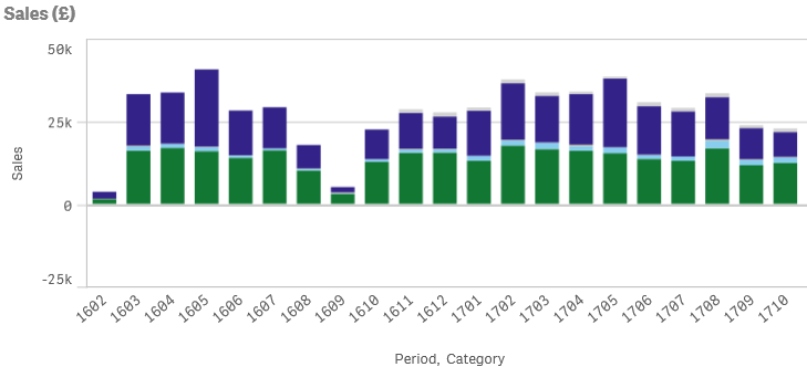
When no period is selected each bar is shown as a stacked bar chart reflecting the various categories,
However, when a period is selected, only the selected period shows the categories,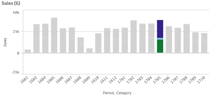
Is it possible to make all periods show the categories when a period is selected?
Periods are 4 digits, first 2 are the year, last 2 represent the period in the year. E.g. 1710 means period 10 of year 17.
Categories are text, e.g. 'Shops'. There are 6 categories.
Thanks, appreciate any help that anyone can give.
- « Previous Replies
-
- 1
- 2
- Next Replies »
- Mark as New
- Bookmark
- Subscribe
- Mute
- Subscribe to RSS Feed
- Permalink
- Report Inappropriate Content
That's it !
semgem12 , try to replicate such a thing in ur applicaion
- Mark as New
- Bookmark
- Subscribe
- Mute
- Subscribe to RSS Feed
- Permalink
- Report Inappropriate Content
Yes that works, thank you very much! Thanks to Omar too.
In case this helps anyone I created an inline table to describe the RGB colours for each type of category,
Load * inline [
Category,CategoryRed,CategoryGreen,CategoryBlue
Shops,180,190,250
Restaurants,200,210,250
Supermarkets,220,230,250
];
Then in the bar chart properties, appearance, colours and legend, I set Colours to Custom and By expression. The expression is
rgb(only({<Period>}CategoryRed), only({<Period>}CategoryGreen), only({<Period>}CategoryBlue))
Make sure to tick 'The expression is a color code'
- Mark as New
- Bookmark
- Subscribe
- Mute
- Subscribe to RSS Feed
- Permalink
- Report Inappropriate Content
Hi,
I have the same problem here and used the technique you gave and it worked. But the Legend is getting disappeared. Can you please help with this?
Thank you.
Regards
Santhosh Kasam
- Mark as New
- Bookmark
- Subscribe
- Mute
- Subscribe to RSS Feed
- Permalink
- Report Inappropriate Content
Can you include an image of the problem?
- Mark as New
- Bookmark
- Subscribe
- Mute
- Subscribe to RSS Feed
- Permalink
- Report Inappropriate Content
Hi Semir,
If you observer it does not indicate which color belongs to which bucket. That is the LEGEND is Missing. Please help.
Thank you 
- Mark as New
- Bookmark
- Subscribe
- Mute
- Subscribe to RSS Feed
- Permalink
- Report Inappropriate Content
Hi Santosh
Just looked back at the Qlik Sense app where I used this approach. I'm afraid I wasn't able to include a legend within the chart. I was lucky in that I had only 3 categories and so created 3 KPIs that only showed text .... on the KPI I set the Data to be the required text, e.g. 'Shops' and then on the appearance tab switched off conditional colours and then set the colour to the required colour for that category. I used KPI because it gave more flexibility in colour choice rather than a text box.
- Mark as New
- Bookmark
- Subscribe
- Mute
- Subscribe to RSS Feed
- Permalink
- Report Inappropriate Content
Hi Semir,
This can be done in a different way too. I just found today. Create a master dimension and define the colors for each value in it. Then add the dimension to the chart. Mark the colors and Legend to Auto mode. Then everything works perfectly.
I think it's worth trying. Thank you.
Regards
Santhosh Kasam
- Mark as New
- Bookmark
- Subscribe
- Mute
- Subscribe to RSS Feed
- Permalink
- Report Inappropriate Content
That's great, thanks Santhosh I'll give it a try.
- « Previous Replies
-
- 1
- 2
- Next Replies »