Unlock a world of possibilities! Login now and discover the exclusive benefits awaiting you.
- Qlik Community
- :
- Forums
- :
- Analytics
- :
- New to Qlik Analytics
- :
- Frequency distribution chart
- Subscribe to RSS Feed
- Mark Topic as New
- Mark Topic as Read
- Float this Topic for Current User
- Bookmark
- Subscribe
- Mute
- Printer Friendly Page
- Mark as New
- Bookmark
- Subscribe
- Mute
- Subscribe to RSS Feed
- Permalink
- Report Inappropriate Content
Frequency distribution chart
Is there a way to plot the frequency distribution chart in Qlik Sense ?
For example:
Frequency:
LOAD *
INLINE [
cr_id, date_added
CR0,01/12/2014
CR0,01/12/2014
CR1,01/12/2014
CR1,01/12/2014
CR1,01/12/2014
CR2,01/12/2014
CR2,01/12/2014
CR2,01/12/2014
CR0,01/12/2014
CR0,01/12/2014
CR0,01/12/2014
CR3,01/12/2014
CR3,01/12/2014
CR3,01/12/2014
CR0,01/12/2014
CR3,01/12/2014
CR4,01/12/2014
CR5,01/12/2014
CR6,01/12/2014
CR7,01/12/2014
CR8,01/12/2014
CR9,01/12/2014
CR10,01/12/2014
CR11,01/12/2014
CR12,01/12/2014
CR13,01/12/2014
CR14,01/12/2014
];
should produce this:
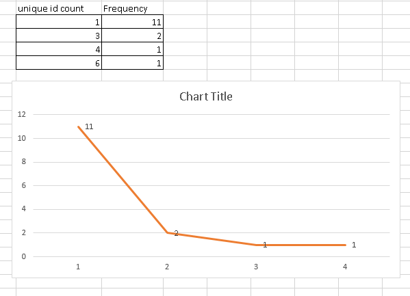
I tried to use "class(aggr(count(cr_id), cr_id),1)" as dimension then do a count(cr_id) but that doesn't give the desired results. Using "Round(count(cr_id),1)" as the dimension gives an Invalid dimension error. What would be the best approach?
Thanks in Advance!
Accepted Solutions
- Mark as New
- Bookmark
- Subscribe
- Mute
- Subscribe to RSS Feed
- Permalink
- Report Inappropriate Content
Have you tried
=aggr(count(cr_id), cr_id)
as dimension and
=Count(Distinct cr_id)
as expression?
- Mark as New
- Bookmark
- Subscribe
- Mute
- Subscribe to RSS Feed
- Permalink
- Report Inappropriate Content
Have you tried
=aggr(count(cr_id), cr_id)
as dimension and
=Count(Distinct cr_id)
as expression?