- Mark as New
- Bookmark
- Subscribe
- Mute
- Subscribe to RSS Feed
- Permalink
- Report Inappropriate Content
Qlik Sense: Maps
Hi Qlik Community,
I'm new at Sense and I'm wondering if we can add more than one measure in a Map graphic. Can you help me?
I have some urgency on this isse in order to close a suggestion for a potencial customer.
Thanks in advance!
Vera Gomes
- Mark as New
- Bookmark
- Subscribe
- Mute
- Subscribe to RSS Feed
- Permalink
- Report Inappropriate Content
In a bubble/point map , you can have 1 measure determine the size of the bubble and a 2nd measure determine the color intensity of the bubble.
Would that work ?
To do this use color 'by expression' and use a colormix() function to produce a gradient.
- Mark as New
- Bookmark
- Subscribe
- Mute
- Subscribe to RSS Feed
- Permalink
- Report Inappropriate Content
Hi Jonathan,
Not really, we have the requirement to show different metric values in the map graph. This is not possible with Qlik Sense?
Thanks.
Vera Gomes
- Mark as New
- Bookmark
- Subscribe
- Mute
- Subscribe to RSS Feed
- Permalink
- Report Inappropriate Content
Do you have a sample image / screenshot you could share ? Tools aside, i could think of a few visual ways a map could convey this.. if you had a concept in mind that might help.
- Mark as New
- Bookmark
- Subscribe
- Mute
- Subscribe to RSS Feed
- Permalink
- Report Inappropriate Content
Something like this, were different colors correspond to different metrics:

- Mark as New
- Bookmark
- Subscribe
- Mute
- Subscribe to RSS Feed
- Permalink
- Report Inappropriate Content
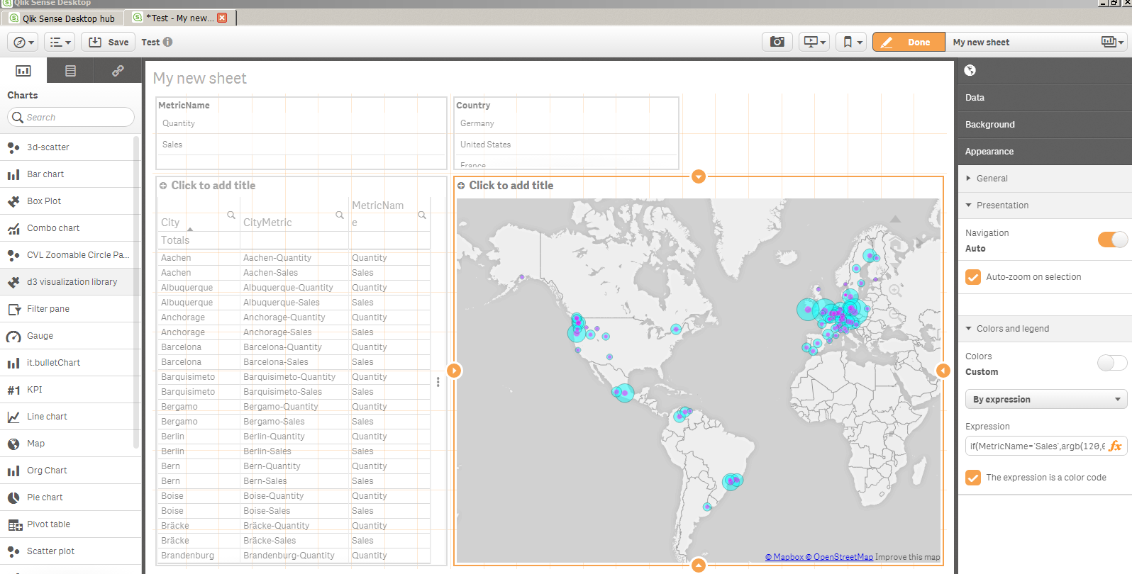
Hi yes i think so , and if the different metrics correspond to different points on the map then there are less visual design elements to take into account.
The technique i can propose involves:
1. Loading the source data into 1 table that has , among other fields, 2 fields:
Metric Name
Metric Value
where metric name is the name of the metric (like 'sales') and metric value is the numeric amount ( like 100)
2. Then when you create a map, add a measure of sum( [Metric Value]) but on the Presentation/Color change the color to be by expression and add something like; if(MetricName='Sales',argb(120,0,255,255) , argb(120,255,0,255)) ...where the 2nd and 3rd parameters are the colors you want.
i uncovered that more things are needed when you have metric values for multiple metrics on the same points.. how best to represent ?
a) you could add a set of geopoints for each metric where the lat/long is slighlty different each time , so that mulitlpe bubbles show up for a point when there is multiple metrics and they show up side by side .
b) As above, but instead of worrying about altering the points, use the argb() function whose 1st argument determines how transparent the color is... so that the points are visible through each other and overlap (screenshot below)
Both have strengths / weaknesses but both require some data modelling techniques and i think we can probably make this a little easier overall to setup.
Attached is a QVF where you can see how the load has been strucutred . its a little technical but i hope it helps you !