Unlock a world of possibilities! Login now and discover the exclusive benefits awaiting you.
- Qlik Community
- :
- Forums
- :
- Analytics
- :
- New to Qlik Analytics
- :
- Re: Showing missing dimension labels on a chart
- Subscribe to RSS Feed
- Mark Topic as New
- Mark Topic as Read
- Float this Topic for Current User
- Bookmark
- Subscribe
- Mute
- Printer Friendly Page
- Mark as New
- Bookmark
- Subscribe
- Mute
- Subscribe to RSS Feed
- Permalink
- Report Inappropriate Content
Showing missing dimension labels on a chart
Hi,
I have 12 survey questions each with a scale of: Strongly disagree, Disagree, Neutral, Agree, Strongly agree. For some questions, some of the responses haven't been selected, and therefore don't contain data points. The result is a chart with missing dimension values (see below). Also sort order is out of place as well. Can someone suggest a fix to the issues? Thanks!
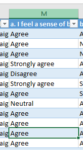
The data is contained in Excel and in the following format.
Accepted Solutions
- Mark as New
- Bookmark
- Subscribe
- Mute
- Subscribe to RSS Feed
- Permalink
- Report Inappropriate Content
What you can do, is use valuelist
You can set your dimension to:
=ValueList('Strongly disagree', 'Disagree', 'Neutral', 'Agree', 'Strongly agree')
And your measure to (not sure about your field names):
pick(match(ValueList('Strongly disagree', 'Disagree', 'Neutral', 'Agree', 'Strongly agree'),'Strongly disagree', 'Disagree', 'Neutral', 'Agree', 'Strongly agree'),
Avg({$*<Rating={"Strongly disagree"}>}Score),Avg({$*<Rating={"Disagree"}>}Score),Avg({$*<Rating={"Neutral"}>}Score),Avg({$*<Rating={"Agree"}>}Score),Avg({$*<Rating={"Strongly agree"}>}Score))
This should also solve your sorting
- Mark as New
- Bookmark
- Subscribe
- Mute
- Subscribe to RSS Feed
- Permalink
- Report Inappropriate Content
I don't know what the "best" way is, but I managed to make this work by using the Modifier of my Measure. I set it as "Accumulation", the range as "Custom", and then "Steps" as 1.
Note: "Show excluded values" didn't help me at all.
I had the same issue of wanting some of my bars, which had 0 counts, to always be shown. I played around a lot and stumbled on this solution.
- Mark as New
- Bookmark
- Subscribe
- Mute
- Subscribe to RSS Feed
- Permalink
- Report Inappropriate Content
I'm not seeing the Accumulation option in the chart settings? Are you using a bar chart?
- Mark as New
- Bookmark
- Subscribe
- Mute
- Subscribe to RSS Feed
- Permalink
- Report Inappropriate Content
Yes, this is a standard bar chart. Added another image here. You can see I expanded my Measure (% ELV. Risk Utilization_COI) and just under where I have the Master Item picked (greyed out % ELV. Risk Utilization_COI) is the option to use a Modifier. It says "Accumulation" in parentheses because that is the option I picked. It won't show that until you set it up.
This is Qlik Sense version November 2019.
- Mark as New
- Bookmark
- Subscribe
- Mute
- Subscribe to RSS Feed
- Permalink
- Report Inappropriate Content
What you can do, is use valuelist
You can set your dimension to:
=ValueList('Strongly disagree', 'Disagree', 'Neutral', 'Agree', 'Strongly agree')
And your measure to (not sure about your field names):
pick(match(ValueList('Strongly disagree', 'Disagree', 'Neutral', 'Agree', 'Strongly agree'),'Strongly disagree', 'Disagree', 'Neutral', 'Agree', 'Strongly agree'),
Avg({$*<Rating={"Strongly disagree"}>}Score),Avg({$*<Rating={"Disagree"}>}Score),Avg({$*<Rating={"Neutral"}>}Score),Avg({$*<Rating={"Agree"}>}Score),Avg({$*<Rating={"Strongly agree"}>}Score))
This should also solve your sorting
- Mark as New
- Bookmark
- Subscribe
- Mute
- Subscribe to RSS Feed
- Permalink
- Report Inappropriate Content
@lorenzoconforti I've got it part working, but because the Gender value is text, I've had to use Count which ends up breaking the sorting. Also I want the percentage of column total so dividing by total for category (which part works). Code below:
pick(match(ValueList('Strongly disagree', 'Disagree', 'Neutral', 'Agree', 'Strongly agree'),'Strongly disagree', 'Disagree', 'Neutral', 'Agree', 'Strongly agree'),
Count({$*<[Question1 ]={"Strongly disagree"}>}Gender)/Count(Total Gender),
Count({$*<[Question1 ]={"Disagree"}>}Gender)/Count(Total Gender),
Count({$*<[Question1 ]={"Neutral"}>}Gender)/Count(Total Gender),
Count({$*<[Question1 ]={"Agree"}>}Gender)/Count(Total Gender),
Count({$*<[Question1 ]={"Strongly agree"}>}Gender)/Count(Total Gender))
- Mark as New
- Bookmark
- Subscribe
- Mute
- Subscribe to RSS Feed
- Permalink
- Report Inappropriate Content
To fix the sorting, in the sorting section of your chart, disable auto and unselect all the other options (i.e. nothing selected, sorting will be based on the data order which is taken from the valuelist)
Regarding the count, it should work fine. Are the numbers you are seeing incorrect?
- Mark as New
- Bookmark
- Subscribe
- Mute
- Subscribe to RSS Feed
- Permalink
- Report Inappropriate Content
@lorenzoconforti That did the trick. Thank you for your help 👍

