Unlock a world of possibilities! Login now and discover the exclusive benefits awaiting you.
- Qlik Community
- :
- Forums
- :
- Analytics
- :
- New to Qlik Analytics
- :
- Re: A chart that only shows the data higher than a...
- Subscribe to RSS Feed
- Mark Topic as New
- Mark Topic as Read
- Float this Topic for Current User
- Bookmark
- Subscribe
- Mute
- Printer Friendly Page
- Mark as New
- Bookmark
- Subscribe
- Mute
- Subscribe to RSS Feed
- Permalink
- Report Inappropriate Content
How to create a chart that only shows the data higher than a certain number in Qlik Sense?
Hey everyone,
Im very new to Qlik and am not sure how to solve this.
I need to show the the products that have a margin higher than 40%.
I have the products, sales, costs and Margin as data.
Can somebody help me solve this?
Accepted Solutions
- Mark as New
- Bookmark
- Subscribe
- Mute
- Subscribe to RSS Feed
- Permalink
- Report Inappropriate Content
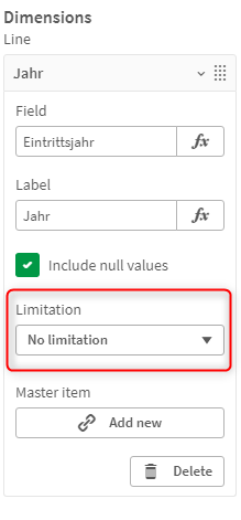
Hi Silver,
you can do that by the Limitation Option in your Visualization. Check the screenshots attached. I don't know if your margin data is in percent. If not, you might need to calculate it in your load script.
You can watch this video to see how to use this option:
Let me know if it helped.
Regards,
Can
- Mark as New
- Bookmark
- Subscribe
- Mute
- Subscribe to RSS Feed
- Permalink
- Report Inappropriate Content
Yes it worked! thank you