Unlock a world of possibilities! Login now and discover the exclusive benefits awaiting you.
- Qlik Community
- :
- Forums
- :
- Analytics
- :
- New to Qlik Analytics
- :
- Alternate Measure not working on Histogram chart
- Subscribe to RSS Feed
- Mark Topic as New
- Mark Topic as Read
- Float this Topic for Current User
- Bookmark
- Subscribe
- Mute
- Printer Friendly Page
- Mark as New
- Bookmark
- Subscribe
- Mute
- Subscribe to RSS Feed
- Permalink
- Report Inappropriate Content
Alternate Measure not working on Histogram chart
Hi all,
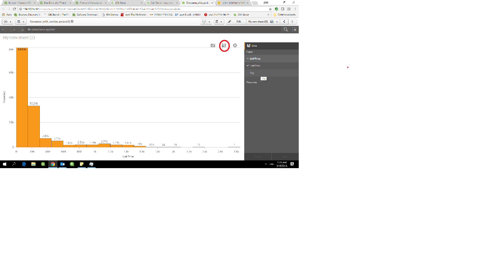
I was trying to use the new Histogram chart in Qlik Sense. The Data menu allows you to add alternative measures but I could not see the toggles next to the X-Axis title to select the alternative measure on the chart. See attached picture. The Bar chart has the toggle arrow on the Y-Axis, but the Histogram does not.
Is this a bug or am I forgetting something?
Thanks,
Olivier
- Mark as New
- Bookmark
- Subscribe
- Mute
- Subscribe to RSS Feed
- Permalink
- Report Inappropriate Content
According to https://help.qlik.com/en-US/sense/February2018/Subsystems/Hub/Content/Visualizations/Histogram/histo...
the histogram chart is supposed to support alternative fields. I did not find a way how to switch to the alternative field either.
I am using Qlik Sense Feb 2018. I think this could be a bug.
- Mark as New
- Bookmark
- Subscribe
- Mute
- Subscribe to RSS Feed
- Permalink
- Report Inappropriate Content
hi
you are right that you can't change to alternate field in the bar
but similar to other chart type for example treeview you can change the field using the exploration menu
so not sure it's a bug , although it'll make sense to allow the change from the axis label
look at the attach image