Unlock a world of possibilities! Login now and discover the exclusive benefits awaiting you.
- Qlik Community
- :
- Forums
- :
- Analytics
- :
- New to Qlik Analytics
- :
- Re: Average on count of the whole loaded data
- Subscribe to RSS Feed
- Mark Topic as New
- Mark Topic as Read
- Float this Topic for Current User
- Bookmark
- Subscribe
- Mute
- Printer Friendly Page
- Mark as New
- Bookmark
- Subscribe
- Mute
- Subscribe to RSS Feed
- Permalink
- Report Inappropriate Content
Average on count of the whole loaded data
Hi. I'm trying to calculate average value on count of a field so that it would take the whole loaded data.
For example, I need to take average on count of sales by date. This works fine unless I apply filters:
Avg(Aggr(Count(sales), date))
If I apply filtering, the average will be recalculated, but I need it to be constant among the whole data. So I tried using
Avg(ALL Aggr(Count(sales), date))
But it didn't work. Is that possible at all in QlikSense without primary grouping on query level?
Any help is highly appreciated.
Thanks in advance!
- « Previous Replies
-
- 1
- 2
- Next Replies »
Accepted Solutions
- Mark as New
- Bookmark
- Subscribe
- Mute
- Subscribe to RSS Feed
- Permalink
- Report Inappropriate Content
- Mark as New
- Bookmark
- Subscribe
- Mute
- Subscribe to RSS Feed
- Permalink
- Report Inappropriate Content
Try this
Avg({1} Aggr(Count({1} sales), date))
- Mark as New
- Bookmark
- Subscribe
- Mute
- Subscribe to RSS Feed
- Permalink
- Report Inappropriate Content
Thank you, Sunny! This is what I was looking for. 
I can successfully get this average in a KPI chart, but when it comes to bar or combo chart, I see a strange broken line instead of straight line. Would you have any ideas about that?
- Mark as New
- Bookmark
- Subscribe
- Mute
- Subscribe to RSS Feed
- Permalink
- Report Inappropriate Content
It seems you have no data from Sep/Oct 2014 till June/July 2016... may be that is what is causing it?
- Mark as New
- Bookmark
- Subscribe
- Mute
- Subscribe to RSS Feed
- Permalink
- Report Inappropriate Content
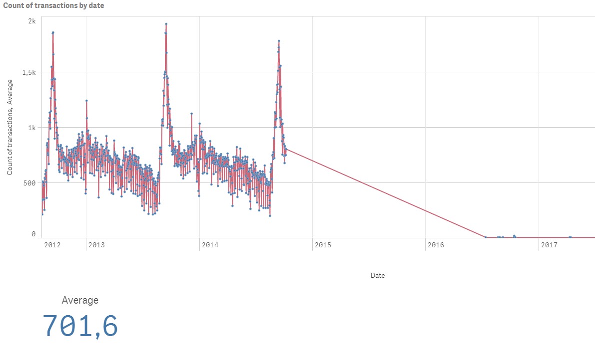
I don't think that's the case. I mean, it must be a straight line across the whole chart. Anyway I managed to do it as a reference line in line chart. Unfortunately there are no reference lines available for combo charts, and I couldn't add such an average value as a measure.
- Mark as New
- Bookmark
- Subscribe
- Mute
- Subscribe to RSS Feed
- Permalink
- Report Inappropriate Content
May be share you qvf for us to take a look at?
- Mark as New
- Bookmark
- Subscribe
- Mute
- Subscribe to RSS Feed
- Permalink
- Report Inappropriate Content
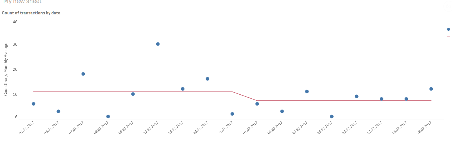
Hi Sunny,
I attached my qvf with some dummy data. Anyway the problem there still exist. Using one and the same formula in different charts I get different results. In KPI chart it shows real average of the whole data, but in combo chart red line, which is supposed to show the same constant value, behaves as if it is composed of average values at each point. 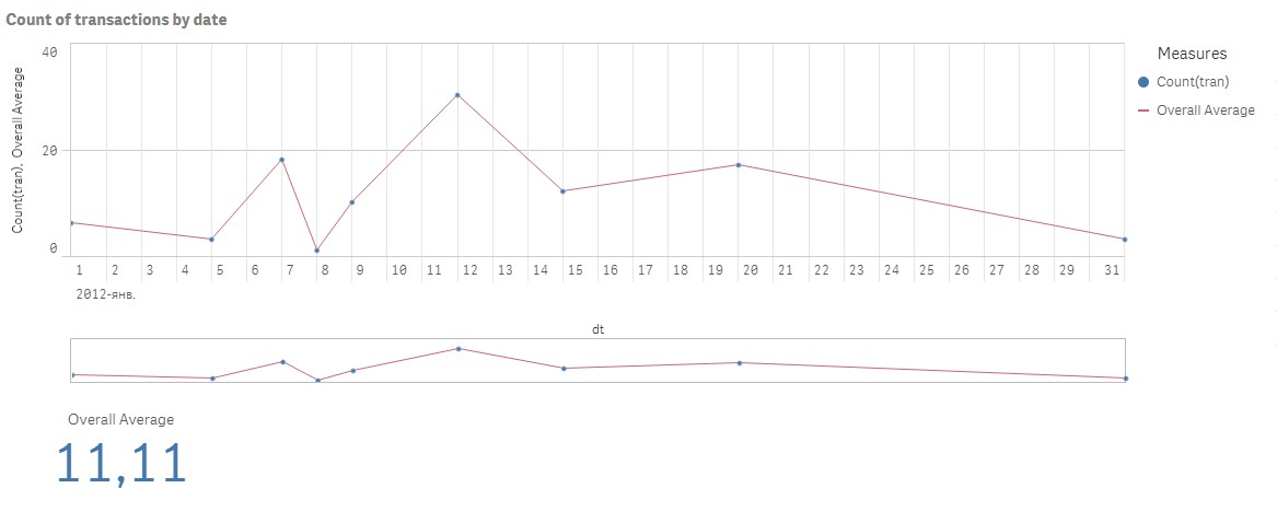
The used formula is Avg({1} Aggr(Count({1} tran), dt))
- Mark as New
- Bookmark
- Subscribe
- Mute
- Subscribe to RSS Feed
- Permalink
- Report Inappropriate Content
Try this
=Avg({1} TOTAL Aggr(Count({1} tran), dt))
or this
=Avg(TOTAL Aggr(Count(tran), dt))
or this
=Avg(TOTAL Aggr(Count({1} tran), dt))
- Mark as New
- Bookmark
- Subscribe
- Mute
- Subscribe to RSS Feed
- Permalink
- Report Inappropriate Content
Hello Sunny,
That was really helpfull. Thanks.
But can we go more advanced and apply average line depending on month here?
For example, if I have data for two months and I need a separate part of average line for each. So that when I select a specific month in filter pane, I get straight line for this month.
This is what I expect:
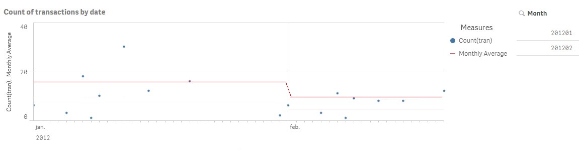
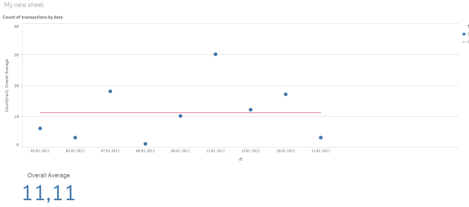
I tried to apply formula =Avg({1} TOTAL Aggr(Count({1} tran), [dt.autoCalendar.Month])), but it didn't work.
I attached my qvf with sample data. Could you please have a look? Thanks a lot.
- Mark as New
- Bookmark
- Subscribe
- Mute
- Subscribe to RSS Feed
- Permalink
- Report Inappropriate Content
Try this
=Aggr(NODISTINCT Avg({1} Aggr(Count({1} tran), [dt.autoCalendar.Month], dt)), [dt.autoCalendar.Month])
- « Previous Replies
-
- 1
- 2
- Next Replies »