Unlock a world of possibilities! Login now and discover the exclusive benefits awaiting you.
- Qlik Community
- :
- Forums
- :
- Analytics
- :
- New to Qlik Analytics
- :
- Re: Bar Chart for Trend Line Slope
- Subscribe to RSS Feed
- Mark Topic as New
- Mark Topic as Read
- Float this Topic for Current User
- Bookmark
- Subscribe
- Mute
- Printer Friendly Page
- Mark as New
- Bookmark
- Subscribe
- Mute
- Subscribe to RSS Feed
- Permalink
- Report Inappropriate Content
Bar Chart for Trend Line Slope
Hi All,
I am quite new to Qlik Sense. I need to create a bar chart with bars being slopes of the trend line for sales of the last 12months, rolling.
In Excel, slope is calculated by the formula SLOPE(known_y’s, known_x’s)
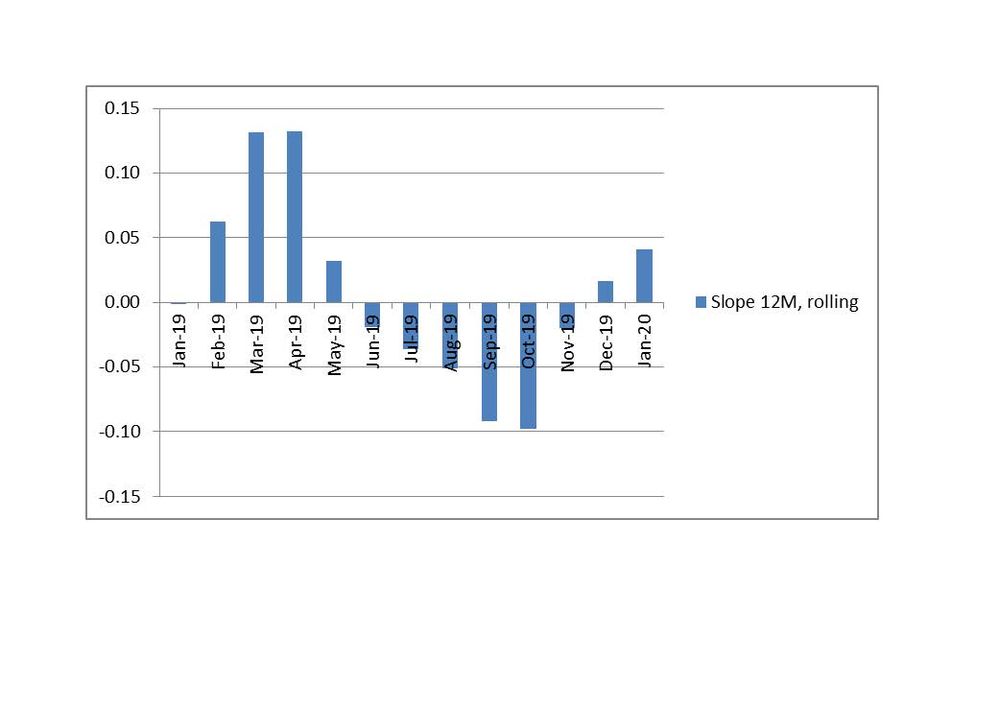
The graph would look like this:
Bar “Jan-20” shows the slope (measure) of the trend line for sales for the period Feb19-Jan20.
Bar “Dec-19” shows the slope of the trend line for sales for the period Jan19-Dec19, etc.
I know how to get the trendline for 12 months in Qlik Sense. In my case it is the following expression:
linest_m(total aggr(if(Sum({<is12M={1}, AsOfMonth={'$(=vMaxMonthNo)'}>}[Sales]),Sum({<is12M={1}, AsOfMonth={'$(=vMaxMonthNo)'}>}[Sales])),MonthYear),MonthYear)*only(MonthYear)+linest_b(total aggr(if(Sum({<is12M={1}, AsOfMonth={'$(=vMaxMonthNo)'}>}[Sales]),Sum({<is12M={1}, AsOfMonth={'$(=vMaxMonthNo)'}>}[Sales])),MonthYear),MonthYear))
To my understanding, the bold part is the slope. But how to calculated the slopes for rolling 12 months and put them all in one bar chart?
Any help on this is highly appreciated!
- Mark as New
- Bookmark
- Subscribe
- Mute
- Subscribe to RSS Feed
- Permalink
- Report Inappropriate Content
In Excel in the SLOPE formula (for example for Aug'19 slope) I use:
y's range : sales for Sep18-Aug19
x's range : numbers 13 to 24. Because the step is 1 (1 month)
Unfortunately the last expression with AsOfMonth limitation is not working. I get no bars on the chart.
- Mark as New
- Bookmark
- Subscribe
- Mute
- Subscribe to RSS Feed
- Permalink
- Report Inappropriate Content
why do you have in this variable?
AsOfMonth={'$(=vMaxMonthNo)'}
- Mark as New
- Bookmark
- Subscribe
- Mute
- Subscribe to RSS Feed
- Permalink
- Report Inappropriate Content
Because if I only use AsOfMonth , without vMaxMonthNo, the trend line refers to the whole data set (24 months) and not to last 12 months or 6 months.
- Mark as New
- Bookmark
- Subscribe
- Mute
- Subscribe to RSS Feed
- Permalink
- Report Inappropriate Content
I understand but how is this variable (vMaxMonthNo) defined? What do you have in there?
- Mark as New
- Bookmark
- Subscribe
- Mute
- Subscribe to RSS Feed
- Permalink
- Report Inappropriate Content
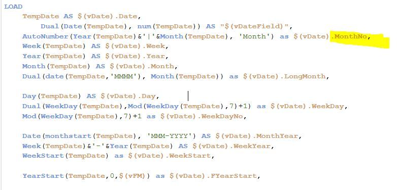
vMaxMonthNo = Max(MonthNo)
Here is one part of the script related to MonthNo. The other part is in the beginning of the chat.
- Mark as New
- Bookmark
- Subscribe
- Mute
- Subscribe to RSS Feed
- Permalink
- Report Inappropriate Content
I forgot the double quotes
LinEst_M( aggr(sum({<is3M={1}, AsOfMonth={">=12<=24"} >}[Sales]), MonthYear, AsOfMonthYear), aggr(Only({<is3M={1}, AsOfMonth={">=12<=24"}>}MonthYear), MonthYear, AsOfMonthYear))
- Mark as New
- Bookmark
- Subscribe
- Mute
- Subscribe to RSS Feed
- Permalink
- Report Inappropriate Content
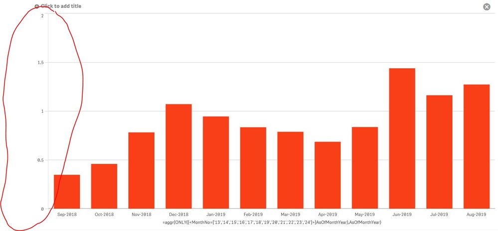
Thanks. It made the difference. It showed the full 24 months but the bars only for the last 12 months. So I adapted the Dimension to limit to the last 12 months:
=aggr(ONLY({<MonthNo={'13','14','15','16','17','18','19','20','21','22','23','24'}>}AsOfMonthYear),AsOfMonthYear)
Now it looks very good except for the Y-scale. Any ideas how to turn it to the correct scale?
Many thanks!
- Mark as New
- Bookmark
- Subscribe
- Mute
- Subscribe to RSS Feed
- Permalink
- Report Inappropriate Content
To limit the dimension to just the months with data you should deselect "Include null values" in your dimension
Regarding the scale, try this:
LinEst_M( aggr(sum({<is3M={1}, AsOfMonth={">=12<=24"} >}[Sales]), AsOfMonth, AsOfMonthYear), aggr(Only({<is3M={1}, AsOfMonth={">=12<=24"}>}AsOfMonth), AsOfMonth, AsOfMonthYear))
- Mark as New
- Bookmark
- Subscribe
- Mute
- Subscribe to RSS Feed
- Permalink
- Report Inappropriate Content
Sorry, this expression does not work - no bars.
- Mark as New
- Bookmark
- Subscribe
- Mute
- Subscribe to RSS Feed
- Permalink
- Report Inappropriate Content
Can you change your dimension, for the moment, to just AsOfMonthYear? We are clearly very close; any chance you can share the dashboard?


