Unlock a world of possibilities! Login now and discover the exclusive benefits awaiting you.
- Qlik Community
- :
- Forums
- :
- Analytics
- :
- New to Qlik Analytics
- :
- Re: Bar chart displaying hours and minutes instead...
- Subscribe to RSS Feed
- Mark Topic as New
- Mark Topic as Read
- Float this Topic for Current User
- Bookmark
- Subscribe
- Mute
- Printer Friendly Page
- Mark as New
- Bookmark
- Subscribe
- Mute
- Subscribe to RSS Feed
- Permalink
- Report Inappropriate Content
Bar chart displaying hours and minutes instead of months when a single year is selected
Hello.
I have a bar chart that displays the average number of courses ([Nome Evento]) in a given time.
Here's the expression of the chart's measure:
Count(distinct [Nome Evento]) / Count(distinct [Nome do servidor])
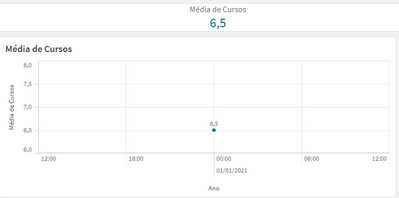
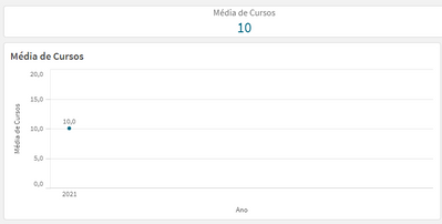
Here's what it looks like when a single year is selected:
It's a single dot, with the scale showing hours and minutes.
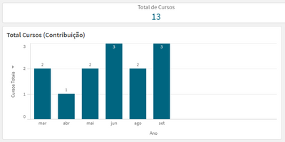
Here's another bar chart that displays the actual number of courses taken when a single year is selected:
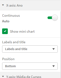
In both cases I have the Continuous option in the X-Axix tab selected, as seen bellow:
How can I make the first bar chart behave like the second? Why is it behaving the way it is?
Thank you in advance
Accepted Solutions
- Mark as New
- Bookmark
- Subscribe
- Mute
- Subscribe to RSS Feed
- Permalink
- Report Inappropriate Content
Okay. For that you can create a drill down dimension (Year->Month)
- Mark as New
- Bookmark
- Subscribe
- Mute
- Subscribe to RSS Feed
- Permalink
- Report Inappropriate Content
Hello,
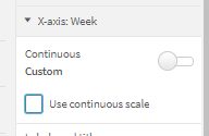
Try disabling below property.
Thanks,
Ashutosh
- Mark as New
- Bookmark
- Subscribe
- Mute
- Subscribe to RSS Feed
- Permalink
- Report Inappropriate Content
If I do that, it only shows the year:
I need it to show the months as well.
- Mark as New
- Bookmark
- Subscribe
- Mute
- Subscribe to RSS Feed
- Permalink
- Report Inappropriate Content
Okay. For that you can create a drill down dimension (Year->Month)
- Mark as New
- Bookmark
- Subscribe
- Mute
- Subscribe to RSS Feed
- Permalink
- Report Inappropriate Content
It worked, thank you!
- Mark as New
- Bookmark
- Subscribe
- Mute
- Subscribe to RSS Feed
- Permalink
- Report Inappropriate Content
Great 🙂
