Unlock a world of possibilities! Login now and discover the exclusive benefits awaiting you.
- Qlik Community
- :
- Forums
- :
- Analytics
- :
- New to Qlik Analytics
- :
- Re: Bar chart with 2 dimensions on X axis need to ...
- Subscribe to RSS Feed
- Mark Topic as New
- Mark Topic as Read
- Float this Topic for Current User
- Bookmark
- Subscribe
- Mute
- Printer Friendly Page
- Mark as New
- Bookmark
- Subscribe
- Mute
- Subscribe to RSS Feed
- Permalink
- Report Inappropriate Content
Bar chart with 2 dimensions on X axis need to hide bar label but show bar group label
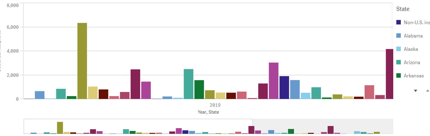
The Bar chart we are building has 2 dimensions: Bars is States and Bar Group is Year. If we set Color to Auto then the chart is displayed with just the bar grouping label (Year) on the X axis but the bars are restricted to the 12 colors in the default color pallet (see attached file BarChartAutoColor). So we changed the color option to Custom By Dimension so that we can use the 100 color pallet but now both the bar grouping dimension (Year) and the bars dimension (States) appear on the X Axis (see attached file BarChart100Color). The state labels display is taking too much space so we want to only show years. I've tried various property combinations like setting the X Axis Labels and Titles drop-down to Titles but then we loose the Year label which we ant to continue to display. Any suggestions will be appreciated.
Thanks
Brian
- Mark as New
- Bookmark
- Subscribe
- Mute
- Subscribe to RSS Feed
- Permalink
- Report Inappropriate Content
could you please attach your .QVF file here with dummy data, might be I can help you.
- Mark as New
- Bookmark
- Subscribe
- Mute
- Subscribe to RSS Feed
- Permalink
- Report Inappropriate Content
Our QVF contains some customer sensitive information so I recreated the issue using the attached Executive Dashboard.qvf file provided by Qlik. Open the QVF's Test Bar Chart sheet and you will see two bar charts. The first uses the default 12 color pallet and displays bars for each Sales Rep. As you can see it repeats the use of the same color for different bars - this can be confusing when the same colored bars are displayed right next to each other as demonstrated by the 2 brown bars. To get around this issue we want to use the 100 color pallet which is shown in the second bar chart. The problem with the second bar chart is that we only want to see the bar grouping dimension (Year) on the X axis, which is how it is displayed in the first bar chart. By default, the chart includes the Sales Rep name on the X Axis which takes up to much space when the chart is rendered on a smaller device. I've tried changing the X-Axis Title and Label properties but that is not working - the chart either displays with no X axis labels or with both X axis labels. Any ideas are appreciated. Thanks
- Mark as New
- Bookmark
- Subscribe
- Mute
- Subscribe to RSS Feed
- Permalink
- Report Inappropriate Content
may be try like to set number of x-axis value as custom, and try to set maximum number values more than 10
my case it is 20.
see attached .qvf file

- Mark as New
- Bookmark
- Subscribe
- Mute
- Subscribe to RSS Feed
- Permalink
- Report Inappropriate Content
I downloaded the qvf but I still see the Sales Rep names along the X axis. I also verified the qvf has the Axis properties set to Custom and 20. What I find odd is that your screen shot does not show the Sales Rep labels. I am using Qlik Sense Desktop Sept 2020 - I wonder if you may be using a different version which results in different behavior?